Archive for December 2012

If We Can Beat the Mayan Apocalypse Why Not the Fiscal Cliff?

December 21, 2012

If the Mayan apocalypse can be postponed (I am not sure exactly at which time it is supposed to occur so I may be speaking too soon here) then surely the U.S. Congress can agree to actions to avoid the fiscal cliff.  Lawmakers are poised to give us over $500 billion in tax increases and over $100 billion in spending cuts to begin the new year.  The fiscal cliff is a  pretty big lump of coal as a gift to begin 2013.

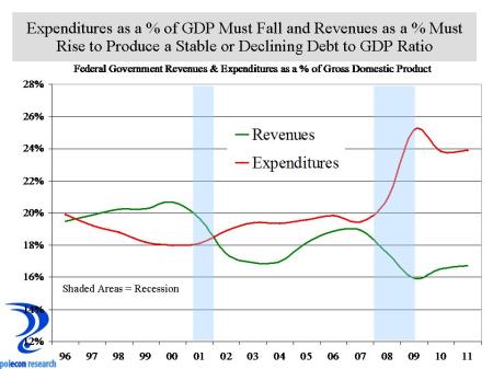
What is extraordinary about the cliff’s self-inflicted harm is that it appears  almost all sentient beings realize what needs to happen. More importantly, there also appears to be substantial agreement on most of the actions necessary to avoid the economic harm resulting from the fiscal cliff.   Spending clearly has to be cut  just as surely as revenues have to be raised.

deficit trends

With so much apparent agreement on actions needed to avoid the damage, it is hard to understand the calculus of lawmakers as the lack of an agreement begins to  demonstrably affect business and consumer confidence as well as financial  markets.  Congress always comes up with a temporary fix for the alternative minimum tax and can easily do so again.  Almost everyone wants the payroll tax cut to expire (for different reasons – Republicans because they don’t like the temporary nature and believe it has no incentive for work and saving and Democrats because of its impact on the Social Security trust fund).  There is little support for extending unemployment benefits.  It seems like neither party really wants the spending cuts (Republicans opposed to defense cuts and Democrats to non-defense cuts).   There is disagreement over the tax increase for high income individuals included in the Affordable Care Act and Medicare reimbursements for doctors but those are a miniscule portion of the cliff’s effects.   Beyond all the posturing,  the fight in congress is really  about whether to extend tax cut provisions to 98% or 100% of U.S. households.

cliff effects on growth

I know I am simplifying here.  Even with many agreed upon temporary  fixes,  longer-term solutions must be found.  But lawmakers could still salvage strong economic benefits by avoiding the worst of the cliff’s impacts in the short-term while resolving longer-term issues in the first-half of 2013.  Such a “grand bargain”  would both increase business and consumer confidence and set the nation on a more sustainable budgetary and debt path that would quickly overcome any of the short-term negative impacts  resulting from necessary spending cuts and revenue increases.

Rural Stresses and Yankee Values: Another Reason to Admire the North Country

December 19, 2012

I love NH’s North Country.  I didn’t grow up there but as a youth I festered in nearby state in a town along the Canadian border that also once had a thriving paper products industry and strong French Canadian accent.  In my elementary school we recited the Pledge of Allegiance in both English and French.

What I love most and what distinguished NH’s North Country from others with similar geography, industry or demographics is the Yankee values of hard work, honesty, integrity, frugality, and a more intense connection to earth that so many of its residents demonstrate.

With some notable exceptions, but on balance, rural counties across the country have struggled more with demographic and economic issues than have more urban and suburban counties over the past several decades.  Population and job growth trends and the demographic mix of Coos County have exposed that county’s residents to the economic equivalent of the “trials of Job”  in recent decades.  Thus I expected that data on delinquent debt by county would show Coos County residents to be far more likely to be behind in debt payments than most other counties in NH.  In fact, as the chart below shows, at the peak of debt delinquencies in the country (Q4 2010), Coos County had the lowest percentage of debt that was 90 or more days delinquent (summing the percentage of auto loan, credit card, and mortgage debt that was 90+ days delinquent).

delinquent debt by county

Whether it is the Yankee values of  “living within your means,” or doing whatever it takes to honor obligations, it surely wasn’t a robust economy and strong income growth that enabled Coos County to have the lowest aggregate severe delinquency rate.  I wasn’t looking for nor did I need another reason to admire and root for the North Country, but I found one anyway.


Say What About Natural Gas Prices?

December 14, 2012

I read a story in the media today where an electric utility is justifying a large rate increase based on the notion that  the price of natural gas for electricity generation has risen by 20% in the past 2 1/2 months.    Hmmm.  Price data for natural gas for electricity production isn’t available in NH because of the small number electricity producers means releasing it would violate disclosure regulations.  Price data for the U.S. and for Massachusetts is available though, and while it does stop at the end of September 2012, it suggests that natural gas prices for electricity generation have been substantially lower for the most of the past two years.   As of September 2012, the year-over-year change in natural gas prices for electricity production in the U.S. and in Massachusetts averaged -30% for the preceding 12 months.  It is hard to see how a 2 1/2 month increase will negate average reductions of 30% over the preceding 12 months.  But a lot of the calculations used in setting electric rates doesn’t conform to mathematical laws.

Nat gas for electrticty 12 mos MA

One would think years of natural gas price declines would have prompted greater  price reductions if  a 2 1/2 month rise warrants a large increase.  Looking at price changes over the same month of the prior year year (to avoid any seasonal distortions that can occur), you can see the prices fell by as much as 40% or more  in 2012.  Prices do vary by state but not enough to negate these trends.  Sure, prices do rise and have very recently, but not enough to offset the tremendous drop they have experienced over the past several years.

nat gas prices for electricity no moving avg

This Crash Was Different

December 13, 2012

This is my second housing market crash since I’ve been in NH and old enough to know anything about them.  The first was the great crash of the late 1980s and early 1990s that took with it the five largest banks in NH and many of the largest banks in New England.  But that crash was fundamentally different and was largely the result of tremendous overbuilding of housing in the state and the region during the mid and late 1980s (see graph below).  Even the recent crash was, in large part, the result of over-building in many of the hardest hit states like Nevada, Florida, and Arizona.  Where overbuilding occurs, downturns are a more dramatic combination of excess supply and and a retreat from irrational expectations of price appreciation.  Again, because NH didn’t overbuild this time, our price declines weren’t as dramatic as many areas of the country and our rebound likely won’t be as dramatic either.  If values have fallen 50 percent as they did in some states, you can get pretty large jumps in appreciation quickly as things stabilize – even though a 10% price appreciation still means values are down 40%.

NH Housing Permits

In NH we don’t have years of excess housing supply to work off before prices can begin to recover.  This time around recovery in prices and new construction will be about the fundamentals that drive the demand for housing, population and job growth, new household formations, and the need to replace old units – I’ve noted that  before (and here).  I wish people would look to job growth in NH instead of what is happening to home prices in other states if they want a clue as to where NH prices are going.  One of the great unknowns is whether the recent troubles in the housing markets nationally and in NH have fundamentally altered perceptions of the value and desirability of homeownership.  I don’t have an answer to that but one indicator could be the percentage of new construction that is for single units versus the percentage for multi-unit structures.  The chart below does suggest that the percentage of building permits for single units in NH did trend lower as the market began to decline, and is likely an indicator of developer’s responding to a lower level of demand for single family housing compared to multi-unit.  Whether this is just temporary or a longer-term adjustment in the attractiveness of single family housing remains to be seen.

NH Single Unot Housing Permits

NH’s Most Valuable Import?

December 11, 2012

I write a lot about the importance of skilled individuals with higher levels of educational attainment to the prospects for our nation’s and NH’s economic growth and prosperity.  I’ve also written about how important the in-migration of skilled individuals with higher levels of educational attainment from other states to NH has been to NH’s economic success.

I know  foreign immigration to the U.S. is a hot-button issue in this country and an increasingly high-profile one in cities like Manchester in NH.  Whether because of economics, legitimate  fiscal concerns, or simple xenophobia,  for many, foreign immigration is viewed with concern, skepticism, and sometimes hostility.  While some cities and school districts are more challenged by differing characteristics of immigrant populations in NH, on balance, foreign born individuals add significantly to the overall level of skill and educational attainment of the workforce in NH.  The chart below shows how much higher is the educational attainment of the foreign-born workforce in NH than it is in the U.S. as whole.

Ed Attainment by Place of Birth US and NH

Comparing foreign born workers in NH to U.S. born workers in NH shows that foreign born workers are much more likely to have a graduate or professional degree than are U.S. born workers age 25-34.  Foreign born workers comprise a disproportionately large percentage of NH residents with graduate and professional degrees and that is reflected in many of the highest skill occupations in the state.  Which, of course, will be the subject of a future post.

Ed attainment by birth ages 25 to 34

Hiring by Age: More Evidence of a Skills Gap?

December 10, 2012

I know its a tough labor market for young people and recent college grads, but they still represented a larger portion of new hires in NH in 2011 than would be expected based on the percentage of employment by age in the state.  The chart below shows the age distribution of  employment in NH in 2011 along with the percentage of new hires in the state by age group.   Although job growth has been slow this recovery, the chart still shows that among those who have been hired for a new job (that is the hiring that is not a “call back” of a previously laid-off worker), younger workers make up a disproportionate number of the new hires.

Emp by age

This could be more evidence of, as well as a subset of,  the “skills gap” debate.  Many employers complain that the skills that young workers and recent grads posses don’t match their needs, and this is true for many occupations, but what this data also seems to suggest is that the mismatch between the demands of employers and those seeking work among the existing workforce is even greater than that for younger workers and new entrants to the labor force.  It suggests a bigger problem than just getting kids into the right majors and training programs (although that is a big part of it).  It points to a larger problem of a fundamental change in the types of occupations in demand (or the skills required of the same occupations) as well as a “twist” in the labor market that results in differences in the occupational make-up of industries.  It is a much more difficult , slower, and likely painful process to have the existing workforce adapt to these changes in order to increase their employment prospects than it is to begin with the next generation of workers, although both will challenge future employment and economic growth for some time.

Of course it is possible that employers just prefer younger and perhaps less expensive workers and that is what accounts for their outsized share of recent new hires.  Or it could be a function of the type of industries that were hiring in 2011 (I will be examining this hypothesis).  It may be more comforting to view labor market trends from those perspectives but it won’t get us any closer to taking the personal and policy actions necessary to create greater alignment between the skills of our workforce and the skills needed for a more prosperous economy.

Natural Gas Price Outlook Improves Again This Year

December 7, 2012

The U.S. Energy Information Agency issued an early release version of its 2013 Annual Energy Outlook and the increase in U.S. energy production and the production outlook over recent years continue to keep forecasts of price increases modest.  That is especially true for natural gas where long-term price forecasts have fallen by 15% to 30% in just the past three years (chart below).

Nat Gas Forecast

Of course all sorts of national and international events can interrupt these trends, but the  price forecast along with the expectation of a continued, long-term, price differential between oil and natural gas should  result in continued  fuel switching by electricity generators, and an increase in switching by end users as well.  Natural gas is already the majority source for home heating everywhere in the country except the Northeast, but opportunities for fuel switching in the  transportation sector are enormous.  Unfortunately, with a gasoline station located about every quarter mile, and large industries supporting them, the prospect of consumers being able to fuel their autos at home using the existing natural gas infrastructure and a relatively small investment in equipment for their home doesn’t have the same appeal to everyone as the economic, environmental and consumer  rationale of switching  implies.

Fuell Price Forecast

Who are the 47% and Who Did they Really Vote For?

December 6, 2012

I know a lot of people who voted for President Obama (and about as many and maybe more who voted for Mitt Romney).  None of the people who voted for the President fit the famous “47%” profile of individuals dependent on government for support.  In fact, very much the opposite was the case.  Nevertheless, the notion that a dependent population was largely responsible for the President’s re-election seems popular in some circles.  My small circle of acquaintances is not a  valid sample from which to accept or reject the dependency theory of  the election so here is one small step toward empirical verification or rejection.

I chose ten states from various regions of the country (NH,MA,NY,IN,KS,GA,FL,TX,AZ,OR), half of whom were won by President Obama and half by Mitt Romney.   I compiled a county-level dataset that includes the percentage of votes won by each candidate, the percentage of the population age 25 and older in the county that has a bachelor’s degree or higher, and the percentage of the population in the county that is white and non-Hispanic.   For my dependency measure I used the percentage of total personal income in the county that comes from government transfer payments.  The largest government transfer payments are for Social Security, Medicare and Medicaid (see chart below).  Of those, only Medicaid is for low-income individuals (and thus more closely fitting the profile of dependency) and income support payments like disability, supplemental income, food stamps and other (see chart below).

transfer payments

The ten states are not random and perhaps not a valid sample and there are many more demographic variables I could have included but this is all I could accommodate in the span of a Boston Celtics game and a couple of glasses of wine.  The ten states represent 814 counties, or about 26% of all counties in the U.S.  Using a simple regression model that analyzes the impact of the educational, race, and dependency variables on the percentage of the vote in each county received by the President, results were significant but still only explain about 25% of the variation in the percentage of the vote received by the President.  A larger percentage of income in a county  from government transfer payments is, in fact,  positively related to higher percentage of the vote for the President (although the simple correlation is small), and a higher percentage of the population that is white is negatively related to the vote received by the President (no surprise that we are a long ways from being color blind).  Its no great epiphany that users and supporters of government assistance  would be more likely to vote for a Democrat or that white voters might be less likely to vote for the President.  What is most interesting, however, is that the strongest relationship is a positive one between the percentage of persons age 25 and above in a county who have at least a bachelor’s degree, and the percentage of the vote received by the President.  Republicans may be right about not being able to win as many individuals who rely on government assistance as will Democrats but over the next few decades the percentage of the population that will be receiving the largest share of government benefits (Social Security and Medicare) is going to skyrocket and the percentage of the population that has a bachelor’s degree or higher is likely to increase as well.

I guess you can dismiss election results when they appear to be an aberration driven by the “great unwashed” who depend on government benefits, but what do you say if  the results were more influenced by the voting behavior of the most educated?

Anyone interested in the limited dataset I have, feel free to contact me.  I’d love to include all 50 states and many more demographic and economic variable but I doubt I will ever get to that.  For the truly nerdy who might want the stats from the regression models, you are welcome to those as well.

A Simpler But No Less Troubling Explanation for Job Growth Trends

December 5, 2012

A lot of analysts, me included, have been looking for reasons why employment growth has been slower much of this recovery.  That prompts questions about whether the slow recovery from recession is the result of cyclical factors (related to swings in the business cycle) or structural factors that fundamentally and longer-term alter the ability of NH and the nation to create jobs.   While some wait for cyclical factors to improve job growth, in NH there is a lot of talk about demographics, migration, and too often (by me at least) the skills gap or mismatch between job openings and the skills of job seekers.  Much of the demographic story, especially concerns about NH’s ability to attract people from other states,  is relevant – except perhaps for the overblown concerns about NH’s “aging” (more about that in future posts).  I believe demographics and things like the skills gap play an important role in the slow recovery and more general downward trend in job growth, both before and following the recession.  But today, I offer another, simpler thesis, but  one that may be no less troubling.   If you look at job growth trends in NH by industry, you see that since the recession, employment weakness has really been most concentrated in  three sectors of the economy;  construction, government, and financial services.   The chart below shows job growth trends over the past several years for total non-agricultural employment in NH,  as well as total employment minus construction, government, and financial services.  Absent the three hardest hit sectors of the economy, job growth following the recession (until recently that is) didn’t look that much different than the recovery from the briefer, milder recession of the early part of the last decade.

recovery

I know construction,  government, and financial services are important but they still represent just over 20 percent of employment in the state, so the weakness in employment isn’t as broad-based as pessimists (including me at times) suggest.   But what is more troubling is that the weakness in these sectors are more structural than cyclical and thus we may be waiting for a rebound that may never occur.  I don’t think that is true for construction, where at least some rebound will occur as the housing market improves, as business investment strengthens, and whenever the fiscal health of governments improve enough for infrastructure spending to pick up.   But weakness in government and financial services employment is likely more structural.  New financial services regulations are likely to be an impediment to job growth in that industry for some time and there is no end in site for the budgetary impediments that will likely continue to weigh on job growth in the government sector.   I, and others, will continue to look at the implications of such things as demographics and skills gaps on recent and prospective job growth, but we can’t fail to recognize that sometimes  answers are less complex than the questions.

The Odds on Gambling Have Gone Up?

December 4, 2012

(Update:  An astute reader has suggested that if gambling is more likely then, in fact, the “odds have gone down”  – I’ve added a question mark to the title to reflect my uncertainty.)

With a newly elected governor open to this possibility of introducing casino gambling in NH and a state senate that has been similarly inclined in recent years, by all accounts casino gambling will be a hot topic in the legislature this year.    Because this blog attempts to address timely issues, this is the first of what will be a number of posts that take an empirical (as opposed to moral or ideological) look at the fiscal and economic impacts of casino gambling in NH.  First, a disclosure:  I am not now nor have I ever been involved in debates regarding expanded gambling in New Hampshire or anywhere, either professionally or personally.  I only point this out because so much of the debate is framed by advocates or opponents, the information from each is often discounted by some percentage because of their advocacy.  There may be other reasons to discount the information I offer here but my position as an advocate or opponent ought not be one.  Most of what I will be posting here are aspects of casino gambling that interest me, and thus may not be the most important or most relevant from a public policy perspective.   If there are issues you think I ought to examine,  feel free to let me know.

casino tax revenues

Looking at the basics, casino gambling provides substantial revenues to the three states I examined for this post.  The chart above shows the state government revenues provided by casino gambling revenues of CT, NJ, and Nevada.  For Nevada, the  revenues do not include casino gambling related revenues such as taxes on rooms or meals and for each state the figures do not include any licensing revenues.  Revenues in Connecticut are the “cleanest” to interpret, they represent the state’s 25% share of the “win” from slot machines at both Foxwoods and Mohegan Sun.  I don’t know (yet) the revenue formula for Nevada or New Jersey but I do know that slots are important regardless.  In Nevada, slot machines represent about 65% of casino revenue (61% at publicly traded – larger- casinos).  A key question from the chart is whether the decline in state revenues is cyclical, or structural.  Cyclical involves changes resulting from economic conditions, while structural involves issues such as competition (the increase in gambling locations) and perhaps the 800 pound gorilla, internet gambling.  Either way, the decline in gambling revenue has been especially dramatic in New Jersey, which likely reflects a combination of increased competition (especially from new Pennsylvania casinos) as well as economic conditions.  It will be interesting to see how CT and NJ fare with the impending opening of casinos in Massachusetts.

Casino gambling revenues come from the discretionary spending of consumers.  Discretionary income suffered significantly during the recent recession.  In NH, the revenue source probably most dependent on discretionary spending is the state’s meals and rooms tax.  A significant percentage of the meals and rooms tax is related to entertainment and recreation spending, similar to casino gambling (although the meals and rooms tax is also a function of business conditions and expenditures).  A quick comparison of gambling and meals and rooms tax revenues shows that the meals and rooms tax (adjusted for rate changes) declined during the recession but has been a more stable source of revenue for NH than has casino gambling revenues has been for other states.  Another interesting fact is that revenue from NH’s meals and rooms tax was about $237 million in FY 2012, while casino gambling revenues in NJ were about $238 million.Casino vs meals and rooms


%d bloggers like this: