Archive for the ‘Election’ category

“Tomorrow Will Still be Wednesday” – Our Final Presidential Election Model

November 4, 2016

November 8th can’t come soon enough.  When it does, take a deep breath and remember this: “tomorrow will still be Wednesday.”  Whoever manages to win the unpopularity contest that is the 2016 presidential election, the earth will remain on its axis, the sun will  rise again on November 9th, you can still hug your children (if they live away from home they still won’t return your call but they will respond to your texts), and no doubt your dog will love you unconditionally no matter who wins.  You wouldn’t know it from the hyperbole on both sides but on November 9th know this: the republic will remain standing.  That is my mantra at the end of an awful campaign that has cheapened and debased our electoral system in a way that won’t be easily repaired.  You don’t have to like the politics of past presidents to appreciate that, for the most part, they led our country with dignity, honor, and respect, things that are just as important to maintaining our democracy and our position in the world as are any shows of military or economic strength. Nobody gets to be president of the United States without a healthy ego and sharp elbows but today, with an election that shows how easy it is for many to excuse rudeness, sexism, racism, nativism and just about every other “ism” as a justifiable response to political correctness or as a sign of “strength,” I can’t help but think of past presidents who led our nation through difficult times knowing that they could not do so alone and with with a decency and a humility characteristic of genuine strength and leadership.

I definitely picked a bad year to try to make political predictions based primarily on economic conditions and without regard to the particular candidates running.  As a lover of statistics and statistical models I like reading Nate Silver’s FiveThirtyEight blog for its election predictions but when he said:  “Still, you should be wary of economic determinism. “Fundamentals”-based models that don’t look at polls have a fairly bad track record, even in years that aren’t as crazy as this one.” I couldn’t resist the effort to predict presidential election results with a regression model that used primarily economic data and that didn’t require the complexity and volume of polling data that FiveThirtyEight uses. In fairness, Mr. Silver did also say “I do not mean to suggest that the economy does not matter to elections, or that there is no predictive content in looking at economic variables. As this experiment should show you, the economy assuredly does not account for 90 percent of voting results. But it may well account for half of them.” I would argue more than half.   I won’t say, but I have heard others say, that Mr. Silver would have better luck with “economic determinism” if his model used individual state-level economic data and conditions rather than national data  because economic conditions vary greatly across states (note here that I am doing my best Donald Trump imitation by saying something without taking responsibility for it).   I also won’t say Mr. Silver would have better luck using economic variables that aren’t endogenously determined (i.e. some of the explanatory economic variables he uses are almost completely determined by other economic variables in the model).  That is a pretty big no-no for a stats maven to make but only if he knows something about economics.

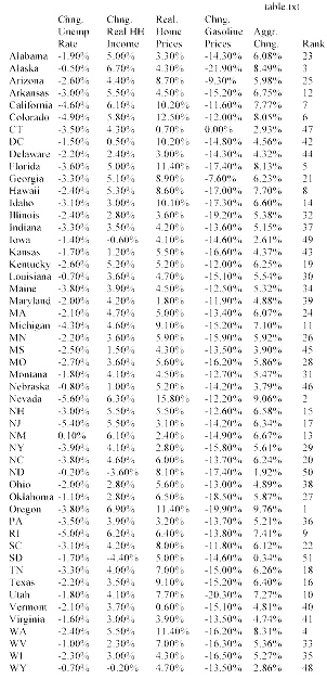
I first posted in April and updated in July, a presidential election prediction model.  I failed to note in prior posts that I consider only the two candidates from the major political parties in the model so the winner of each state is the one that gets more than 50 percent of a state’s vote and the predicted vote percentages will not be similar to actual results that include third party candidates.  In July I also promised to post one more iteration of the election model after the latest state-level personal income data was released prior to the election because personal income growth trends are so important to the model’s predictions.

In the November election model the Democratic candidate still has a large advantage in the electoral college but as the chart below shows, there are more states currently predicted as Democratic victories that could switch to a Republican victory than vice versa.  In the unlikely event that all predicted narrow Democratic victories changed to Republican victories and all narrow Republican victories remained Republican wins, then the Republican candidate would be awarded 294 electoral votes and win the presidency.  On the other hand, in the unlikely event that all predicted narrow victories for the Republican candidate changed to Democratic victories and all predicted Democratic victories remained Democratic wins, the electoral college vote total tally would be 384 to 154 in favor of the Democratic candidate.  These are the extremes of potential outcomes but while the July model suggested an almost impossible path to electoral college victory for the Republican candidate, the November model shows an improbable but not impossible path.

november-map

To the Victor Goes the ?

President Obama’s reward for winning the presidency was inheriting an economy in a severe recession but at least one where the most controversial policies adopted to combat it were already largely in place.  The next president will begin seeking reelection fully 10 years since the end of the “great recession” making it the longest period of economic expansion in U.S. history and suggesting the possibility that U.S. will once again be in, near, or ending a recession. I believe Mrs. Clinton will win the White House and a recession in her first term and voter fatigue after three terms of a Democratic presidency will give the 2020 election to the Republican Party.  Of course that assumes a disarming of the circular firing squad that is the current Republican Party and if there is one thing the Republican Party probably doesn’t want to do it is disarm. Republicans may be able to capture the White House in 2020 with a better salesman at the top of the ticket but demographic trends suggest it will need more.  To me, the most interesting aspect of the 2016 election is that it hints at a future realignment of political parties, with the Republican party becoming the party of the working class and the Democratic party becoming the free trading, immigration supporting, party favored by business.

Not With a Bang But With a Whimper

July 26, 2016

The U.S. economy is currently in its 86 month of an economic expansion that began in the summer of 2009 according to the National Bureau of Economic Research, the organization that officially dates U.S. business cycles. If the expansion lasts another seven months (as it will), it will be the third longest economic expansion in our nation’s history, trailing only the 120 month expansion from 1991 to 2001 and the 106 month expansion from  1961 to 1969.

The probability of recession in the next six months is low but the business cycle hasn’t been repealed, another recession will occur and almost certainly sometime before the end of 2019.  It’s just that none of the excesses – wage and price growth, high energy prices, inflationary pressures, inflated asset values, etc.- that have preceded past recession are much apparent in today’s economy and there aren’t signs that any are imminent.  What will make the next recession unique in the post WWII era is that it may very well occur before the nation has fully recovered from the previous recession, despite how long the current recovery has lasted.  “Fully recovered” here means that the actual output of the nation’s economy (GDP) reaches its potential output (for a brief explanation of actual and potential output of the economy see this Congressional Budget Office publication). This is somewhat akin to feeling the effects of a hangover in the morning despite not having enjoyed the celebration the night before.  Unlike the last recession, or most recessions, the next one may not begin with a bang but rather with a whimper.

No expansion can last forever; the U.S. and the NH economies are showing signs of slowing so it is difficult for me to believe that the nation can avoid slipping into recession sometime during the first term of our next president.  If that President is named Clinton it will most likely mean a one-term presidency as three consecutive terms for an incumbent party (relatively rare in itself) along with a recession in the third term (unless is happens very early in her term allowing sufficient time for growth prior to 2020) would almost certainly result in the nation looking for a change in the party controlling the White House.  If the President is named Trump he will no doubt blame the recession on the past administration and that may help give him a pass in 2020, but a recession will challenge his claim as someone who knows how to create jobs, while his penchant for populist and nationalistic themes aren’t generally viewed as monetary and fiscal policies effective in combating a recession.  His administration’s and his personal  response to the recession might determine his fate (does anyone else remember the images of the first, single-term, President Bush zooming around in his cigarette boat off the coast of Maine while the U.S. was in the middle of the 1990-91 recession?).

The past two months have been marked by one very bad and one very good month for job growth in the nation and in NH.  I  advocate looking at three months of job growth numbers in discerning employment growth trends and a prudent man would wait for the release of the nation’s July job growth numbers on August 5th before making any proclamations about the direction of the U.S. or NH economy.  But a prudent man doesn’t write this blog and I am comfortable knowing that when you right too early it often seems like you are wrong so here are a few of the more accessible  indicators that I believe suggest slower economic growth moving forward.  There are others but jobs and revenues are what interest policymakers most so they are highlighted here.

  • The rate of private sector job growth has slowed.
  • The number of industries that are adding jobs versus the number shedding jobs (the employment diffusion index) has declined.
  • Help wanted advertising is declining.
  • Nationally, state corporate income tax collections appear to have peaked.

Slowing Private Employment Growth

Recognizing that there is always some level of unemployment in the economy, the nation and NH are at or very near “full employment,” making  job gains harder to obtain.  Full employment in the latter stages of recovery is the most obvious rationale for slower job growth going forward.  As the chart below shows, growth in private sector employment nationally is still solid but has been trending downward for some time while growth in NH accelerated in 2015 but appears to have peaked in early 2016.

private sector job growth

The Breadth of Job Gains Narrows

I use a 13 industry private employment diffusion index to assess the breadth of job growth across the private sector economy.  When more industries are adding jobs than are shedding jobs, the index is below .50 and the greater the number of industries adding jobs compared to those shedding jobs the higher is the index number.  The chart below shows that both the national and NH diffusion index have dropped, with NH’s decline of particular concern as it now stands below .50 on a three month moving average basis. NH’s employment numbers are often substantially revised so this index value may not be as bad as it appears here but the U.S. number still points to a slowdown.

diffusion index

Historically, significant declines in NH’s employment diffusion index have signaled turning points in the state’s labor market. The relationship between NH’s diffusion index value and the rate of year-over-year private sector job growth four months later is strong (a correlation of .82).  A simple linear regression of the NH diffusion index on private sector employment growth suggests the last two quarters of 2016 will see private employment growth in NH of about 0.6% on an annualized basis compared to the current rate of growth of about 2.0%.  Clearly not in danger of recession but definitely a slowdown.

diffusion index and emp growth

Fewer Help Wanted Ads

Nationally and in NH the number of help wanted ads has declined in recent months.  In NH the relationship between the three month moving average of help wanted ads and job growth in the quarter that follows is strong (R= .80).

NH US Help Wanted

Growth in State Corporate Income Tax Collections Has Peaked

Nationally, the rate of growth in state corporate income taxes is declining (chart below).

corporate tax revenues

The chart shows that compared to all states combined, the growth in NH’s business tax revenues is increasing as the growth rate nationally declines.  This despite the fact that NH’s private sector employment growth has been at about the U.S. average over the past year.  What is different in NH is the inclusion of NH’s Business Enterprise Tax revenue along with NH’s tax on corporate profits in the chart above.  Both private employment and wage growth have accelerated in NH over the past year. Wages and salaries paid by a business are the largest portion of the Business Enterprise Tax base so even as business profits grow more slowly, business tax revenues can be buoyed by substantial increases in overall wages and salaries.  While not a measure of the payroll of NH businesses, wage and salary income increased in NH by 8.6 percent between QI 2015 and QI 2016 compared to 5.3 percent nationally.  That increase has helped boost Business Enterprise Tax revenue and overall business tax revenue in NH in a way that it cannot in other states (most other states would see the change in individual income tax revenue).  The trend is depicted in the chart below that shows the growth rate of the annualized business profits portion of NH’s business tax revenue has slipped while the growth rate of the portion more dependent on wages and salaries has seen accelerated growth.  A slowing growth rate in private employment in NH implies slower growth in wages and salaries and business tax revenues in the state growing more similarly to the pattern among states nationally.  This will occur just as a budget surplus and strong overall revenue growth have increased pressures for additional state spending that had been muted by several years of relatively weak business tax and overall revenue growth.

NH business tax revenue growth

It is impossible to predict monthly payroll employment growth for a small state like NH (or any state for that matter) but I predict employment growth of about 120,000 jobs nationally in July but anything between 100,000 and 150,000 would be in line with the indicators highlighted in this post and consistent with a gradual slowing of economic growth nationally and in NH. Not soon but at some point that slowing will become a recession and that will be the reward for winning the White House and for new and incumbent occupants of statehouses across the nation.

Economics Sees a Clearer Election Result

July 14, 2016

In April I offered a presidential election prediction model based primarily, but not exclusively, on economic variables as an extension of the old “misery index” that was an overly simple calculation of the impact of economic conditions on presidential elections that nevertheless did a pretty good job of predicting election outcomes.  I presented two model scenarios depending on how the past voting patterns in each state were weighted (how large was their coefficient in the regression model).  The model does not consider any factors related to the candidates other than whether or not they represent the party currently occupying the White House.   The first scenario used my cross sectional estimate of the importance of prior voting patterns for predicting election results in each state; it indicated a fairly close election with a victory for the Democratic candidate. A second scenario weighted prior state voting patterns more heavily and predicted a larger margin of victory for the Democratic candidate.  As a reminder the results from one of the April model runs are shown in the chart below.

base scenario

It may be impossible to consider this election’s results outside the context of the characteristics of the candidates but whether it is New England’s first heat wave of the summer affecting my judgment or just a whiff of dementia surrounding the effort, I still think it important to find some predictable and rational pattern to this election that isn’t related to the outsized personalities of any of the candidates.  Since politics isn’t my expertise I look for that rationality in economic conditions and variables.   My model uses some high-frequency data (changes in gasoline prices, presidential approval, etc.) but also some data available on a quarterly basis (changes in real household personal income in each state, real house price appreciation in each state, etc.) so it can only be updated every few months.  It can now be updated (as promised) and it will be updated one more time prior to the election.  I will skip reiterating a description of the model so if you aren’t one of the 10 people that read that April post and want to know more about the model go back and read this post.

What has Changed Since April?

Almost all states have lower gasoline prices and the real household income in most states increased at rates faster over the past year than was the case in April, both have a demonstrated impact on the willingness of voters to vote for the incumbent party’s candidate and each of these variables are increasing the predicted vote totals for the party currently occupying the White House.  Real home price appreciation was more of a mixed bag among states, almost all had appreciation but several experienced slower appreciation than was used in the April model’s predictions so the impacts only slightly favored the Democratic candidate in most states.  The President’s approval rating has increased slightly since April, benefiting the candidate of the incumbent party (I use data from a Republican pollster and would use data from a Democratic pollster if a Republican were in office to counteract any bias in favor of the incumbent party). Voter fatigue with the incumbent party after two terms in office does not change over time in the model and continues to subtract several percentage points from the Democratic candidate’s vote totals.

Both model scenarios – smaller and larger weighting for each state’s past voting trends – suggest a growing margin of victory for the Democratic candidate.  The July model scenario, using a smaller weighting for each state’s past voting trends, shows that the Democratic candidate’s electoral college margin of victory increases to 317 to 221, up from 295 to 243 in the April model results (chart below).  All of the changes in party “wins” in individual states were in favor of the Democratic candidate.

July Base Map

The July results of this model scenario show Oregon and North Carolina switching to a Democratic victory, NH and Maine moving from a “most likely to switch” from Democratic to Republican victories to more certain Democratic victories and some states moving from more certain Republican victories to “most likely to switch” from Republican to Democratic victories (Arizona, Georgia, Missouri).

The “Official” Model Scenario

As I noted in my first election model post in April, because of the time and data involved, my estimate of the effect of prior voting patterns in each state was not calculated individually using a unique time series for every state.  It wasn’t the best solution and it suggested prior voting patterns will play a somewhat less important role in election results in each state than has been found in research by others.  Rather than continue to present two election result scenarios depending on the weighting of prior voting patterns I will take the middle or average of the two weightings to produce one “official” model prediction.  In my final model update (likely in October) this middle scenario will be the only result I report.

The July model results using this middle scenario show an even wider margin of victory for the Democratic candidate, 347 to 191 electoral college votes. In this scenario Pennsylvania narrowly becomes a Democratic win as does Minnesota and the margin of victory in several close races become more certain for the Democratic candidate.  More surprisingly and perhaps showing how naïve this prediction effort is, some Republican states (Mississippi,   Georgia, and South Carolina) become much less certain republican victories.

July official Map

What Happens If?

 The July model results show a number of states with close races as indicated in the “most likely to switch” columns of the chart above.  If all of the states in the Republican “most likely to switch” column became Democraqtic victories then the margin of victory for the Democratic candidate would be 399 to 139 electoral votes, a true “landslide’ election.  If all of the states in Democratic “most likely to switch” column change to Republican victories then the electoral college results would show a narrower but still strong 302 to 236 victory for the Democratic candidate.  Of course results are likely to contain a mix of both Republican and Democratic wins in the above chart “switching” to victories for the other party’s candidate.  In any combination, however, the results suggest a likely victory for the Democratic candidate and a very difficult electoral college road to victory for the Republican candidate.

EndNote:  I refer to candidates only by their party affiliation and not by name to reinforce the objective and empirical nature of this exercise and to, for a moment at least, consider the election outside of the role that candidate personalities play in the election, not out of any disrespect for the candidates – there has been more than enough of both of those things throughout this election cycle.

“It’s the Economy Stupid,” Unless it Isn’t: Predicting the 2016 Presidential Election

April 6, 2016

You don’t need a political pundit to tell you what your eyes, ears and presidential primary results show  – in 2016 the electorate is angry. The economy isn’t at the top of every voters mind in every election but it is close.  For decades nearly every presidential candidate from both incumbent and non-incumbent political parties has asked voters “are you better off today than you were four years ago?”  As I documented in one of the very first posts in this blog, when the majority response was “yes,” the incumbent party’s candidate was almost certain to capture the White House.  There are some troubling economic trends and vexing economic issues affecting large numbers of Americans, still, to me the apparent level of anger in the electorate today seems outsized in historical context.

By most aggregate measures the country, as well as most individual states, are better off economically today than in 2012.  The simple calculus of Arthur Okun’s “misery index” – or the combined rates of unemployment and inflation – long a shorthand metric for assessing the likely aggregate economic sentiment of the American electorate, is much lower today than it was in 2012 suggesting that, collectively at least, we should feel somewhat better off.  But the level of anger in political and public discourse has elevated during the past four years and the  old “misery index” now seems a woefully inadequate measure of  the electorate’s assessment of current economic conditions.

Adding economic variables that have a demonstrable impact on American’s perceptions of the economy to the “misery index” – such as gasoline prices, home price appreciation, and household income – only adds to the apparent disconnect between standard economic metrics and current voter sentiment.  The table below shows, on a percentage basis, how much lower is the unemployment rate (since 2012), how much real household personal income has grown (since 2013), how much real home price appreciation has occurred in the past two years, and how much lower are gasoline prices over the last year, in each of the 50 states.  In addition, the table assigns weights (subjective though they may be) to the income, home price, and gasoline price measures to develop an aggregate measure of how much better or worse off the electorate is in each state over the past several years.  (The unemployment rate is not included in the combined metric because it is already captured as a determinant of changes in real household personal income).

table Notepad copyMisery metrics aside, historical election results show that regardless of economic conditions there is a tendency for many states to vote consistently for the candidate from one political party (the Democratic candidate has not garnered even 40% of the presidential vote since 1964 in Wyoming and the Republican candidate has won a majority in Massachusetts only once in the past 60 years). In addition, there is clear evidence of ‘voter fatigue” with the incumbent party after two terms in the White House that, depending on the state, can reduce the percentage of the incumbent party’s vote total by as much as 5%.  All of this makes me question the value of economic metrics in predicting presidential elections – just not enough to overcome my left brain obsession with developing quantitative analytical models to explain all things.  I am no political pundit and this is an economics and policy blog not a political blog – this post has nothing to do with arguing for one presidential candidate or one party over another.

I examined the statistical relationship between voting patterns and key economic variables and used the relationships between non-economic variables (voter fatigue, current presidential approval ratings, etc.) found by others to estimate the percentage of the vote that both the Republican and Democratic candidate would receive in each state and to produce the electoral vote totals in the two graphics below. The model is based on the most recent economic and other data and does not take into consideration the quality or characteristics of the potential candidates – a significant shortcoming as in this election in particular, who the candidates are would seem to have a large impact.

base scenario

The first graphic (or base scenario) suggests an election that should be reasonably close but with a victory for the Democratic candidate.  The second graphic shows a much larger margin of victory for the Democratic candidate.  The only difference between the two scenarios is in the importance (statistical coefficient) of the voting trend variable.  Each state exhibits a different strength of voting trend (for one party or the other) but after the time needed to statistically determine the trend variable in several states I opted to examine an easier, cross sectional, 50 state aggregate trend variable. This is a sub-optimal solution because the trend variable has a large impact on results.

scenario 2

In the first chart the voting trend variable has a somewhat weaker impact on the vote percentages, while the second chart shows a somewhat stronger impact than I found in my cross sectional analysis.  Each chart also shows states that are most likely to switch from either a Democratic (light blue) or Republican (light red) win.

I make no claim that this analysis will bear any relationship to actual election results and this post should make clear why I should stick to policy and not politics, but it has been an interesting exercise in examining the impact of the economy on elections and I will update the charts in the coming months to see how key variables impact the predictions.

Small Business is Not Booming

March 12, 2013

The National Federation of Independent Businesses just released its monthly report on the condition of  small businesses nationally.  The report is based on a national survey and state-level results are not available.  However you feel about NFIB or their advocacy positions their monthly report is a valuable source of  information about the issues and factors affecting small businesses.

Robust economic growth does not occur unless small businesses are confident, healthy, and hiring.  That seems especially true in NH and is one reason NH’s job growth has been slower than the national average.  I especially pay attention to the headline portion of the NFIB’s monthly survey,  it’s “Small Business Optimism Index”,  because it seems to be a pretty good indicator of near-term job growth in the U.S. and NH.  The simple correlation between the NFIB Small Business Optimism Index (lagged 3 months because it takes some time for optimism/confidence to affect hiring plans) and U.S. Job Growth  is about .68, while the correlation between the NFIB Index and NH employment growth is about .74.   Thus the relationship is slightly stronger between the Index and job growth in NH than it is for the U.S. as a whole.  The NFIB Index inched-up in February, but overall it remains relatively low, suggesting that small businesses aren’t yet ready to provide the boost to hiring that typically occurs in a strong recovery from recession.

NFIB Index and Job Growth


A more troubling indicator of the health of small businesses (and thus hiring plans) comes from the Experian/Moody’s Analytics Small Business Credit Index.  This quarterly assessment of the financial health of small businesses suggests the balance sheets of small businesses (in the aggregate) deteriorated in the fourth quarter of 2012.   According to the quarterly report:

“Delinquent balances rose, pushing the share of delinquent dollars higher to 9.7 percent from the prior quarter’s 9.4 percent. A slowdown in personal income growth led to sluggish retail sales, hurting small-business revenues. Though small firms have worked to trim their labor costs in recent months, sales have fallen more quickly, forcing many small companies to borrow funds to cover their payroll expenses…..The next six to nine months likely will be lean ones for small businesses as rising taxes strain household budgets  and nervous firms of all sizes postpone hiring, thereby stunting the jobs recovery. Consumer sentiment is likely to remain subdued, and spending will be underwhelming, which will keep pressure on small-business balance sheets.”

Experian Moodys  Credit Conditions


Who are the 47% and Who Did they Really Vote For?

December 6, 2012

I know a lot of people who voted for President Obama (and about as many and maybe more who voted for Mitt Romney).  None of the people who voted for the President fit the famous “47%” profile of individuals dependent on government for support.  In fact, very much the opposite was the case.  Nevertheless, the notion that a dependent population was largely responsible for the President’s re-election seems popular in some circles.  My small circle of acquaintances is not a  valid sample from which to accept or reject the dependency theory of  the election so here is one small step toward empirical verification or rejection.

I chose ten states from various regions of the country (NH,MA,NY,IN,KS,GA,FL,TX,AZ,OR), half of whom were won by President Obama and half by Mitt Romney.   I compiled a county-level dataset that includes the percentage of votes won by each candidate, the percentage of the population age 25 and older in the county that has a bachelor’s degree or higher, and the percentage of the population in the county that is white and non-Hispanic.   For my dependency measure I used the percentage of total personal income in the county that comes from government transfer payments.  The largest government transfer payments are for Social Security, Medicare and Medicaid (see chart below).  Of those, only Medicaid is for low-income individuals (and thus more closely fitting the profile of dependency) and income support payments like disability, supplemental income, food stamps and other (see chart below).

transfer payments

The ten states are not random and perhaps not a valid sample and there are many more demographic variables I could have included but this is all I could accommodate in the span of a Boston Celtics game and a couple of glasses of wine.  The ten states represent 814 counties, or about 26% of all counties in the U.S.  Using a simple regression model that analyzes the impact of the educational, race, and dependency variables on the percentage of the vote in each county received by the President, results were significant but still only explain about 25% of the variation in the percentage of the vote received by the President.  A larger percentage of income in a county  from government transfer payments is, in fact,  positively related to higher percentage of the vote for the President (although the simple correlation is small), and a higher percentage of the population that is white is negatively related to the vote received by the President (no surprise that we are a long ways from being color blind).  Its no great epiphany that users and supporters of government assistance  would be more likely to vote for a Democrat or that white voters might be less likely to vote for the President.  What is most interesting, however, is that the strongest relationship is a positive one between the percentage of persons age 25 and above in a county who have at least a bachelor’s degree, and the percentage of the vote received by the President.  Republicans may be right about not being able to win as many individuals who rely on government assistance as will Democrats but over the next few decades the percentage of the population that will be receiving the largest share of government benefits (Social Security and Medicare) is going to skyrocket and the percentage of the population that has a bachelor’s degree or higher is likely to increase as well.

I guess you can dismiss election results when they appear to be an aberration driven by the “great unwashed” who depend on government benefits, but what do you say if  the results were more influenced by the voting behavior of the most educated?

Anyone interested in the limited dataset I have, feel free to contact me.  I’d love to include all 50 states and many more demographic and economic variable but I doubt I will ever get to that.  For the truly nerdy who might want the stats from the regression models, you are welcome to those as well.

The World Needs Another Election Analysis

November 13, 2012

How many times over the last week have you heard someone say “I just don’t think there has been enough post-election analysis, where can I get more”?  Ok, nobody has likely said that to anyone, anywhere, in this country since November 6th.  But just like there is “always room for Jello,” there is always a little more room for political analysis, especially when it comes with absolutely no political spin, and from someone uniquely unqualified to offer it.  Examining town-by-town results from NH’s race for governor in the context of  demographic as well as political variables provides some clues to the problems facing the NH Republican party.   Using regression analysis to predict the percentage of votes both the Republican and Democratic candidates received in each of 230+ towns shows that several variables were significantly related to the percentage of votes each candidate received.  I know there are all sorts of explanations and contexts that account for the election results but I am striving for some level of empiricism in an ocean of spin, even if some of the important context (issues) can’t be quantified and are left out.  I am going for parsimony here.

Of course the percentage of voters registered in each party in a town is the single largest determinant of the percentage of votes received by the party’s candidate, but after and controlling for that, what other variables were significantly related to the election results?  The chart below shows the most important demographic variables (at least the most important of the 30 or so I examined).  The bars are standardized results (z scores) that show the RELATIVE importance of the variables in determining the percentage of the vote that went to the Republican candidate.

Results show that sometimes, empiricism supports rather than refutes conventional wisdom.  The variable that has the strongest negative association with the percentage of votes for the Republican candidate (controlling for all other variables) is the percentage of the town’s population age 25+ that has at least a bachelor’s degree or higher.  The percentage of the population age 25-34 also has a strong, statistically significant negative association with the vote received by the Republican candidate.  On the plus side, higher income towns and towns where a higher percentage of residents moved to NH from another state (again controlling for all the other variables and with a caveat that this data include only those who moved to NH between 1995 and 2000) were both associated with higher percentage totals for the Republican candidate.  The percentage of households with children in a town  just missed a statistically significant relationship with higher vote percentages for the Republican candidate.  In combination, these three variables point to Republican strength in higher income communities that also have a high percentage of families with children and that have a higher percentage of households that moved into NH from another state- that is a good description of many of NH’s, bedroom communities near our southern border.  It is (or was until recently) also a pretty good characterization of the bulk of NH’s in-migration from other states.   The notion that movement to NH is positively related to Republican vote totals suggests that other explanations (demographic but also issue-based) besides “NH is becoming Massachusetts north” may be responsible for NH’s emerging blue hue.  In any case,  in-migration to bedroom communities slowed a lot this past decade.  More troubling for Republicans is the negative association between higher educational-attainment and the percentage of votes received by the Republican candidate.  A higher percentage of population aged 25-34 is also negatively associated with the percentage of Republican votes, although the true meaning of this is harder to glean because this age group is also associated with a higher percentage of independent voter registration.  Whether it is age or lack of party affiliation that is the cause, however, votes for the Republican candidate were negatively associated with a higher percentage of individuals in a town in this age group.  None of this is an epiphany, but sometimes you just have to document the obvious (even if only to make it patently or inherently obvious) in order to really believe it.

Whoever Wins, I’m Rooting for Propserity

November 6, 2012

The winners of today’s state and national elections face some daunting budgeting tasks.  Compounding those difficulties is the fact that winners will likely begin their efforts having disappointed close to 50 percent of the people who care enough about their country and state to exercise their right of franchise.  Its hard to set a course when half the oarsmen and women are are using them to poke you in the eye rather than right the ship of state.  This is not a circumstance unique to this election, but what does seem different is how many people think they still win even when their candidate loses, if the country or the state fail to prosper under the administration of the victor.    Some may have, but I never have  been better off when the economy is weak,  so whether or not my candidates win today, I’m rooting for prosperity.

In NH, today’s winner of the race for governor will confront pent-up demand for limited state resources that show no near-term signs of significant increase.   The state’s largest source of general fund revenue, the combined business profits and business enterprise taxes, has shown limited growth recently.  In the past, this source of revenue has demonstrated an ability to rise quickly and dramatically as the state’s and nation’s economies rebound, but a severe recession and changes to the state’s business loss carry forward provisions will dampen some of these effects that typically occur early in a recovery.  The chart below shows the seasonally adjusted,  annualized, business tax revenue over the past decade, along with our forecast for the next two years.  This forecast uses a statistical model (ARIMA) that makes no assumptions about changes in the strength of the economy and it indicates that, without significant changes,  business tax revenues can be expected to increases by about 5.3 percent over the next two years.  We will update the forecast as new data becomes available as well as use modeling that incorporates key assumptions about changes in state and national economic variables, but as it stands now, it appears that  little of the pent-up demand for state spending  is likely to be satisfied under the current path.

What Does the “Misery Index” Say About Election Results?

October 16, 2012

I am not a political analyst and this is not a political blog.  The polemics of political discourse are as tedious to me as the graphs I use with two Y axes are no doubt tedious to politicos. If you are prone to apoplexy or unable to view any data or information without an ideological lens, stop reading now.

Since Ronald Reagan closed a presidential debate with Jimmy Carter by asking “are you better of today than you were four years ago” that question has been a benchmark in every presidential election and with good reason because  the answer to the question is a pretty good predictor of election results.  But how do you operationally define “better off”?    The sum of the unemployment rate and the inflation rate is  referred to as the “misery index”, since a high reading on either one or both of the components would likely have a negative impact on household sentiment.  When the misery index is lower in an election year than it was in the previous presidential election, the party in power typically retains the presidency,  and when the misery index is higher, the presidency typically changes parties.  The chart below highlights the relationship.  The chart line shows the value of the “misery index” in the 3rd quarter of each year (just before the election) and each circular marker indicates a presidential election year.  The shaded markers indicate a change in control of the party in the White House.

With the exception of the 2000 election of George W.  Bush over Al Gore, when the misery index was lower in an election year than it was in the prior presidential election year, the party in power retains the White House and when the misery index is higher,  party control of the White House changes.   The chart suggests that the 2012 election should be close, but probably leans toward President Obama’s reelection.  Looking at the individual misery indices in  swing states also gives The President a slight edge.

The misery index doesn’t say much about NH’s gubernatorial election however.   The chart below shows that declines in the misery index (compared to 2 years earlier during the prior election for governor) do not appear to be associated with changes in party control of the governorship in the state.  The chart does does show that a change is more likely to occur in a year in which the gubernatorial election coincides with the presidential election.

Overall, however, the chart suggests that NH voters do not hold gubernatorial candidates responsible for weaker economic conditions nor are they likely to credit them for good economic performance.  Rather, they make their choices based on the perceived qualities of candidates.  Isn’t that refreshing?


%d bloggers like this: