Posted tagged ‘election’

Not With a Bang But With a Whimper

July 26, 2016

The U.S. economy is currently in its 86 month of an economic expansion that began in the summer of 2009 according to the National Bureau of Economic Research, the organization that officially dates U.S. business cycles. If the expansion lasts another seven months (as it will), it will be the third longest economic expansion in our nation’s history, trailing only the 120 month expansion from 1991 to 2001 and the 106 month expansion from  1961 to 1969.

The probability of recession in the next six months is low but the business cycle hasn’t been repealed, another recession will occur and almost certainly sometime before the end of 2019.  It’s just that none of the excesses – wage and price growth, high energy prices, inflationary pressures, inflated asset values, etc.- that have preceded past recession are much apparent in today’s economy and there aren’t signs that any are imminent.  What will make the next recession unique in the post WWII era is that it may very well occur before the nation has fully recovered from the previous recession, despite how long the current recovery has lasted.  “Fully recovered” here means that the actual output of the nation’s economy (GDP) reaches its potential output (for a brief explanation of actual and potential output of the economy see this Congressional Budget Office publication). This is somewhat akin to feeling the effects of a hangover in the morning despite not having enjoyed the celebration the night before.  Unlike the last recession, or most recessions, the next one may not begin with a bang but rather with a whimper.

No expansion can last forever; the U.S. and the NH economies are showing signs of slowing so it is difficult for me to believe that the nation can avoid slipping into recession sometime during the first term of our next president.  If that President is named Clinton it will most likely mean a one-term presidency as three consecutive terms for an incumbent party (relatively rare in itself) along with a recession in the third term (unless is happens very early in her term allowing sufficient time for growth prior to 2020) would almost certainly result in the nation looking for a change in the party controlling the White House.  If the President is named Trump he will no doubt blame the recession on the past administration and that may help give him a pass in 2020, but a recession will challenge his claim as someone who knows how to create jobs, while his penchant for populist and nationalistic themes aren’t generally viewed as monetary and fiscal policies effective in combating a recession.  His administration’s and his personal  response to the recession might determine his fate (does anyone else remember the images of the first, single-term, President Bush zooming around in his cigarette boat off the coast of Maine while the U.S. was in the middle of the 1990-91 recession?).

The past two months have been marked by one very bad and one very good month for job growth in the nation and in NH.  I  advocate looking at three months of job growth numbers in discerning employment growth trends and a prudent man would wait for the release of the nation’s July job growth numbers on August 5th before making any proclamations about the direction of the U.S. or NH economy.  But a prudent man doesn’t write this blog and I am comfortable knowing that when you right too early it often seems like you are wrong so here are a few of the more accessible  indicators that I believe suggest slower economic growth moving forward.  There are others but jobs and revenues are what interest policymakers most so they are highlighted here.

  • The rate of private sector job growth has slowed.
  • The number of industries that are adding jobs versus the number shedding jobs (the employment diffusion index) has declined.
  • Help wanted advertising is declining.
  • Nationally, state corporate income tax collections appear to have peaked.

Slowing Private Employment Growth

Recognizing that there is always some level of unemployment in the economy, the nation and NH are at or very near “full employment,” making  job gains harder to obtain.  Full employment in the latter stages of recovery is the most obvious rationale for slower job growth going forward.  As the chart below shows, growth in private sector employment nationally is still solid but has been trending downward for some time while growth in NH accelerated in 2015 but appears to have peaked in early 2016.

private sector job growth

The Breadth of Job Gains Narrows

I use a 13 industry private employment diffusion index to assess the breadth of job growth across the private sector economy.  When more industries are adding jobs than are shedding jobs, the index is below .50 and the greater the number of industries adding jobs compared to those shedding jobs the higher is the index number.  The chart below shows that both the national and NH diffusion index have dropped, with NH’s decline of particular concern as it now stands below .50 on a three month moving average basis. NH’s employment numbers are often substantially revised so this index value may not be as bad as it appears here but the U.S. number still points to a slowdown.

diffusion index

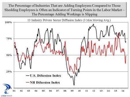
Historically, significant declines in NH’s employment diffusion index have signaled turning points in the state’s labor market. The relationship between NH’s diffusion index value and the rate of year-over-year private sector job growth four months later is strong (a correlation of .82).  A simple linear regression of the NH diffusion index on private sector employment growth suggests the last two quarters of 2016 will see private employment growth in NH of about 0.6% on an annualized basis compared to the current rate of growth of about 2.0%.  Clearly not in danger of recession but definitely a slowdown.

diffusion index and emp growth

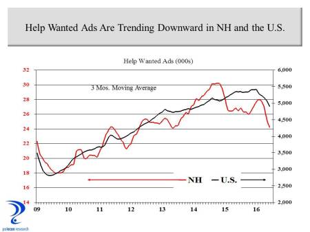
Fewer Help Wanted Ads

Nationally and in NH the number of help wanted ads has declined in recent months.  In NH the relationship between the three month moving average of help wanted ads and job growth in the quarter that follows is strong (R= .80).

NH US Help Wanted

Growth in State Corporate Income Tax Collections Has Peaked

Nationally, the rate of growth in state corporate income taxes is declining (chart below).

corporate tax revenues

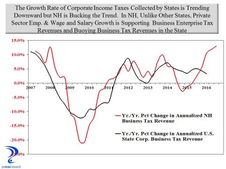
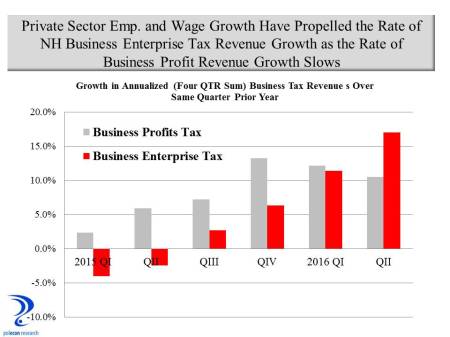
The chart shows that compared to all states combined, the growth in NH’s business tax revenues is increasing as the growth rate nationally declines.  This despite the fact that NH’s private sector employment growth has been at about the U.S. average over the past year.  What is different in NH is the inclusion of NH’s Business Enterprise Tax revenue along with NH’s tax on corporate profits in the chart above.  Both private employment and wage growth have accelerated in NH over the past year. Wages and salaries paid by a business are the largest portion of the Business Enterprise Tax base so even as business profits grow more slowly, business tax revenues can be buoyed by substantial increases in overall wages and salaries.  While not a measure of the payroll of NH businesses, wage and salary income increased in NH by 8.6 percent between QI 2015 and QI 2016 compared to 5.3 percent nationally.  That increase has helped boost Business Enterprise Tax revenue and overall business tax revenue in NH in a way that it cannot in other states (most other states would see the change in individual income tax revenue).  The trend is depicted in the chart below that shows the growth rate of the annualized business profits portion of NH’s business tax revenue has slipped while the growth rate of the portion more dependent on wages and salaries has seen accelerated growth.  A slowing growth rate in private employment in NH implies slower growth in wages and salaries and business tax revenues in the state growing more similarly to the pattern among states nationally.  This will occur just as a budget surplus and strong overall revenue growth have increased pressures for additional state spending that had been muted by several years of relatively weak business tax and overall revenue growth.

NH business tax revenue growth

It is impossible to predict monthly payroll employment growth for a small state like NH (or any state for that matter) but I predict employment growth of about 120,000 jobs nationally in July but anything between 100,000 and 150,000 would be in line with the indicators highlighted in this post and consistent with a gradual slowing of economic growth nationally and in NH. Not soon but at some point that slowing will become a recession and that will be the reward for winning the White House and for new and incumbent occupants of statehouses across the nation.

Who are the 47% and Who Did they Really Vote For?

December 6, 2012

I know a lot of people who voted for President Obama (and about as many and maybe more who voted for Mitt Romney).  None of the people who voted for the President fit the famous “47%” profile of individuals dependent on government for support.  In fact, very much the opposite was the case.  Nevertheless, the notion that a dependent population was largely responsible for the President’s re-election seems popular in some circles.  My small circle of acquaintances is not a  valid sample from which to accept or reject the dependency theory of  the election so here is one small step toward empirical verification or rejection.

I chose ten states from various regions of the country (NH,MA,NY,IN,KS,GA,FL,TX,AZ,OR), half of whom were won by President Obama and half by Mitt Romney.   I compiled a county-level dataset that includes the percentage of votes won by each candidate, the percentage of the population age 25 and older in the county that has a bachelor’s degree or higher, and the percentage of the population in the county that is white and non-Hispanic.   For my dependency measure I used the percentage of total personal income in the county that comes from government transfer payments.  The largest government transfer payments are for Social Security, Medicare and Medicaid (see chart below).  Of those, only Medicaid is for low-income individuals (and thus more closely fitting the profile of dependency) and income support payments like disability, supplemental income, food stamps and other (see chart below).

transfer payments

The ten states are not random and perhaps not a valid sample and there are many more demographic variables I could have included but this is all I could accommodate in the span of a Boston Celtics game and a couple of glasses of wine.  The ten states represent 814 counties, or about 26% of all counties in the U.S.  Using a simple regression model that analyzes the impact of the educational, race, and dependency variables on the percentage of the vote in each county received by the President, results were significant but still only explain about 25% of the variation in the percentage of the vote received by the President.  A larger percentage of income in a county  from government transfer payments is, in fact,  positively related to higher percentage of the vote for the President (although the simple correlation is small), and a higher percentage of the population that is white is negatively related to the vote received by the President (no surprise that we are a long ways from being color blind).  Its no great epiphany that users and supporters of government assistance  would be more likely to vote for a Democrat or that white voters might be less likely to vote for the President.  What is most interesting, however, is that the strongest relationship is a positive one between the percentage of persons age 25 and above in a county who have at least a bachelor’s degree, and the percentage of the vote received by the President.  Republicans may be right about not being able to win as many individuals who rely on government assistance as will Democrats but over the next few decades the percentage of the population that will be receiving the largest share of government benefits (Social Security and Medicare) is going to skyrocket and the percentage of the population that has a bachelor’s degree or higher is likely to increase as well.

I guess you can dismiss election results when they appear to be an aberration driven by the “great unwashed” who depend on government benefits, but what do you say if  the results were more influenced by the voting behavior of the most educated?

Anyone interested in the limited dataset I have, feel free to contact me.  I’d love to include all 50 states and many more demographic and economic variable but I doubt I will ever get to that.  For the truly nerdy who might want the stats from the regression models, you are welcome to those as well.

Whoever Wins, I’m Rooting for Propserity

November 6, 2012

The winners of today’s state and national elections face some daunting budgeting tasks.  Compounding those difficulties is the fact that winners will likely begin their efforts having disappointed close to 50 percent of the people who care enough about their country and state to exercise their right of franchise.  Its hard to set a course when half the oarsmen and women are are using them to poke you in the eye rather than right the ship of state.  This is not a circumstance unique to this election, but what does seem different is how many people think they still win even when their candidate loses, if the country or the state fail to prosper under the administration of the victor.    Some may have, but I never have  been better off when the economy is weak,  so whether or not my candidates win today, I’m rooting for prosperity.

In NH, today’s winner of the race for governor will confront pent-up demand for limited state resources that show no near-term signs of significant increase.   The state’s largest source of general fund revenue, the combined business profits and business enterprise taxes, has shown limited growth recently.  In the past, this source of revenue has demonstrated an ability to rise quickly and dramatically as the state’s and nation’s economies rebound, but a severe recession and changes to the state’s business loss carry forward provisions will dampen some of these effects that typically occur early in a recovery.  The chart below shows the seasonally adjusted,  annualized, business tax revenue over the past decade, along with our forecast for the next two years.  This forecast uses a statistical model (ARIMA) that makes no assumptions about changes in the strength of the economy and it indicates that, without significant changes,  business tax revenues can be expected to increases by about 5.3 percent over the next two years.  We will update the forecast as new data becomes available as well as use modeling that incorporates key assumptions about changes in state and national economic variables, but as it stands now, it appears that  little of the pent-up demand for state spending  is likely to be satisfied under the current path.

What Does the “Misery Index” Say About Election Results?

October 16, 2012

I am not a political analyst and this is not a political blog.  The polemics of political discourse are as tedious to me as the graphs I use with two Y axes are no doubt tedious to politicos. If you are prone to apoplexy or unable to view any data or information without an ideological lens, stop reading now.

Since Ronald Reagan closed a presidential debate with Jimmy Carter by asking “are you better of today than you were four years ago” that question has been a benchmark in every presidential election and with good reason because  the answer to the question is a pretty good predictor of election results.  But how do you operationally define “better off”?    The sum of the unemployment rate and the inflation rate is  referred to as the “misery index”, since a high reading on either one or both of the components would likely have a negative impact on household sentiment.  When the misery index is lower in an election year than it was in the previous presidential election, the party in power typically retains the presidency,  and when the misery index is higher, the presidency typically changes parties.  The chart below highlights the relationship.  The chart line shows the value of the “misery index” in the 3rd quarter of each year (just before the election) and each circular marker indicates a presidential election year.  The shaded markers indicate a change in control of the party in the White House.

With the exception of the 2000 election of George W.  Bush over Al Gore, when the misery index was lower in an election year than it was in the prior presidential election year, the party in power retains the White House and when the misery index is higher,  party control of the White House changes.   The chart suggests that the 2012 election should be close, but probably leans toward President Obama’s reelection.  Looking at the individual misery indices in  swing states also gives The President a slight edge.

The misery index doesn’t say much about NH’s gubernatorial election however.   The chart below shows that declines in the misery index (compared to 2 years earlier during the prior election for governor) do not appear to be associated with changes in party control of the governorship in the state.  The chart does does show that a change is more likely to occur in a year in which the gubernatorial election coincides with the presidential election.

Overall, however, the chart suggests that NH voters do not hold gubernatorial candidates responsible for weaker economic conditions nor are they likely to credit them for good economic performance.  Rather, they make their choices based on the perceived qualities of candidates.  Isn’t that refreshing?


%d bloggers like this: