Posted tagged ‘forecast’

Natural Gas Prices Can’t Rise Soon Enough

June 29, 2016

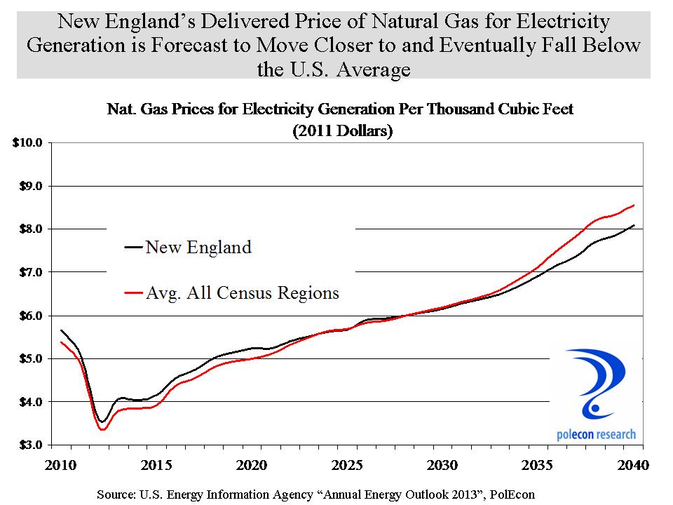
Natural gas prices have dropped sharply over the past two years and while the prospect of paying higher prices for energy is not appealing, unless prices rise soon, the prices we pay later are likely to be much higher and for much longer than currently forecast.  The chart below shows the decline in natural gas prices over the past two years.  In response,  a steady rise in production of U.S. natural gas stagnated and began declining over the past year.             1

One impact of very low energy prices is a U.S. energy industry that is in financial shambles, devastating industries that support oil and gas extraction and threatening the financial institutions that lend to energy-related industries along the way.    In the first quarter of 2016 the largest shale gas producer in the world had negative cash from operations.  Most other large producers similarly had revenues from the sale of oil and gas that didn’t cover operating costs much less capital expenditures like drilling and completion. Sympathy for energy companies isn’t expected and won’t be forthcoming but the result of consistently low energy prices is predictable, lower U.S. oil and gas production.  The longer prices for natural gas remain very low, and the smaller and financially weaker the industry gets, the less likely production will be able to ramp-up as prices rise (as they most surely will) and that means even higher prices in the future and for a longer period of time.

The Importance of Shale Gas

The U.S. is increasingly dependent on shale gas. Conventional natural gas production appears to be in terminal decline as fewer producers are drilling those wells.  Shale gas now represents more than half of all natural gas produced in the U.S. (and rising).  Production of shale gas will have to continue to increase just to compensate for the decline in the production of conventional natural gas but recently shale gas production has also begun to decline.  2

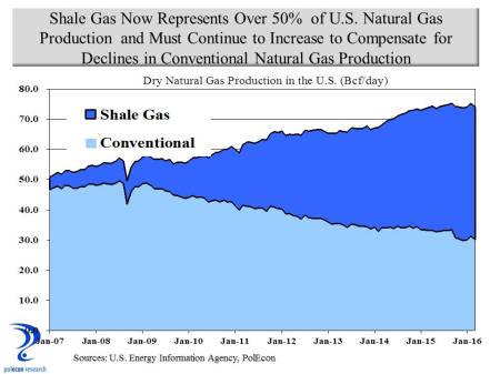
The Marcellus and Utica shale gas regions (closest to NH) are relatively new sources of shale gas (production began in the mid-2000s).  They, Marcellus in particular, are the  kings of shale gas in the U.S..  Not surprisingly they have, on average, the lowest cost-of- production of any shale gas region in the country.  As a result, production in those regions has been maximized and the percentage of U.S. shale gas that comes from the Marcellus and Utica shales is now almost 50 percent.  That percentage probably would be even higher except for pipeline capacity that limits movement of gas from the region.

3

But even in these lower cost-of-production regions the lowest cost producers have a breakeven price of about $3.50-$4.00/MMBTU (the average of all producers in the regions is higher).  Meanwhile natural gas prices in the U.S. have been below $3.00 since 2015 and below $2.00 in 2016.  The average production costs in shale regions that have been producing longer is considerably higher (from about $5.00/MMBTU to more than $6.50).  The impact of natural gas prices on the production of increasingly important shale gas is best understood by looking at the impact that prices have had on different shale gas producing regions across the country.  The chart below shows changes in production from each shale play’s peak production to May of 2016, when spot natural gas prices were at $1.92/MMBTU.  As economics would predict, the chart shows that production declines were greatest in the highest production cost regions and smallest in the lowest cost Marcellus and Utica Shale regions. On a percentage basis declines in production appear even more dramatic.  Production has declined 50 percent  in the Haynesville shale region of Louisiana and Texas since peak production occurred there in 2012.  The Barnett (Texas) and Fayetteville (Arkansas) shale regions experienced production declines of 39 and 26 percent respectively since 2012.  In contrast the lower cost Marcellus (0.4%) and Utica (2.0%) experienced minimal declines in production and only in 2016 when spot prices were under $2.00/MMBTU.

4

But here is the thing, like all gas and oil producing regions, the longer the Marcellus and Utica shales produce gas the more likely production cost will rise as increased withdrawals require production to move from core areas of the shale play to more marginal areas of production.

Prices and Costs Matter

Only in a fantasy world will U.S. production of natural gas continue to increase for decades with prices remaining near or below breakeven costs.  In the real world prices and costs matter.  I am a fan of natural gas and believe increasing availability in New England will benefit consumers and businesses but thinking that natural gas can be simultaneously cheap, abundant, and profitable defies the rules economics.

Unfortunately I think the U.S. Energy Information Agency is contributing to a fantasy by suggesting an almost unlimited supply of natural gas at low prices in their forecast of natural gas production and prices contained in the EIA’s  2016 Annual Energy Outlook (released in May).  I respect the work of the EIA and regularly rely on the data they produce but this forecast seems to lack a fundamental grounding in economics.

5

At $6.00/MMBTU (in 2015 dollars)the U.S. will have an ample supply of natural gas for decades.  At $5.00 (not reached until 2024 in the EIA forecast scenario) production is unlikely to increase by 50 percent as the EIA forecast suggest. At prices below $3.00 for long, as is the current case, production will decline significantly and supply shortfalls will require supplementing U.S. production with ever larger withdrawals from storage, increasing imports (questionable if that is possible) and/or  a reconsideration of the exporting of natural gas.  It is important to note that shortfalls in production don’t mean there won’t be enough natural gas, there is ample gas in storage to cover shortfalls for a while but prices will rise quickly as more gas is withdrawn from storage.  Rising prices should prompt increases in production but things may be different this time, depending on how soon prices rise.  The industry is smaller, financially weakened,  and unlike a few years ago capital, as well as workers who were forced to leave the industry as it shrank, may not be as readily available to ramp up production as prices rise.

As we know too well from experience, natural gas supply shortfalls have more dramatic and especially harmful impacts on New England.  New Hampshire and the rest of the country would be better off with a modest rise in natural gas prices now rather than face supply shortfalls and much higher prices in future years.

“It’s the Economy Stupid,” Unless it Isn’t: Predicting the 2016 Presidential Election

April 6, 2016

You don’t need a political pundit to tell you what your eyes, ears and presidential primary results show  – in 2016 the electorate is angry. The economy isn’t at the top of every voters mind in every election but it is close.  For decades nearly every presidential candidate from both incumbent and non-incumbent political parties has asked voters “are you better off today than you were four years ago?”  As I documented in one of the very first posts in this blog, when the majority response was “yes,” the incumbent party’s candidate was almost certain to capture the White House.  There are some troubling economic trends and vexing economic issues affecting large numbers of Americans, still, to me the apparent level of anger in the electorate today seems outsized in historical context.

By most aggregate measures the country, as well as most individual states, are better off economically today than in 2012.  The simple calculus of Arthur Okun’s “misery index” – or the combined rates of unemployment and inflation – long a shorthand metric for assessing the likely aggregate economic sentiment of the American electorate, is much lower today than it was in 2012 suggesting that, collectively at least, we should feel somewhat better off.  But the level of anger in political and public discourse has elevated during the past four years and the  old “misery index” now seems a woefully inadequate measure of  the electorate’s assessment of current economic conditions.

Adding economic variables that have a demonstrable impact on American’s perceptions of the economy to the “misery index” – such as gasoline prices, home price appreciation, and household income – only adds to the apparent disconnect between standard economic metrics and current voter sentiment.  The table below shows, on a percentage basis, how much lower is the unemployment rate (since 2012), how much real household personal income has grown (since 2013), how much real home price appreciation has occurred in the past two years, and how much lower are gasoline prices over the last year, in each of the 50 states.  In addition, the table assigns weights (subjective though they may be) to the income, home price, and gasoline price measures to develop an aggregate measure of how much better or worse off the electorate is in each state over the past several years.  (The unemployment rate is not included in the combined metric because it is already captured as a determinant of changes in real household personal income).

table Notepad copyMisery metrics aside, historical election results show that regardless of economic conditions there is a tendency for many states to vote consistently for the candidate from one political party (the Democratic candidate has not garnered even 40% of the presidential vote since 1964 in Wyoming and the Republican candidate has won a majority in Massachusetts only once in the past 60 years). In addition, there is clear evidence of ‘voter fatigue” with the incumbent party after two terms in the White House that, depending on the state, can reduce the percentage of the incumbent party’s vote total by as much as 5%.  All of this makes me question the value of economic metrics in predicting presidential elections – just not enough to overcome my left brain obsession with developing quantitative analytical models to explain all things.  I am no political pundit and this is an economics and policy blog not a political blog – this post has nothing to do with arguing for one presidential candidate or one party over another.

I examined the statistical relationship between voting patterns and key economic variables and used the relationships between non-economic variables (voter fatigue, current presidential approval ratings, etc.) found by others to estimate the percentage of the vote that both the Republican and Democratic candidate would receive in each state and to produce the electoral vote totals in the two graphics below. The model is based on the most recent economic and other data and does not take into consideration the quality or characteristics of the potential candidates – a significant shortcoming as in this election in particular, who the candidates are would seem to have a large impact.

base scenario

The first graphic (or base scenario) suggests an election that should be reasonably close but with a victory for the Democratic candidate.  The second graphic shows a much larger margin of victory for the Democratic candidate.  The only difference between the two scenarios is in the importance (statistical coefficient) of the voting trend variable.  Each state exhibits a different strength of voting trend (for one party or the other) but after the time needed to statistically determine the trend variable in several states I opted to examine an easier, cross sectional, 50 state aggregate trend variable. This is a sub-optimal solution because the trend variable has a large impact on results.

scenario 2

In the first chart the voting trend variable has a somewhat weaker impact on the vote percentages, while the second chart shows a somewhat stronger impact than I found in my cross sectional analysis.  Each chart also shows states that are most likely to switch from either a Democratic (light blue) or Republican (light red) win.

I make no claim that this analysis will bear any relationship to actual election results and this post should make clear why I should stick to policy and not politics, but it has been an interesting exercise in examining the impact of the economy on elections and I will update the charts in the coming months to see how key variables impact the predictions.

“A Chicken in Every Pot and a Car in Every Garage”

September 28, 2015

I say this with all of the sagacity of Herbert Hoover who is quoted above: New Hampshire will once again exceed the U.S.  rate of employment growth in 2015 and will have the highest growth rate in the Northeast.  It has been our state’s decade long nightmare to have sub-par job growth after becoming accustomed to superior job growth for much of the prior three decades.  After several years of playing the pessimist it is nice to be able to argue that New Hampshire will once again be a leader in economic performance. Private sector job growth has accelerated and NH is moving up in the state rankings over the past twelve months. A steep decline in energy prices is helping the state by lowering the price of fuel oil, gasoline, and natural gas, lowering some costs for businesses and increasing disposable income of households in a state and region burdened by higher energy costs. Energy producing states are feeling the brunt of price declines. A year ago North Dakota could not be displayed on the graph below without ruining the scale of the Y axis, now they, along with Alaska, Wyoming, Oklahoma and other energy producing states are the laggards. Energy isn’t the reason NH had sub-par job growth but a reduction in energy prices is helping accelerate growth in the state.

Gottlob 2015 Savings Bank of Walpole Presentation

The quality of job growth is also improving, with jobs in better paying industries increasing more than jobs in industries that tend to have fewer well-paying jobs. The troubling exception is in professional, scientific, and technical industries where there has been no job growth.

job quality

Private sector job growth is accelerating despite the fact that help-wanted ads have declined. I believe this indicates that more jobs are being filled, lowering the number of unfilled jobs, and thus help-wanted ads, even as job growth is increasing. One exception may be jobs in professional, scientific, and technical fields which comprise the largest category of help-wanted ads but where industries that employ the largest number of these occupations appear to have had no net job growth over the past year. A large number of these jobs appear to be going unfilled and indicate a technical and professional labor supply problem in the state.

help wanted

I expect New Hampshire to add about 16,000 non-farm jobs in 2016, a rate of about 2.5% annual growth. This is a rate higher than any in the past decade and comes with a few caveats. First, energy prices must remain stable and relatively low, this I think is a lock. NH faces more upside potential (things will get better) than downside risk on the energy front. Second, the pace of government job cuts has to slow or reverse. The reduction in local government employment has been a significant drag on overall employment growth in the state, subtracting about 0.5% from the state’s total non-farm job growth rate. And stop please, anyone who thinks cutting local government jobs is a reason for accelerating private sector job growth. Third and most importantly, NH’s labor force has to grow at rates above the past few years. I have recently written about the labor force being the most significant constraint on the NH economy, and largely responsible for NH’s sub-par job growth (as opposed to some fundamental erosion of the business climate). One thing is clear, labor force growth will not come from just absorbing the “slack” in NH’s labor market. The chart below shows that NH is essentially at full employment with the exception of individuals who are working part-time for economic reasons (that is they would like to work full-time but can’t get full-time employment). There will always be some level of unemployment regardless of the strength of the economy, both for frictional reasons as people change careers or jobs, as well as structural reasons as the economy and industries change and the demand for different skills and occupations shifts. There are now  more people working part-time for economic reasons in NH than there are unemployed individuals. Three quarters of part-time workers in NH work part-time by choice according to my analysis of Bureau of Labor Statistics Current Population Survey data. The remaining 25 thousand or so part-timers wanting full-time work shows an equal number of men and women, spread fairly evenly over the age distribution between 22 and 64. More than one-third have at least an associate’s degree and 24% a bachelor’s degree. This source of labor can be more fully utilized boosting overall output but they are already working and don’t expand the size of the labor force. Discouraged workers number less than 1,500 with about that number again who are conditionally discouraged but would enter the workforce for the right job. They are predominately male (80%) and older (75% age 45+) and overall have lower levels of educational attainment (although a percentage of college grads is included).

unemployement rate

Hope for expanding the labor force in NH comes mostly from a return to net in-migration from other states. NH’s primary source of for increasing the skill and talent of its labor force for three decades, this source became a net negative factor in recent years. Data on this comes with a long lag but some unofficial, non-government statistics suggest that in-migration is returning and accelerating in some parts of the state, supplying an influx of talent and additional labor that will contribute to expanding differential rates of growth in the state. Areas of the state that have seen labor force growth in recent years have been adding jobs at a much faster rate than the remainder of the state and is one reason why I advocate giving as much attention to making a community, region, or state “attractive to individuals and families”  as making them attractive to business. The Seacoast will continue to lead in job growth because of the region’s ability to attract “talent” and expand its labor force. Job growth in the Manchester region is picking up and I expect a stronger performance for that region in 2016, while the Nashua region will continue to lag.

labor forcde growth

“Honest Brokers” and Revenue Estimates

May 14, 2013

Unlike the federal government, states can’t easily budget and spend more money than they take in revenue so revenue estimates play a much more important role in state budgeting than they do  in federal budgeting.  I don’t know how anyone can accurately forecast revenues when the revenue yields are based on negotiations, lawsuits or other non-economic variables but that seems to be the basis  of much of the disagreement among budget writers in New Hampshire. When a comparatively large percentage (compared to many other states) of your revenues are derived from a “Medicaid enhancement tax”  and “tobacco settlement”  money budget writing can become even more politicized than usual.

I don’t pretend to know what these non-traditional sources of revenue will yield in the coming years but I get a sense that those who do are fitting their forecasts to their meet their budgetary goals.  I  don’t think revenue forecasting is that difficult as long it is based on real economic data and trends and it minimizes the use of assumptions about changes in the performance of the economy.   I make forecasts with assumptions all the time but  minimizing their use  in revenue forecasts will mean that even if the forecast is wrong, it won’t appear as though the error resulted from a desire to “coax” a specific result from the forecast.   In January I presented my outlook to the NH House Committee on Ways Means.  At that time I said I thought revenue growth from major, “own-source” revenues would average about 2% each year of the biennium and that businesses tax revenue growth would be a bit higher, but with even modest economic improvement could average 5-6% annual growth.  Now, several months later, based on recent revenue performance, and making  no assumptions about significant changes in economic conditions, I see growth at about 3% in FY 2014 from the eight largest sources of general revenue, and just under 5% in 2015.  Those numbers don’t count the “non-traditional” revenue sources but I think they are important in reflecting the fundamental underlying growth in the state’s economy and a better assessment of  general revenue trends.

NH General revenue forecast

Clearing out some old boxes from my attic  I came across a number of old college tests and papers.  One was from a graduate school class on public finance where I argued that all federal budgeting and budgeting  debates should proceed from a common economic and revenue forecast.  I also found one from an undergraduate class on the philosophy of Marxism in which I wrote phrases like “man should never be a means to end but only an end in himself ” so clearly I was prone to a lot of bad and muddled thinking back then.  In the 1990’s I wrote a column in a publication arguing for a non-partisan revenue estimating committee in NH.  That was a pretty good idea  and it did happen – although my prompt had nothing to do with it –  and it was enacted largely absent the “non-partisan” aspect (or at least “unbiased”).  I still think a true, non-partisan, representative revenue estimating panel would be a good thing for NH, not to bind any actions but simply to serve as a baseline scenario that any policymakers who wishes to deviate from would have to offer solid reasons for doing so.  Some group in the budget debate has to serve as the “honest broker”  but the honest broker role won’t happen if the group is loved too much by some or hated too passionately by others.   The current estimating panel has some of the best and most qualified people I know to do revenue estimating .  It just doesn’t have the  credibility among many policymakers that it could have  if  no one loved or hated it too much, but instead almost everyone complained a little (or a lot) about  it.  It is too bad because we are still going to need an “honest broker” when the NH House and Senate begin negotiations on the next budget.

The Outlook for Natural Gas Prices in New England

May 3, 2013

There is a lot of discussion, debate, advocacy and lobbying about whether New England’s energy future is becoming more vulnerable because of the region’s increasing reliance on natural gas for electricity generation.   Some see the prospect of rising natural gas prices (because of increasing demand in the region and nationally) as a vulnerability and others are concerned about constraints on the pipelines that bring natural gas into the region.  I’ve posted a lot about natural gas and electricity related issues and as I have previously stated my belief that regional increases in demand along with greater U.S. production of natural gas are more likely than not to create scenarios that will increase the capacity of the regional pipeline infrastructure. New England has traditionally been a region with a relatively low percentage of its energy consumption in the form of natural gas.  That is changing rapidly, but increases in U.S. production of natural gas along with demand driven incentives to increase infrastructure capacity in the region should reduce a lot of the volatility of natural gas prices in New England.

Apparently there are other folks who feel similarly.  The U.S. Energy Information Agency (EIA) released its “Annual Energy Outlook” last month and it has a wealth of historical data, forecasts and projections.   Their forecast of natural gas prices across the country are based on many economic, energy demand, production and other variables.  They also produce a range of forecasts based on different assumptions about economic growth , energy demand and prices.  The good news is that their baseline forecast for natural gas prices in New England (chart below) shows that  prices in the region, which are traditionally higher than in most other regions of the country, are expected to align with the national average early in the next decade, and then move lower than the national average over time.  Even better news is that this forecast is not dependent on a much weaker economy in New England than in the rest of the country (which would imply lower increases in energy demand in the region compared to the rest of the country).  I don’t think EIA would be forecasting lower relative prices in New England if they did not see  region’s pipeline infrastructure issue as being addressed.
NE Nat Gas Price vs US Forecast
The EIA also projects that the price of natural gas relative to coal will continue to increase.  Coal will probably almost always be a cheaper fuel than natural gas but today’s typical “combined-cycle” natural gas generating facilities are much more efficient than coal-fired plants.  When the ratio of natural gas prices to coal prices is approximately 1.5 or lower, a typical natural gas-fired combined-cycle plant has lower generating costs than a typical coal-fired plant.   Natural gas-fired electricity generators enjoyed a strong competitive advantage over coal plants in 2012 but natural gas plants will begin to lose competitive advantage over time, as natural gas prices increase relative to coal prices.    The retirement of older coal-fired generating plants, however, will mean that coal continues to generate a smaller percentage of the region’s and the nation’s electricity.

Some see New England’s increased use of natural gas as a concern.  There are issues that need to be addressed but none that are insurmountable or that should have the region reconsider its increasing reliance on natural gas.  Long-range energy price forecasts are notoriously difficult but New England’s energy needs and interests are finally becoming more aligned with the rest of the nation.  For too long New England has been an anomaly as the most oil-dependent and least natural gas-dependent region in the country.  Personally, I would rather have 300 million people concerned about my energy needs than just 15 million.

Natural Gas Price Outlook Improves Again This Year

December 7, 2012

The U.S. Energy Information Agency issued an early release version of its 2013 Annual Energy Outlook and the increase in U.S. energy production and the production outlook over recent years continue to keep forecasts of price increases modest.  That is especially true for natural gas where long-term price forecasts have fallen by 15% to 30% in just the past three years (chart below).

Nat Gas Forecast

Of course all sorts of national and international events can interrupt these trends, but the  price forecast along with the expectation of a continued, long-term, price differential between oil and natural gas should  result in continued  fuel switching by electricity generators, and an increase in switching by end users as well.  Natural gas is already the majority source for home heating everywhere in the country except the Northeast, but opportunities for fuel switching in the  transportation sector are enormous.  Unfortunately, with a gasoline station located about every quarter mile, and large industries supporting them, the prospect of consumers being able to fuel their autos at home using the existing natural gas infrastructure and a relatively small investment in equipment for their home doesn’t have the same appeal to everyone as the economic, environmental and consumer  rationale of switching  implies.

Fuell Price Forecast


%d bloggers like this: