A Pyrrhic Victory for Pipeline Opponents

Posted June 2, 2016 by Brian Gottlob
Categories: Energy, Natural Gas, NH Economy, Uncategorized

Tags: , ,

Another energy project has been scuttled that could have provided some relief to New Hampshire and New England households and businesses who are paying among the highest prices for energy of any state in the nation. I believe the project would also have contributed to the important goal of reducing carbon emissions in NH and New England (more about my support for reducing carbon emissions and some controversial policies to accomplish that in a future post).  No doubt any proposed energy project is better when forged and tempered through a process of public review and debate.  But the withdrawal of proposed wind energy projects, and more recently the Northeast Energy Direct (NED) natural gas pipeline project, as well as the difficulties encountered by some solar projects in the state, question how committed many residents and some policymakers in NH are to finding solutions to an energy climate that is widely recognized as detrimental to households, businesses, and the NH economy.  As opponents of  pipeline, wind, and solar projects claim another “victory” in NH, an admonition given to Pyrrhus, a Greek general and ruler of Epirus comes to mind.  After a costly victory over his Roman enemies by Pyrrhus, the Greek philosopher Plutarch reportedly told Pyrrhus that another, similar “victory” would ruin him.  If the “ruin” that could occur only affected the combatants in NH’s  energy infrastructure battles, instead of the 1.4 million non-combatant “energy civilians” in the state, Plutarch’s warning might be useful.  But there are no “generals” and no real leaders or statesmen and stateswomen battling NH’s energy constraints and so the casualties of our state’s inability to take control and direct its energy future will be most broadly spread across the state’s population.

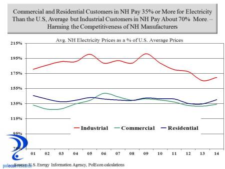
This post highlights some of my calculations of the costs to NH of the defeat (or victory as opponents would argue) over the Northeast Energy Direct natural gas pipeline proposal.  To begin, let’s reiterate the cost disadvantages faced by consumers of electricity in NH.  The chart below shows that through 2014, residential and commercial electricity customers paid, on average, about 35 percent higher rates than the national average, while industrial customers paid a whopping 70 percent higher rates than the national average.

energy prices

The NED Project’s Impact on Natural Gas and Electricity Prices

Natural gas prices have been lower in recent years as a result of increased U.S. production, largely from the Marcellus and Utica shale formations in  Ohio and Pennsylvania.  But as I noted in this post, a lack of pipeline capacity precludes NH and New England from realizing the full benefits from declining natural gas prices.  The increased supply of natural gas from nearby sources enabled by the Northeast Energy Direct project would impact natural gas prices in NH and New England.  Price reductions would result in direct savings to residential, commercial, and industrial consumers of natural gas and would also result in electricity prices that are lower in NH than without the Northeast Energy Direct project. New England’s wholesale power prices are closely related to natural gas prices because of the region’s dependence on gas-fired power generation capacity. By reducing spot prices for natural gas in New England, the NED Project will have a direct impact on New England’s wholesale power prices.

At least eight separate studies have forecast lower natural gas prices in New England resulting from an increase in pipeline capacity into the region.  Even one study from the Massachusetts Attorney General’s Office, while suggesting an increase in pipeline capacity to New England isn’t needed to assure reliability of electricity supplies in the region (inaccurately I believe and contrary to reports by others, including the operator of the New England Energy grid), recognizes that increased pipeline capacity would result in lower regional natural gas prices.

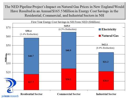
 There is a range of estimates of the price impacts from an increase in natural gas supply to the region. My estimates of energy cost savings in NH use one of the more conservative estimates of the price impacts of increased supplies to the region as documented in a study  by ICF International. I used historical data on both natural gas and electricity consumption by sector (residential, commercial, industrial)  in NH from the U.S. Energy Information Agency (EIA) as well as forecasts of future consumption based on the EIA’s regional forecast for growth in natural gas and electricity consumption and applied ICF natural gas and electricity price reduction estimates to consumption forecasts in NH to estimate savings to customers in the state that would result from the operation of the NED pipeline.  In the initial full-year of pipeline operation I estimated the savings to natural gas and electricity consumers in NH to be $165.5 million.  The breakdown of saving by source and sector is presented below.  Savings represent about 3.4 % of the 2014 energy expenditures of NH residential consumers, 6.5% of commercial sector energy expenditures, and 8.9% of the energy expenditures of industrial consumers.

savings by sector

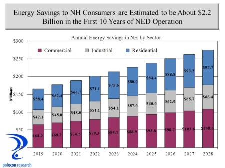
 Using the same sources and methods, I estimate the 10 year energy cost savings to NH natural gas and electricity consumers  would be just under  $2.2 billion in nominal dollars as a result of the Northeast Energy Direct project.

10 years savings

Additional Benefits of Increased Regional Access to Natural Gas

There are other potential benefits from NED that have been less talked about.  Much of NH has limited or no access to pipeline natural gas from local distribution companies.  The lack of access to natural gas increases energy costs for households and businesses in many regions the state.  In particular, lack of access increases the economic disadvantages currently faced by most rural regions in the state.   Natural gas is most available in the populated regions of Southern NH closest to regional pipelines and the lateral pipelines operated by local utilities who purchase natural gas from the regional pipeline operators.  The proposed NED pipeline would have passed through a portion of the state where the economy has lagged for some time and regions that could most benefit from access to pipeline natural gas.  The NED would increase capacity but local utilities would have to add lateral pipelines to serve communities, households and business in places like Keene, Claremont, Cheshire, Sullivan and Grafton Counties.

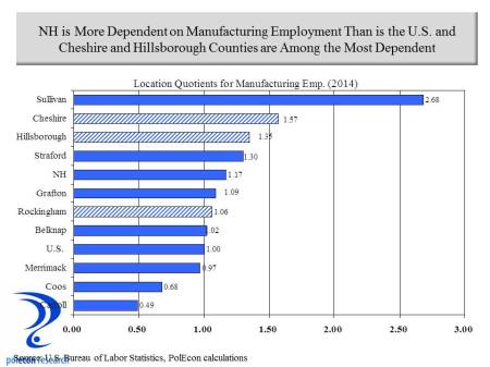
Along with extremely high electricity prices for industrial consumers relative to the U.S. average, the lack of access to natural gas is a significant disincentive to operating a manufacturing facility in much of New Hampshire, as nationally, natural gas accounts for 40 percent of the purchased energy of manufacturers on a BTU basis.  There is anecdotal evidence that manufacturers nationally are starting to react to lower natural gas prices by planning to open new facilities in the United States. There are other influential factors, including rising employment costs overseas, but those industries for which natural gas is an important input are anticipating an advantage of locating their operations in the U.S..  Cheshire and Sullivan Counties are among the most manufacturing dependent regions in the state and access to utility natural gas would especially benefit communities in those regions.  The chart below presents location quotients which represent the concentration of manufacturing employment in each NH county relative to the concentration of manufacturing employment in the U.S. overall. A location quotient of 1.00 indicates a region where the concentration of manufacturing employment is identical to the concentration of manufacturing in the the U.S. economy overall.  Location quotients above about 1.20 suggest counties where manufacturing is especially important to the regional economy.  Shaded bars represent counties through which the NED project would pass. The NED would not pass through Sullivan County but its proximity would make lateral access to gas from the pipeline feasible.

manufacturing LQ

Increased natural gas supplies and lower prices will be especially helpful to smaller manufacturing firms which face higher prices in New England but also face larger natural gas price differentials relative to larger manufacturers than anywhere in the country.  High prices and larger price differentials create a strong disincentive for new and emerging manufacturing firms to operate in New Hampshire and may be contributing to an “aging” in the manufacturing sector in the state.

gas prices to manufactures

Access to natural gas would also benefit households. Just under 20 percent of households in New Hampshire use pipeline natural gas for heating and another 13 percent use bottled gas but there are large regional variations in the availability of natural gas for heating.  Again, regions of the state that are considered economically disadvantaged, in most cases, have the least access to pipeline natural gas.  Access to pipeline gas won’t guarantee a reduction in disparities in the economic performance of various regions of NH but it would help households and manufacturers in regions where the economic performance has lagged.

home heating in NH by source

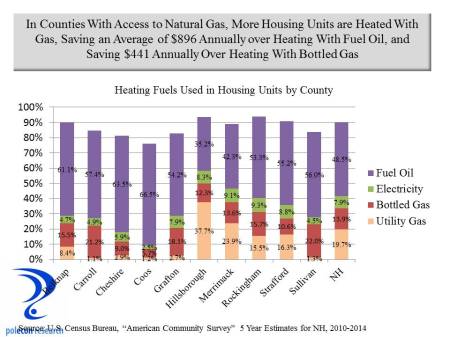
The savings for households heating with pipeline natural gas is substantial. The table below shows the average cost differential in annual heating costs between housing units heated with pipeline natural gas and other sources.  The difference between pipeline natural gas heating and fuel oil – the largest source of home heating fuel in NH – averaged over $890 annually between 2010 and 2014. By lowering natural gas prices the differential between homes heated with natural gas and other sources (other than solar) are likely to widen.  The NED would  increase opportunities for more communities, regions and more homes to be heated with natural gas in New Hampshire, amplifying the potential savings estimated here for NH households and the NH economy associated with lower natural gas prices.

Table copy

Factoring the impacts of the NED project on natural gas prices and disposable income for  residential consumers (and not including the impacts on commercial and industrial consumers)  I estimate that an additional 5,300 jobs would have been created in the first 10 years in response to the energy cost savings to households from the NED project.  When the impacts on industrial and commercial consumers are considered the potential benefits of the project become even clearer.

Disclosure

I originally prepared more detailed estimates (than in this post) in a report I did for the proposed NED project.  I write this blog (when I have time) because I enjoy researching and writing about topics that interest me, not to advance client interests. I think the report contained some good analyses and now that the NED proposal has been withdrawn and the company is no longer a client, I don’t feel conflicted writing about it here.  The success or failure of the NED project had no impact on the compensation I received. The report addresses energy issues in NH that I have been writing about since long before my work for the NED project. It examines the usual economic impacts from the construction phase of the project but more importantly potential longer-term impacts of the project.  The report also examines controversial topics such as potential impacts on tourism activities as well as fiscal impacts of the project.  The report can be viewed here. Because the report was paid for by the NED project owners, critics will dismiss some or all of the findings.  But a report that is paid for only means that its author(s) has some “skin in the game.” In a small state, and especially in NH, anyone who produces work that distorts findings or misleads policymakers won’t be offering services of  value and won’t be working in the state for long.  On the other hand, anyone without “skin in the game” or some compensated interest is pretty much free to make any claim without evidence, present any data, or any “analysis” regardless of its accuracy, without concern for the impact that it has on their business or professional reputation. I am not arguing that any information brought to policy debates that isn’t paid for has no value or is necessarily inaccurate or misleading, just that information that is not paid for by some interests is not is inherently or by definition more accurate or relevant than work that is paid for – there should be no “halo effect” for information entered into important policy debates simply on the basis of whether or not compensation was involved – compensated or not, information entered into the debate is provided by a party with a particular interest in the issue.  The quality and accuracy of the analysis should determine its merits.  I like to think that the ultimate test of the quality of an analysis is whether those who produced it will be around and willing to answer for its accuracy or inaccuracy when the time comes when that can be determined.  I don’t think my analyses (or forecasts) are wrong that often but when they are I am available to answer to policymakers and others for it.  I don’t think I would have had to answer for my my analysis of the impacts of the NED.

A Perfect Labor Force Storm

Posted May 24, 2016 by Brian Gottlob
Categories: Demographics, Labor Force, New Hampshire, Uncategorized, Workforce

Tags: , ,

A perfect storm is brewing for the economy and individual businesses in NH and across the country.  Slow labor force growth, the retirement of baby boomers, and weak growth in labor productivity are severely limiting the productive capacity of the nation’s economy.  Between 2010 to 2015 labor productivity in the U.S. increased by just 0.5 percent on average annually, and the labor force by an average of just 0.4 percent.  Since the end of World War II, the combined, labor productivity and labor force growth in the U.S. had never fallen below 1 percent – until 2015 when it was just 0.9 percent. I have written about the the limits labor force growth place on the U.S. and NH economies here and here (and others).  Factors such as the flow of population (state-to-state migration and  international migration), and changes in labor force participation rates will play a large role in determining which states and regions are most affected, but a real possibility exists that the economies of some  states and regions could shrink over time.

Figure 1

A quick assessment of the potential impact of baby boom retirements across the country is illustrated in Figure 1 which shows the ratio of the population in each state that will (or could) be entering the labor force approximately over the next decade – that is individuals currently ages 5-19 –  to those who will (or could) be exiting the labor force – individuals currently ages 50 to 64.   The bars in the graphic that fall below zero indicate states that face more retirements from their labor force than new entrants over the next decade or more.  As the chart shows, the labor force in New England and much of the Northeast will be especially challenged by baby boom retirements as far more individuals will leave than enter the workforce.

In NH, the impact of baby boom retirements will vary greatly by industry.  The Millennial generation will soon be the largest segment of the labor force but their distribution across industries varies greatly.  For this analysis I examined the demographic characteristics of each industry’s workforce in NH.  Figure 2 presents the ratio of early career (age 25-34) to older workers (age 55-64) in major industry groupings in NH.  The graph suggests industries that will be more and less challenged by retirements of the baby boom generation.  Industries that have higher ratios employ more individuals early in their working lives than individuals nearing retirement age.  Several industries stand out for the high percentage of older individuals in their workforce.  Manufacturing is one industry that has had difficulty attracting younger workers and I have written about that issue long ago in this blog, Educational services is another.  Professional, scientific, and technical industries have a surprisingly low percentage of younger workers but an examination of this industry grouping at a more detailed level shows that the legal profession has among the oldest demographics of any industry in the state.

Figure 2

Looking at the age composition of workers in broad occupational groups in NH (Figure 3)  shows how much difference there is across different occupations employed in professional, scientific, and technical industries. The ratio of younger to older workers in the legal profession is just 46 percent, while in computer and mathematical occupations there are many more younger workers and the ratio is 127 percent.

Figure 3

Health care is also a field with a larger percentage of older individuals in the workforce but when the demographics are examined at a more detailed industry level or by specific occupations, it is clear that the industry is bifurcated – with physicians and other health care practitioners having an older demographic while many of the support occupations in the industry that have emerged as health care has become a much larger portion of the economy, have a much younger demographic.

Industry Growth is as Important as Industry Demographics

 The retirement of baby boomers only hints at the industries that could face the most significant labor shortages over the next decade.  Retiring workers may need to be replaced but they may not.  If employment in an industry shrinks or if it grows slowly over the next decade, then labor shortages are likely to be less severe than baby boomer retirements would suggest, even in industries with a higher percentage or older and retiring workers.

 To capture the impact of industry trends on potential labor shortages related to baby boom retirements I combined projected industry growth in NH over the next decade with the ratio of younger to older workers in each industry to produce a supply/demand balance metric.  For illustrative purposes I present the supply/demand calculations for broad industry groupings in Figure 4.  I did the same calculations at a more detailed (50+ industry) level but that level of detail is not amenable to presentation in a single graphic.  It is not possible to know what industries workers entering the labor force over the next decade will work in so these calculations are only rough estimates of potential supply/demand imbalances. As the chart shows,  industries with a relatively older workforce, such as manufacturing, public administration, and utilities, will nevertheless likely confront fewer labor shortages because of slower employment growth in those industries.  Unfortunately, all industries are likely to face shortages in some occupations that are employed and in demand across many industries.

Figure 4

What Can States and Business Do?

The primary shortcoming of Figure 1 is that it is a static representation of the demographics each state’s workforce.  The population and demographic composition of states are not static however.  People move from place-to-place, state-to-state, county-to-county, and country-to- country.  A state or region with substantial labor shortages that is also viewed as an attractive location can see increases in labor supply in response to labor shortages and wages that are rising in response to shortages.   For more than two decades attracting skilled individuals with higher levels of educational attainment has been a key to NH’s economic success, since the mid 2000s however, NH has seen fewer individuals moving into the state from other states.

A popular meme in NH (and in many rural states) is that the state’s labor force challenges are largely the result of young people leaving the state.  But that is a phenomenon that has been occurring for decades in NH as it has in other rural states.   While it plays some role in the state’s labor force challenges, it has not been a key factor contributing to or detracting from NH’s economic performance – either NH’s strong successes of the 1980s and 1990s  or its subpar job growth of recent years. I wrote about who is moving to NH here, the chart below adds who (from an age perspective) left NH during the same recent 5 year time period.

Figure 5

I am not arguing that we ignore the issue of out-migration of youth, but a state budget in surplus along with the “migrating youth” meme is likely to produce proposals for labor supply policies that are likely to be as costly as they are ineffective.  In future posts I will examine the costs and benefits of several labor supply policies directed at increasing the percentage of young people in NH as well as the percentage attending college and remaining in NH after graduation.   NH is not monolithic, some communities and regions have been attracting younger workers and the age structure of their labor forces has not been increasing as rapidly as NH overall.  If policymakers want to attempt to change decades of youth migration trends then these communities are instructive of the types of actions that may or may not help NH capture higher numbers of workers early in their working lives.

Still, migration along with changes in the labor force participation rate among different demographic groups are going to be the primary determinants of the magnitude of NH’s labor force growth in the coming decades. As Figure 6 below shows, net migration from other states (the # moving in versus the # moving out) has been negative in recent years. That is largely the result of a slowdown in people moving to NH rather than a substantial increase in those leaving the state. The chart also shows that net international migration has offset much of the recent loss from state-to-state migration.

Figure 6

International migration of foreign workers into NH has played a critical role in meeting the demand for many occupations in NH.  Overall just under 8 percent of the labor force in NH is foreign born but in some occupations such as computer and mathematical occupations and life and physical sciences occupations, the percentage of foreign born workers in the NH labor force is over 20 percent (Figure 7).

Figure 7

The projections of labor supply/demand imbalances in this post don’t account for  potential increases in domestic or foreign migration but each of these will  play an important role in meeting the demand for labor in the Granite State.  Businesses have little control over net migration to NH so what can businesses do in the face of impeding labor shortages?  Here are some possible strategies to help businesses  meet their labor needs in an era of slow labor force growth:

  • Increase Wages and Pass Costs on to Consumers
  • Expand Automation and Increase Productivity
  • Move to Areas with More Labor
  • Increase Teleworking to Expand Potential Labor Pool
  • Tap the Untapped Labor Pools
  • Provide Incentives to Delay Retirement
  • Rely More on Contingent Workers
  • Recruit (and Train) Discouraged Workers.

These strategies are not available to all businesses or all industries.  Of all, I like providing incentives to delay retirement the best – it is the “revenge of the baby boomers”. More occupations today are less physically demanding and older citizens are healthier than any time in our nation’s history.  Combined, this should allow individuals to work (if they so chose) well beyond traditional retirement years.  For a long while now younger workers have been all the rage.  It is fitting that baby boomers who entered the workforce in numbers large enough to depress wages, and who have seen workplace cultures that increasingly look to appeal to the youngest workers, could see increasing demand for their services at the end of their working lives.


“It’s the Economy Stupid,” Unless it Isn’t: Predicting the 2016 Presidential Election

Posted April 6, 2016 by Brian Gottlob
Categories: Economy, Election, prediction, presidential, presidential election

Tags: , , , ,

You don’t need a political pundit to tell you what your eyes, ears and presidential primary results show  – in 2016 the electorate is angry. The economy isn’t at the top of every voters mind in every election but it is close.  For decades nearly every presidential candidate from both incumbent and non-incumbent political parties has asked voters “are you better off today than you were four years ago?”  As I documented in one of the very first posts in this blog, when the majority response was “yes,” the incumbent party’s candidate was almost certain to capture the White House.  There are some troubling economic trends and vexing economic issues affecting large numbers of Americans, still, to me the apparent level of anger in the electorate today seems outsized in historical context.

By most aggregate measures the country, as well as most individual states, are better off economically today than in 2012.  The simple calculus of Arthur Okun’s “misery index” – or the combined rates of unemployment and inflation – long a shorthand metric for assessing the likely aggregate economic sentiment of the American electorate, is much lower today than it was in 2012 suggesting that, collectively at least, we should feel somewhat better off.  But the level of anger in political and public discourse has elevated during the past four years and the  old “misery index” now seems a woefully inadequate measure of  the electorate’s assessment of current economic conditions.

Adding economic variables that have a demonstrable impact on American’s perceptions of the economy to the “misery index” – such as gasoline prices, home price appreciation, and household income – only adds to the apparent disconnect between standard economic metrics and current voter sentiment.  The table below shows, on a percentage basis, how much lower is the unemployment rate (since 2012), how much real household personal income has grown (since 2013), how much real home price appreciation has occurred in the past two years, and how much lower are gasoline prices over the last year, in each of the 50 states.  In addition, the table assigns weights (subjective though they may be) to the income, home price, and gasoline price measures to develop an aggregate measure of how much better or worse off the electorate is in each state over the past several years.  (The unemployment rate is not included in the combined metric because it is already captured as a determinant of changes in real household personal income).

table Notepad copyMisery metrics aside, historical election results show that regardless of economic conditions there is a tendency for many states to vote consistently for the candidate from one political party (the Democratic candidate has not garnered even 40% of the presidential vote since 1964 in Wyoming and the Republican candidate has won a majority in Massachusetts only once in the past 60 years). In addition, there is clear evidence of ‘voter fatigue” with the incumbent party after two terms in the White House that, depending on the state, can reduce the percentage of the incumbent party’s vote total by as much as 5%.  All of this makes me question the value of economic metrics in predicting presidential elections – just not enough to overcome my left brain obsession with developing quantitative analytical models to explain all things.  I am no political pundit and this is an economics and policy blog not a political blog – this post has nothing to do with arguing for one presidential candidate or one party over another.

I examined the statistical relationship between voting patterns and key economic variables and used the relationships between non-economic variables (voter fatigue, current presidential approval ratings, etc.) found by others to estimate the percentage of the vote that both the Republican and Democratic candidate would receive in each state and to produce the electoral vote totals in the two graphics below. The model is based on the most recent economic and other data and does not take into consideration the quality or characteristics of the potential candidates – a significant shortcoming as in this election in particular, who the candidates are would seem to have a large impact.

base scenario

The first graphic (or base scenario) suggests an election that should be reasonably close but with a victory for the Democratic candidate.  The second graphic shows a much larger margin of victory for the Democratic candidate.  The only difference between the two scenarios is in the importance (statistical coefficient) of the voting trend variable.  Each state exhibits a different strength of voting trend (for one party or the other) but after the time needed to statistically determine the trend variable in several states I opted to examine an easier, cross sectional, 50 state aggregate trend variable. This is a sub-optimal solution because the trend variable has a large impact on results.

scenario 2

In the first chart the voting trend variable has a somewhat weaker impact on the vote percentages, while the second chart shows a somewhat stronger impact than I found in my cross sectional analysis.  Each chart also shows states that are most likely to switch from either a Democratic (light blue) or Republican (light red) win.

I make no claim that this analysis will bear any relationship to actual election results and this post should make clear why I should stick to policy and not politics, but it has been an interesting exercise in examining the impact of the economy on elections and I will update the charts in the coming months to see how key variables impact the predictions.

“Too Big to Fail” or “Too Small to Succeed”?

Posted March 21, 2016 by Brian Gottlob
Categories: Banks, Financial, regulation, Small Business, Uncategorized

Tags: , , , ,

Community banks’ share of the U.S. banking market has declined significantly over the past two decades but since 2010, around the time the Dodd-Frank Wall Street Reform and Consumer Protection Act was passed, community banks’ share of all U.S. banking assets has shrunk at a much faster rate.  Dodd-Frank may be offering consumers greater protections (data on that issue is not readily available and is less straightforward in any case), but the data clearly show that legislation designed to prevent another “too big to fail” financial crisis is also accelerating the declining market share of community banks, contributing to consolidation in the banking industry, and perhaps helping to create more “too big to fail” institutions.  The chart below shows how the volume of assets and loans have changed since the passage of Dodd-Frank for community banks (defined here as those with less than $1 billion in assets), banks with $1 to $10 billion in assets (some researchers consider these banks to be community banks), as well as banks with over $10 billion in assets.

assets and loans

Other than bankers and their regulators, nobody really cares about the market shares of different sized banks, but the out-sized role community banks play in lending to small businesses and the critical role community banks play in smaller communities and rural regions of the country make it an important economic issue for a large slice of the U.S. economy.  In almost one-third of the nation’s counties the only depository institutions located in the county are community banks according to a study by the U.S. General Accountability Office (GAO).  Small businesses also depend disproportionately on community banks.   The chart below shows that despite holding only 14 percent of all loans in the banking industry in 2006, community banks held 42 percent of all small business loans across the country.  The chart also shows how the rate of decline in the share of all loans held by community banks, as well as small business loans, have accelerated since 2010.

community bank shares

More troubling than the loss of market share by community banks (after all, does it matter as long as lending to small businesses increases?) is the sharp absolute decline in small business lending by community banks since the passage of Dodd-Frank.  I think it matters a lot that community banks’ share of lending is declining because of the traditional role of relationship banking and the willingness to consider “soft information” has played in community bank lending decisions and the implications for access to credit by small businesses.  As the chart below shows, as recently as 2006, community banks were the largest source of small business lending by the banking industry.  Since 2010, however, small business loans at community banks have fallen sharply.


small business loans

Some of this is the result of consolidation, smaller community banks being acquired by larger, non-community banks. But even that is influenced by Dodd-Frank.  Any regulatory requirement is likely to be disproportionately costly for community banks, since the fixed costs associated with compliance must be spread over a smaller base of assets.  As the GAO reports, regulators, industry participants, and Federal Reserve studies all find that consolidation is likely driven by regulatory economies of scale – larger banks are better suited to handle heightened regulatory burdens than are smaller banks, causing the average costs of community banks to be higher.

The implications for small businesses and for the economies of smaller and more rural communities are clear. As regulations require more standardized lending and reflect bigger bank processes and practices, community bank lending will be constrained and because they are a major source of small businesses loans and major source of local lending in most rural areas, small business and the economies of smaller, more rural communities will be disadvantaged.  Automobile, mortgage, and credit card loans have become increasingly standardized and data driven.  These loans are increasingly made without any personal interactions, via the internet and by less regulated institutions, or by larger banking institutions with the infrastructure to make exclusively data driven lending decisions.  Business loans are different.  Community banks have had to focus to a greater extent on small business and commercial real estate lending – products where community banks’ advantages in forming relationships with local borrowers are still important – as more types of loans have become increasingly standardized.  Community banks generally are relationship banks; their competitive advantage is a knowledge and history of their customers and a willingness to be flexible.  Community banks leverage interpersonal relationships in lieu of financial statements and data-driven models in making lending decisions, allowing them to better able to serve small businesses.  Regulatory initiatives such as Dodd-Frank are more reflective of bigger bank lending processes which are transactional, quantitative and dependent on standardization.   Understanding the financials of a business, its prospects, the local community in which it operates, or the prospects for its industry, are hard to standardize.  Community banks ability to gather “soft information” allows them to lend to borrowers that might not be able to get loans from larger institutions that lend with more standardized lending criteria.  The less “soft information” is incorporated into lending decisions, and the more costly become the regulatory requirements on banks, the more community banks will diminish and with it an important asset for small business, and small communities across the country.  It is possible that someday small business lending can be more standardized, less interpersonal, in a way similar to credit card or auto loans and in a way that does not disadvantage small businesses, but I am skeptical.

The debates surrounding financial services regulation since the “great recession” have focused on the safety and soundness of the financial system and on consumer protections, both important objectives, and to be fair, the banking industry too often  appears only self-interested in regulatory debates.  But far too little consideration has been  given to the impact of new financial services regulations on small business, communities, and rural regions of the country.

Authors Note:  I have done some studies for the banking industry in the past.  This post is not an effort to shill for their interests.  This blog is about timely topics that interest me and a place where I can write about them free of any compensated interests.  It is an outlet for my analytical interests and opinions.   I do confess, however, an affinity for community banks and the people who run them because of the strong commitment that they demonstrate to the people, businesses, and communities in which they operate.    


How Much of a Benefit is Low Oil Prices?

Posted March 7, 2016 by Brian Gottlob
Categories: consumers, Energy, NH Economy, Oil, U,S, Economy

Tags: , , ,

Low oil prices have provided an economic windfall to households in New Hampshire and across the nation. Based on actual 2014 energy consumption and expenditure data for NH, changes in 2015 energy prices, and forecasts of 2015 energy consumption (actual data won’t be released for another year), I estimate that businesses and households saved about $1 billion in 2015 as a result of lower oil prices (Figure 1).

NH savings

Households saved over $800 million – largely as a result of lower gasoline prices – and businesses saved nearly $200 million. In 2015 households in NH spent about $665 million less on gasoline than they did in 2014 and about $800 million less than they did in 2012 (Figure 2).
gasoline savings

Here I am talking about the monetary impacts of lower oil prices, the distribution of impacts among states, between business and households, by different income levels, and how increased U.S. oil production is changing the demand for imported oil. While the overall impact is a net positive on the U.S. economy – especially consumers – the net benefits to our nation’s economy have been smaller than many anticipated. This is not a full accounting, I do not consider any environmental implications (I will write about some of those in future posts on carbon emissions, carbon taxes and climate change that are sure to incite the unstable) or the fact that low oil prices make Vladimir Putin only slightly more scary or any number of petroleum states that much less stable.

There was a time not long ago when low oil prices would have provided a stronger stimulus to the U.S. economy, as every dollar saved by businesses and individuals as a result of lower oil prices translated into nearly a dollar of benefits to the U.S. economy as more of the dollars saved were dollars not being sent overseas. But today many more of the petro dollars saved are dollars that would have gone to U.S. businesses and workers, reducing the overall net benefits that lower oil prices have on the U.S. economy. Figure 3 shows the dramatic increase in U.S. oil production beginning late in the last decade along with a concomitant decline in oil imports.
production and imports

Regional Impacts

Make no mistake, lower oil prices are a good thing for U.S. economy overall, but the boom in oil and gas production in the U.S. includes states that are relatively new to energy production, spreading the negative impacts of a downturn in energy markets more broadly across the U.S., as well as some states who have gone from very small to more significant energy producers, deepening the negative impacts from low prices in those states. Texas, Oklahoma, Alaska, Louisiana are used to economic disruptions caused by fluctuations in oil prices (although much of Texas is now much more diverse) , North Dakota and other states not so much. Figure 4 shows the volume of oil production in 2014 by state and thus the relative exposure that these state have to fluctuations in oil prices.

state production

The increase in U.S. oil production was spurred by high world oil prices that made it economically viable to extract oil using more costly methods, as well as improved technologies that made it possible to extract oil that could not be obtained through traditional drilling techniques. A few years ago I worked on an energy project in the Permian Basin of West Texas and Eastern New Mexico that involved enhanced oil recovery (EOR) techniques. At that time the price of oil was around $100 bbl while the break-even price of EOR was approximately $67 bbl. In that environment it is not surprising that a boom in production would occur in areas with even difficult to extract oil reserves. Continued improvements in technology have no doubt lowered the break-even price of EOR below the $67 that it was back in 2012, but probably not as low as the $48 per bbl that was the average price for U.S. crude in 2015, and certainly not as low as the $32 bbl average of January 2016. The sharp decline in oil prices since 2014 is affecting the profitability, production, and employment of energy companies and those that service and supply them. Low oil and gas prices don’t help energy producing states the way they help NH and other non-energy producing states because the benefits of lower oil and gas prices to households and businesses are mitigated by the reduction in investment and employment in oil and gas extraction, transportation, and the industries that support them – including financial industries, professional and technical industries (engineering etc.) and many others. Figure 5 shows states at the bottom of private sector job growth in 2015 – all but Vermont and Illinois are significant energy producing states.
state emp  change

Income Support

The benefits of lower energy prices on households nationally have been large. Energy spending dropped from 6.1% of total expenditures of households in 2008 to 4.4% through mid-2015. All households benefit from lower energy prices but the benefits are not evenly distributed. Low-income consumers devote a larger share of their budgets to energy and thus lower energy prices provide a greater relative benefit to households lower on the income scale. Data from the Consumer Expenditure Survey of the U.S. Bureau of Labor Statistics show that consumers in the bottom half of the income distribution devoted 10.7% of their budget to energy expenses, while consumers in the top half of the distribution devoted 8.1% of their budgets to energy (the figures are higher in the Northeast where households spends more on heating and much more on oil heat than the national average). To some extent these differences may overstate the benefits of lower energy prices to lower-income households because the largest difference in the percentage of household expenditures on energy by income level is for electricity; lower oil prices have had little impact on electricity prices, but the benefits to lower income households are still signficant. Figure 6 shows the percentage of total household expenditures in the U.S. that are devoted to energy among households in four different income ranges.

exp by income level

Geopolitics

The most important implication of U.S. oil production may be for U.S. foreign policy. Not only are oil imports on the decline as U.S. production has increased, but the sources of imported oil are also changing. Persian Gulf states are a declining source of oil imported in the U.S., while Canada is a rapidly increasing source (Figure 7).

imports by region

The historical role that concerns about oil supplies have played in U.S. policies toward Persian Gulf states is debatable but a declining dependence on Persian Gulf oil at least offers the possibility that whatever U.S. involvement continues in the region will be less energy dependent. If current trends in U.S. production and imports continue, it is possible that the only country that the U.S. imports oil from in 10 years is Canada. If I have learned one thing from this presidential primary season it is that not all Canadian imports are a good thing. But, I grew up along the Canadian border and I would be pretty comfortable only relying on the great white north to meet our nation’s demand for imported oil.

Oh The Damage Done

Posted February 1, 2016 by Brian Gottlob
Categories: Drug Abuse, Drugs

Tags: , , ,

“I hit the city and
I lost my band
I watched the needle
Take another man
Gone, gone, the damage done.”  Neil Young, “The Needle and the Damage Done.”

Two years ago I wrote a report on the annual economic impacts of drug and alcohol abuse in New Hampshire.  It surprised many (and probably created much skepticism) with its findings of $1.84 billion in costs in 2012. Since my analysis of 2012 data the number of drug induced deaths in New Hampshire has almost doubled, from just over 200 to 400 and there is a greater awareness of the damage done in the state by drug abuse.

Time series drug induced deaths

What surprised me in 2014 was how much more advanced the data on the incidence of alcohol abuse and its negative impacts was than was the data on the incidence and negative impacts associated with drug abuse. I felt strongly then that my estimates of the costs of drug abuse were understating its true costs and I feel even more strongly about that today. Research on the negative impacts of alcohol use is more extensive, in part, because alcohol abuse affects more individuals and more individuals across a broader spectrum of the population. In addition, alcohol abuse has been identified as a major economic and societal issue for a much longer period of time. But I also think the relative lack of data and research on the societal and economic costs of drug abuse is, in part, a function of a tacit belief that drug abuse was largely a problem confined to individuals on the margin of society as well as some celebrities. In contrast, alcohol abuse has long been recognized as an affliction that does not discriminate along social, economic, or demographic lines. When the effects of drug abuse (or domestic abuse, human trafficking etc.) are seen to be confined to more marginal members of society it is easier to assign it a lower priority in the long list of public issues that should to be addressed. Increasingly common media reports about the dramatic rise in drug induced deaths, and drug use among a broader segment of society in New Hampshire and nationally, have raised the public’s (and policymakers’s) awareness of the socioeconomic breadth of the issue that long preceded the media’s attention. I couldn’t do my job well if I didn’t approach every analysis and every research project dispassionately but it is more than a little discomforting to me that our hearts today seem to be running around inside of reporters and journalists.

Me and my friends and colleagues in the business community frequently lament the fact that New Hampshire has among the highest electricity costs and highest business tax rates of any state in the nation, as well as the impacts that each has on NH’s economy. We should also be outraged by the fact that NH has the third highest rate of drug induced deaths per 100,000 residents among the 50 states, the tremendous costs that are associated with those deaths, as well as the costs associated with thousands of other users in the state who have not yet died from abusing drugs.

Drug induced deaths

The rates in the chart are age adjusted, meaning they are adjusted to reflect difference in the age composition of each state’s population. In the same way the rate of heart attack deaths per 100,000 in a state like Florida (a state with more older residents) would be expected to be higher than in a state like Utah (the youngest state by median age), a younger state would be expected to have higher rates of drug induced deaths. New Hampshire is not a young state so our 400 drug induced deaths among our population creates a staggeringly high ratio given the composition of our population.

Maybe the hearts of most of the members of the business community are inside of accountants (as if they have hearts) rather than journalists: we should find out as the economic costs of drug abuse continue to rise.

Mismeasuring the Burden of Student Loan Debt

Posted October 14, 2015 by Brian Gottlob
Categories: college, Debt, New Hampshire, NH, Student loan, Uncategorized

Tags: , , , ,

Rising higher education costs along with the volume of outstanding student loans, now in excess of $1.3 trillion nationally and greater than the volume of credit card or motor vehicle loan debt, are prompting  concerns about the impact that student loan debt is having on economic growth. Student loan debt grew at the fastest rates on record during the 2000s, doubling from $600 billion to $1.3 trillion over the past decade. Popular reports annually rank the debt loads of students graduating from colleges and universities in each of the 50 states. New Hampshire, is notable for being at the top of the list as having students graduate with the highest levels of debt in the nation.

debt of grad 2013

But the average debt levels of recent college graduates in any state says little about the impact that student loan debt has on a state’s economy. First, the schools from which students graduate aren’t necessarily the states in which students choose to reside (and repay their debts) after graduation, and second,  reports of the average debt levels of recent graduates provide no information about the outstanding balance of student loan debt (and thus overall student loan debt burden) held by residents of each state. The latter is necessary to understand the impact that student loan debt is having on a state’s economy.  I had not seen data on the balance of student loan debt on a state-by-state basis until a journalist (Ryan Lessard of the Hippo Press here in New Hampshire) passed along data from the U.S. Department of Education that was recently released by the White House. The data includes information on federal student loan debt only, and does not include private student loans or other loans used to pay for college – such as home equity loans taken out by parents, but is still extremely useful in understanding the differential impact of student loan debt in each state. The data present a different view of the student loan debt issue than do the data released annually on the debt of recent college graduates. In this post I add some economic and demographic data to the student loan debt data from the Dept. of Education to examine different measures of the relative burden that student loan debt places on individuals, and thus the economy of each state.

As of January of 2015 there were 212,000 individuals residing in New Hampshire with outstanding federal student loan debts totaling $5.1 billion dollars according to the U.S. Department of Education. The $5.1 billion compares to my estimate of $4.5 to $5.6 billion in credit card debt and $37.8 billion in home mortgage debt in the state.  In contrast to reports showing that the most recent graduates of colleges in NH have the highest student debt levels, the average outstanding loan balance among all of NH’s borrowers (regardless of where or when they graduated), at $24,048, was near the bottom of all states.

outstanding balnace by state

As I documented in a recent study of student debt, New England and the Northeast have the highest college costs in the nation, with graduating student’s debt levels similarly high. So why would NH’s average outstanding student debt balances be among the lowest in the nation? If NH residents with student debt had been paying off those debts for a longer period of time (that is borrowers were longer removed from college i.e. older on average) then their debt levels would be relatively lower even if their original debt levels were higher on average. In addition, if recent grads in NH, and their higher debt levels, leave the state, while somewhat older individuals move into the state, the state would be trading individuals with higher debt levels for those with more modest student debt levels. This seems like a plausible explanation based on some of the analysis of NH’s demographic trends I’ve written about in this blog and elsewhere. In addition, some of the discrepancy results from the new data on total student loan balances by state that includes all debt from students at two and four year colleges, as well as graduates and those with debt but who did not graduate. Thus the data released by the White House is a much more comprehensive measure of student loan debt at the state level. In addition, because it aggregates student loan debt of individuals who reside in each state, it is a more appropriate measure of the burden of student debt on any state’s economy.

Student loan debt is a problem, it has retarded household formation in NH and the U.S. and contributed to a slower than anticipated recovery in the housing market.  It has other negative impacts on younger individuals and families as well, but how large of a burden is student debt on any state’s economy and what is the best metric to assess it? It is not an easy question to answer.  The White House (Dept. of Education) data helps tremendously but analyzing it raises almost as many questions as it answers. The $5.1 billion in federal student loan debt held by borrowers living in NH represents about 7.1 percent of the state’s 2014 gross state product. Using this measure , NH ranks in the middle of all states on student loan debt burden, higher than indicated by the average student loan debt in the state. Because NH has a high percentage of students who have attended (and graduated) from college, even with below average student debt levels among all borrowers, the aggregate debt as a percentage of the state’s economy is higher than in states with lower average levels of debt among borrowers.  States with a high percentage of college attendees and graduates in their populations are likely to have a higher student loan debt to GSP ratio regardless of the average outstanding loan balance of borrowers. But is 7.1 percent a problem for the state’s economy?

debt as a pct of gspI think the student loan debt burden is probably better understood from its impact on individuals.   Only about 20 Percent of the adult population (age 18+) in New Hampshire have student loan debt and the debt has its greatest impact on a subset of the adult population. The typical repayment period of student loan debt is 10 years so, in theory, the population between graduation (or leaving school) and the age of about 35 should be most affected by student loan debt and assessing the impact of student loan debt should focus on impacts among this demographic group. For this analysis I use the characteristics of each state’s population ages 24-34 to assess the relative impacts of student debt on each state. The chart below uses the average outstanding student loan debt in each state and the average annual earnings of residents age 24-34 in each state to calculate how much of the annual earnings of 24-34 year working individuals with at least an associate’s degree go to student loan repayment in each state. Using the average outstanding loan balance in each state and assuming a combined federal subsidized and unsubsidized loan  interest rate of 4.5 percent, on a monthly basis, almost all states have average student loan burdens that require monthly payments of less than $300. The one exception is DC, not presented on the graph, where the $40,000+ average loan balance and $413 monthly payment is attributable to the high percentage of law school and other professional and advanced degree student who reside in the city.

monthly paymentA monthly student loan payment of $300 is not an inconsequential amount but less than most new car loan payments. Still, as a percentage of annual earnings, student debt payments clearly could influence the ability of younger people to purchase a home or make other significant financial commitments.  Combining monthly payments (annualized)  with the average annual earnings of college graduates ages 24-34 living in each state provides a measure of student loan debt service as a percentage of the earnings of graduates in each state.  Again, the chart shows that New Hampshire, along with several other states with both high college costs and high debt, rank relatively lower on repayment as a percentage of annual income.

burdens as a pct of earnings

The examples of several states highlight the importance of different variables in assessing the impact of student debt on any state’s economy.  The average debt of recent graduates from colleges in Vermont is in the middle among all states, yet the average loan balance of all borrowers in the state is higher than the debt levels of recent grads.  As a percentage of the earnings of working college grads ages 24-34, however, student loan debt in Vermont is the highest among all states. This suggests that recent grads (with their moderate level of debt) may be leaving Vermont while the state attracts or retains individuals with higher levels of student debt. It also suggests that the high percentage of the earnings of 24-34 year olds in the state that is absorbed by student loan debt service is, in part, a function of relatively modest average earnings  in the state.

avg debt and pct of earnings scatterplot

Another illustrative example is Georgia, a state with a relatively low average debt among recent graduates from its colleges, but with the highest level of debt among all borrowers of any state. From my limited experience in Atlanta, it is seems the city hasn’t been as overrun with northerners since Sherman’s march to the sea. This time the northerners have come armed with college degrees and promissory notes.  A state with below average student debt among recent graduates from its colleges but with above average student debt among all residents can’t address it’s high student loan debt burden by increasing state support for colleges or by providing more student aid.  Georgia appears to be gaining individuals with higher levels of educational attainment (“talent”) at a cost of higher student debt levels and greater debt burden among its residents. That is not a bad tradeoff as the state gets a more skilled workforce at a low cost to state government. Georgia reinforces a point that I repeatedly make, the importance of being attractive to skilled individuals with higher levels of educational attainment. NH makes this point as well, it has the highest average debt levels of recent graduates but relatively low average student debt for all borrowers in the state. We know NH losses a lot of its recent graduates to other states as I have documented in this blog and elsewhere, but attracts a lot of college graduates from other states, especially in the 25-40 age range.  These individuals, if they have student loan debt, have likely paid-off a good portion of it.  NH too has upgraded the skill of its labor force at a relatively low public cost by importing or attracting talent from other states.

New Hampshire, Vermont and Georgia are just three of many examples of how the debt levels of recent college graduates in a state must be interpreted with caution and in particular, when debating state-level policies directed at rising student debt levels. This brief analysis suggests different ways to assess the burden that student loan debt places on the residents of any state as well as on a state’s economy and shows that those burdens cannot be simply assessed by the most common assessment, looking at the average debt of recent college graduates. Reports on the average student loan debt of recent graduates by state can be an especially misleading indicator of the burden student loan debt places on any state’s economy.  I am not arguing here that student loan debt is not a problem, but like most public policy issues it is subject to errors of popular sentiment and conventional wisdom that can distort decision-making by policymakers. My purpose in this post is to explore some alternative measures (other than the average debt of recent graduates) of the impact that student loan debt has on each state’s economy. I welcome suggestions for better measures or criticisms of the ones examined or the methodology in this post.

Who is Moving to NH and Why Does it Matter?

Posted October 5, 2015 by Brian Gottlob
Categories: in-migration, Labor Force

Tags: , , , , ,

A lot of time and energy is expended fretting over young people and recent college graduates from New Hampshire moving to other states. It would be nice if many young people remained in the state but keeping a larger percentage of a shrinking demographic is, at best, a small part of New Hampshire’s longer-term demographic and economic challenges. New Hampshire, along with the rest of Northern New England has been a net supplier of 18-24 year olds to other states for decades and it that hasn’t changed much in recent years. It isn’t exactly a trade but what NH got in return, that is until the mid-2000s to the mid-2010s, was a lot of 30-44 year olds with high levels of educational attainment. The movement of individuals and families into New Hampshire during their early and mid-career years was what set New Hampshire apart from the rest of New England and the Northeast and it is what provided the fuel for the extraordinary rise in prosperity in the state from the 1980s to the early 2000s.

If NH becomes more attractive to young people that is great, but with the lure of several great and exciting cities so close, I don’t think our appeal to the youngest entrants to the working world is likely to be fundamental strength of our state. Still, I say go for it, it can’t hurt unless it takes our state’s “eye off the ball” of what contributed so greatly to our state’s prosperity. Take whatever actions to make our state a “hipper” place for young people as long as those actions also make NH even more attractive to those we have already proven we can attract and retain. Attempting to address whatever shortcomings NH has in the eyes of young people is a noble goal but no entity thrives for very long if it spends most of its time addressing its failures instead of feeding its successes. In this case, NH’s success is its demonstrated appeal to early and mid-career individuals and young families. After a decade of limited net in-migration from other states (more people moving in than moving out) and even net-out migration, in-migration to NH from other states is once again rising.

I confess to being a huge fan of the middle of the age distribution. Attracting those in the middle won’t give a state the lowest median age but it does help keep a state’s median age relatively stationary in the face of declining birth and mortality rates. More importantly, the benefits that individuals age 30-54 confer on an economy are much more important than are the benefits conferred by the 18-25 crowd. A younger workforce has been in favor since the 1980’s and capturing recent college grads is an obsession in NH and in many states, but in reality the strong economic growth that characterized the US and NH economies during much of the 80s and 90s, was, in part, the result of an increasingly high percentage of workers age 35-54, and a corresponding decline in the % age 20-34. In the aggregate, workers age 35-54 are our most productive. They have more accumulated expertise, knowledge and training than younger workers, at the same time they work more and are in their “peak” earning years. The high % of workers age 35-54 during the 1990s likely played a significant role in boosting our national and state productivity. The 35-54 age group works and earns earn more than older workers, boosting overall income levels and government revenues, at the same time this age group invests and saves more than the 20-34 age group, contributing to lower inflation and interest rates at the national level. As the chart below shows, NH’s period of strongest economic growth (as well as the nation’s) coincides with an increasing % of workers age 35-54.

Age comp of labor force

So, as I hurtle relentlessly toward the dying of the light I say three cheers for middle-age and let’s hope NH keeps attracting skilled, well-educated individuals and families in their peak working and earning years. My analysis of the last five years of NH data from the Census Bureau’s “Current Population Survey” suggests that is what is happening, boosting the prospects for accelerating prosperity in NH along the way. I examined the characteristic of some 22,000 individuals from the survey, over four years, who indicated that they had moved into NH during the prior 12 months period (I also examined the characteristics of those who moved out but that is another post). The age composition of in-migrants age 18 and older is presented in the chart below. It shows that the largest group of in-migrants was ages 25-34, representing 44 percent of the adult age migration to NH during the 2011 to 2014 time period. Another 25 percent were in the larger age 35-54 age group. New Hampshire will do quite well thank you very much if it can attract more of these individuals than it loses to other states each year. Net in-migration to NH resumed in 2013 and anecdotally appears to be accelerating in some parts of the state.

age comp of in migrants

As encouraging and important as the age composition is of in-migrants to NH is, the educational attainment of in-migrants is perhaps even more so. On that front there is even more encouraging news. About 55 percent of in-migrants age 25 and above hold a post secondary degree, with 47 percent holding a bachelor’s degree or higher. This is significantly higher levels of educational attainment than in the current population of NH residents age 25 and above.
ed attain of in migrants

I am waging my own private campaign (with limited success) to keep three of NH’s best and brightest young people in our state. Efforts to attract well-educated, early career and middle-aged residents aren’t nearly as exciting as campaigns to entice the young and the restless to remain or migrate to New Hampshire, but they are likely to pay greater dividends over the long-term for New Hampshire.

“A Chicken in Every Pot and a Car in Every Garage”

Posted September 28, 2015 by Brian Gottlob
Categories: forecast, NH Economy

Tags: , , , ,

I say this with all of the sagacity of Herbert Hoover who is quoted above: New Hampshire will once again exceed the U.S.  rate of employment growth in 2015 and will have the highest growth rate in the Northeast.  It has been our state’s decade long nightmare to have sub-par job growth after becoming accustomed to superior job growth for much of the prior three decades.  After several years of playing the pessimist it is nice to be able to argue that New Hampshire will once again be a leader in economic performance. Private sector job growth has accelerated and NH is moving up in the state rankings over the past twelve months. A steep decline in energy prices is helping the state by lowering the price of fuel oil, gasoline, and natural gas, lowering some costs for businesses and increasing disposable income of households in a state and region burdened by higher energy costs. Energy producing states are feeling the brunt of price declines. A year ago North Dakota could not be displayed on the graph below without ruining the scale of the Y axis, now they, along with Alaska, Wyoming, Oklahoma and other energy producing states are the laggards. Energy isn’t the reason NH had sub-par job growth but a reduction in energy prices is helping accelerate growth in the state.

Gottlob 2015 Savings Bank of Walpole Presentation

The quality of job growth is also improving, with jobs in better paying industries increasing more than jobs in industries that tend to have fewer well-paying jobs. The troubling exception is in professional, scientific, and technical industries where there has been no job growth.

job quality

Private sector job growth is accelerating despite the fact that help-wanted ads have declined. I believe this indicates that more jobs are being filled, lowering the number of unfilled jobs, and thus help-wanted ads, even as job growth is increasing. One exception may be jobs in professional, scientific, and technical fields which comprise the largest category of help-wanted ads but where industries that employ the largest number of these occupations appear to have had no net job growth over the past year. A large number of these jobs appear to be going unfilled and indicate a technical and professional labor supply problem in the state.

help wanted

I expect New Hampshire to add about 16,000 non-farm jobs in 2016, a rate of about 2.5% annual growth. This is a rate higher than any in the past decade and comes with a few caveats. First, energy prices must remain stable and relatively low, this I think is a lock. NH faces more upside potential (things will get better) than downside risk on the energy front. Second, the pace of government job cuts has to slow or reverse. The reduction in local government employment has been a significant drag on overall employment growth in the state, subtracting about 0.5% from the state’s total non-farm job growth rate. And stop please, anyone who thinks cutting local government jobs is a reason for accelerating private sector job growth. Third and most importantly, NH’s labor force has to grow at rates above the past few years. I have recently written about the labor force being the most significant constraint on the NH economy, and largely responsible for NH’s sub-par job growth (as opposed to some fundamental erosion of the business climate). One thing is clear, labor force growth will not come from just absorbing the “slack” in NH’s labor market. The chart below shows that NH is essentially at full employment with the exception of individuals who are working part-time for economic reasons (that is they would like to work full-time but can’t get full-time employment). There will always be some level of unemployment regardless of the strength of the economy, both for frictional reasons as people change careers or jobs, as well as structural reasons as the economy and industries change and the demand for different skills and occupations shifts. There are now  more people working part-time for economic reasons in NH than there are unemployed individuals. Three quarters of part-time workers in NH work part-time by choice according to my analysis of Bureau of Labor Statistics Current Population Survey data. The remaining 25 thousand or so part-timers wanting full-time work shows an equal number of men and women, spread fairly evenly over the age distribution between 22 and 64. More than one-third have at least an associate’s degree and 24% a bachelor’s degree. This source of labor can be more fully utilized boosting overall output but they are already working and don’t expand the size of the labor force. Discouraged workers number less than 1,500 with about that number again who are conditionally discouraged but would enter the workforce for the right job. They are predominately male (80%) and older (75% age 45+) and overall have lower levels of educational attainment (although a percentage of college grads is included).

unemployement rate

Hope for expanding the labor force in NH comes mostly from a return to net in-migration from other states. NH’s primary source of for increasing the skill and talent of its labor force for three decades, this source became a net negative factor in recent years. Data on this comes with a long lag but some unofficial, non-government statistics suggest that in-migration is returning and accelerating in some parts of the state, supplying an influx of talent and additional labor that will contribute to expanding differential rates of growth in the state. Areas of the state that have seen labor force growth in recent years have been adding jobs at a much faster rate than the remainder of the state and is one reason why I advocate giving as much attention to making a community, region, or state “attractive to individuals and families”  as making them attractive to business. The Seacoast will continue to lead in job growth because of the region’s ability to attract “talent” and expand its labor force. Job growth in the Manchester region is picking up and I expect a stronger performance for that region in 2016, while the Nashua region will continue to lag.

labor forcde growth

Jobs Just Don’t (and Won’t) Grow Like They Used To

Posted June 29, 2015 by Brian Gottlob
Categories: Employment Growth, Labor Force, Labor Force Participation, NH Economy, Population Growth

Tags: , , , , ,

A late boss of mine used to say “We all know the time when education in this country started to go downhill; it was the day after each of us graduated.” I am trying to not let nostalgia influence my views of the current labor market and prospects for job and economic and growth. In prior posts I have tried to make the case that slower labor force growth (and to a degree a skills gap) is the fundamental factor constraining growth in the NH economy. In my last post I wrote: “Looking ahead, population and demographic projections show that both nationally and in NH, the working age population (defined here as age 18-64) will show almost no growth over the next 25 years.” If that was written in another’s blog I would have dismissed it if it was not empirically supported, especially if it was as fundamental to the analysis as it was in my post. Regardless of whether you agree with or have even read the analysis in that post, the population and labor force trends it references are keys to understanding critical obstacles to future economic and employment growth.  In this post I provide some documentation and my interpretation of those trends.

It is important to make the distinction between growth in the “working age population” (which my prior post referenced) and “growth in the working age labor force,” (which is a more appropriate measure for the main thesis in that post.). While the two measures  move in the same direction, the magnitude of change can differ as the age composition of the population changes and as  trends in labor force participation among different age and demographic groups change over time. Longer-term trends (as opposed to shorter-term or cyclical trends – those affected by business and economic cycles) in labor force participation can mitigate or exacerbate some of the population trends affecting the size of the labor force.

“Prediction is very difficult, especially if it’s about the future”
—Neils Bohr, Nobel Laureate in Physics

First, let’s look at the assertion from my prior post that: “the working-age population …..will show almost no growth over the next 25 years.” That is a remarkably imprecise statement on which to base any analysis and its accuracy depends on your definition of “almost no growth,” as well as how you define the working-age population.  The chart below shows the U.S. Census Bureau’s “middle scenario” for U.S. population growth to the year 2060. In the chart I show four definitions of “working-age population” along with the cumulative growth rate of each. Three of the four definitions begin at age 22 to reflect the adult working age population. The three definitions include: ages 22-64 that recognizes a historical traditional retirement age at 65, as well as two others (ages 22-69 and ages 22-74) that reflect mortality, health, occupational, and retirement trends that have many individuals working beyond traditional retirement ages. To show that adding the younger population has relatively little impact on the trends I include a traditional definition of working-age population that includes individuals ages 16-64.

working age pop growth

The chart shows that the “adult working-age population” is projected to grow by about 10 percent over the next 25 years (between 2015 and 2040) in the first two (more traditional) definitions of working-age and by a much larger 15 percent for the definition that extends “working-age” population to ages 22-74. “Almost no growth” may overstate the decline in the rate of growth but, for me, 10 percent growth over 25 years is pretty close to almost no growth, especially by historical standards. I think the chart highlights the important role that older individuals could play in employment growth in the future. I like to call this the “revenge of the baby boomers” who first entered the labor market in competition with large numbers of other boomers and who experienced resulting demand for their labor that could not always keep up with the big increase in supply. Much later in life boomers who wish to continue working will likely see demand for their labor higher than it has been in the past for older workers.

The Distinction Between Population and Labor Force Growth

How growth in the “working-age” population translates into growth in the labor force is a function of the age composition of the labor force and the labor force participation rates among the different age groups in the population. Participation rates are highest between ages 25 and 54, much lower among teenagers, lower among 22-24 olds and much lower and declining at ages 55 and above. Thus when the population is growing in high participation age groupings (between 25 and 54) labor force growth will grow more similarly to population growth than when more of the growth in population is among younger (under 25) and older (55+ individuals). That is illustrated in the following two charts. The chart below compares cumulative population and labor force growth between 2015 and 2060 in the broadest definition of “working-age population” which here includes ages 16-74. Labor force projections incorporate a forecast of an increase in labor force participation rates for all age groups above age 55 (averaging about a 5% increase in participation rates) consistent with projections of participation made by the U.S. Bureau of Labor Statistics. The increase in labor force participation among individuals aged 65 and above is not simply a result of individuals who are not able to financially retire (although that does play a role), it is also a function of the better health of older individuals and a decrease in the percentage of jobs in the economy that are physically demanding, among other factors. For age groups in the middle age ranges there is a slight decline in participation rates (averaging about 0.4%), and for the youngest age groups a decline averaging 3.6 percent.

Combining the age distribution of the growth in the working-age population with trends in labor force participation shows that actual labor force growth among the population ages 16-74 is going to be much smaller than population growth because so much of the population growth will be among age groups with the lowest labor force participation rates.

16-74

When a the “adult working-age population” is examined (including ages 22-69), little difference between the cumulative population and labor force growth is seen, with time periods where growth rates are identical and some during which cumulative population growth is slightly higher.. This occurs because the combination of growth in the ages 55-64 population and an increase in the labor force participation rate of this age group compensates for the decline in participation among the youngest age groups and slower population growth in the high participation age groups (25-54).
22-69 growth

Population and Labor Force Growth Over the Next Several Decades Will Support Job Growth That is Less Than One-Half of Current Employment Growth Rates

Each of the graphs above show a labor force that is growing nationally (in fact some states will likely see an outright decline in their labor force). Because the charts show labor force growth it is easy to miss the significance of a slower rate of labor force growth on the U.S. economy and future job growth. Over the past three years the average monthly job growth in the United States has averaged about 200,000 jobs. Real labor force growth hasn’t been sufficient to accommodate that level of growth but because of the layoffs in the labor market during the recession there was enough slack (unemployed individuals and individuals temporarily out of the labor market) in the labor market to allow for that level of job growth. Eventually that slack will be taken-up and job growth will be more constrained because of labor force growth and wages will rise in response to tighter supply (that is just beginning to happen). That was the essence of my thesis about the interaction between NH’s business taxes and demographic and labor market trends.

During the non-recessionary years of the 1990’s the average monthly job growth in the U.S. was about 243,000. Those monthly job growth numbers include jobs going to individuals below the age of 22.  While my analysis primarily is concerned with the adult working-age population (ages 22+), including the labor force ages 16-21 into the analysis changes the population and labor force growth trends very little. Even including individuals ages 16-21 into labor force projections labor force growth will not support an increase in 200,000 plus jobs in the coming decades (except following a recession when substantial layoffs and slack in the labor market exist)..

To illustrate that point the chart below translates the annual increase in the nation’s adult labor force into a potential monthly job growth for the nation (if all of the increase in labor force were employed) under four definitions of the labor force. The chart shows that under a traditional (ages 22-64) or a maximum expansion (ages 16-74) definition of the labor force, annual growth will not sustain current or historical rates of monthly employment growth. During years of the highest labor force growth, jobs would grow only at about one-half the current monthly rate of job growth in the U.S.

LF to job growth conversion

Caveats and Conclusions

Long range forecast and projections are always problematic but the scenario of slower labor force growth and greater competition for labor outlined in this and my previous post will play out even if the degree to which it does has some uncertainty. Despite the overall U.S. trends it is important to note that population and labor force growth will vary greatly among states. Unfortunately NH and other Northeastern states currently are confronting trends that are on the negative end of the spectrum for population and labor force trends.

When the percentage of women in the labor force increased dramatically beginning in the 1970s the labor market was fundamentally changed and the growth potential of the economy was given a tremendous lift. There are no equivalent transformative changes on the labor market horizon. More individuals will work later into their lives but it won’t have the same economic effects as did the increase in labor force participation among half the nation’s population. In addition there has been on ongoing trend of declining labor force participation rates among young people that is, in large part I believe, attributable to the increase in post secondary school enrollments over the past few decades and this partially offsets increases in participation among older individuals. Perceptions of the need for and value of a at four-year college degree are increasingly being challenged so it is possible that the trend of lower labor force participation rates among the young may begin to reverse. The scenario presented here is based on the assumption that current international immigration and state-to-state migration trends will continue unchanged into the future. It is possible that if labor shortages are severe enough in the northeast, we would we see increased net migration into the region, and once again into NH.  But the potential pool of labor which NH can attract will be growing more slowly, making attracting “talent” to the state ever more challenging. That is one reason why I stress the importance of making states and communities attractive to individuals (of all ages) as well as attractive to businesses. Net inter-state migration to NH will likely increase from recent low levels, however, only if the state and its communities offer enough of the amenities and enough of a value proposition to justify that net in-migration. Finally, it is also possible that labor shortages will spur action to increase rates of international immigration to the U.S.. Prediction is indeed very difficult – especially when it is about the future. and especially when it involves a long horizon and as many variables as do population and labor force growth. But for now, my money is on the scenario outlined in this and my previous post.