What Does the “Misery Index” Say About Election Results?
I am not a political analyst and this is not a political blog. The polemics of political discourse are as tedious to me as the graphs I use with two Y axes are no doubt tedious to politicos. If you are prone to apoplexy or unable to view any data or information without an ideological lens, stop reading now.
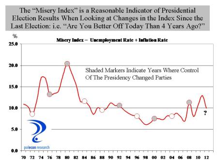
Since Ronald Reagan closed a presidential debate with Jimmy Carter by asking “are you better of today than you were four years ago” that question has been a benchmark in every presidential election and with good reason because the answer to the question is a pretty good predictor of election results. But how do you operationally define “better off”? The sum of the unemployment rate and the inflation rate is referred to as the “misery index”, since a high reading on either one or both of the components would likely have a negative impact on household sentiment. When the misery index is lower in an election year than it was in the previous presidential election, the party in power typically retains the presidency, and when the misery index is higher, the presidency typically changes parties. The chart below highlights the relationship. The chart line shows the value of the “misery index” in the 3rd quarter of each year (just before the election) and each circular marker indicates a presidential election year. The shaded markers indicate a change in control of the party in the White House.
With the exception of the 2000 election of George W. Bush over Al Gore, when the misery index was lower in an election year than it was in the prior presidential election year, the party in power retains the White House and when the misery index is higher, party control of the White House changes. The chart suggests that the 2012 election should be close, but probably leans toward President Obama’s reelection. Looking at the individual misery indices in swing states also gives The President a slight edge.
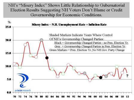
The misery index doesn’t say much about NH’s gubernatorial election however. The chart below shows that declines in the misery index (compared to 2 years earlier during the prior election for governor) do not appear to be associated with changes in party control of the governorship in the state. The chart does does show that a change is more likely to occur in a year in which the gubernatorial election coincides with the presidential election.
Overall, however, the chart suggests that NH voters do not hold gubernatorial candidates responsible for weaker economic conditions nor are they likely to credit them for good economic performance. Rather, they make their choices based on the perceived qualities of candidates. Isn’t that refreshing?
Explore posts in the same categories: Election, employment, NH Economy, Politics, U,S, Economy, UnemploymentTags: election, misery index, NH, obama, presidential election
You can comment below, or link to this permanent URL from your own site.

October 22, 2012 at 5:16 pm
In the age of the 12 oz pound, the measurement of inflation is distorted because the “Basket of Good and Services” is lighter. People are working harder for less and now must pay more for less.
I’m always stumped when I read that inflation is steady. Inflation is alive and well for the goods and services I pay for.
In a future Trend Lines it might be helpful to explain why inflation seems alive and well for consumers but not for the government bean counters.
I for one can no longer swallow the government’s inflation Kool Aid.
Michael
October 22, 2012 at 5:42 pm
Micheal,
So you are saying the current “misery index” should actually be higher, I can’t say I disagree with that sentiment. There certainly does feel like a disconnect between CPI and the experience of many consumers at times, like now. That can be especially true the more the things you purchase differ from the “basket” of goods and services that comprise the CPI. Energy prices (especially gasoline) have a tremendous psychological impact on our sense of economic well-being. The prices of components of the CPI are adjusted for improvements in quality, so if you by a computer that is twice as powerful but costs the same as last year, the measure of the price of that good is adjusted to have declined. The best way to look at the data is to go to the BLS site and get price measures for a mix of things you buy more often. There are many times when I am buy groceries where I say to myself “this is inflation under 2%?”
Brian