In April I offered a presidential election prediction model based primarily, but not exclusively, on economic variables as an extension of the old “misery index” that was an overly simple calculation of the impact of economic conditions on presidential elections that nevertheless did a pretty good job of predicting election outcomes. I presented two model scenarios depending on how the past voting patterns in each state were weighted (how large was their coefficient in the regression model). The model does not consider any factors related to the candidates other than whether or not they represent the party currently occupying the White House. The first scenario used my cross sectional estimate of the importance of prior voting patterns for predicting election results in each state; it indicated a fairly close election with a victory for the Democratic candidate. A second scenario weighted prior state voting patterns more heavily and predicted a larger margin of victory for the Democratic candidate. As a reminder the results from one of the April model runs are shown in the chart below.

It may be impossible to consider this election’s results outside the context of the characteristics of the candidates but whether it is New England’s first heat wave of the summer affecting my judgment or just a whiff of dementia surrounding the effort, I still think it important to find some predictable and rational pattern to this election that isn’t related to the outsized personalities of any of the candidates. Since politics isn’t my expertise I look for that rationality in economic conditions and variables. My model uses some high-frequency data (changes in gasoline prices, presidential approval, etc.) but also some data available on a quarterly basis (changes in real household personal income in each state, real house price appreciation in each state, etc.) so it can only be updated every few months. It can now be updated (as promised) and it will be updated one more time prior to the election. I will skip reiterating a description of the model so if you aren’t one of the 10 people that read that April post and want to know more about the model go back and read this post.
What has Changed Since April?
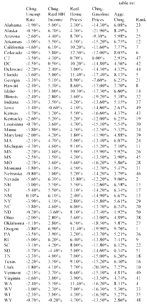
Almost all states have lower gasoline prices and the real household income in most states increased at rates faster over the past year than was the case in April, both have a demonstrated impact on the willingness of voters to vote for the incumbent party’s candidate and each of these variables are increasing the predicted vote totals for the party currently occupying the White House. Real home price appreciation was more of a mixed bag among states, almost all had appreciation but several experienced slower appreciation than was used in the April model’s predictions so the impacts only slightly favored the Democratic candidate in most states. The President’s approval rating has increased slightly since April, benefiting the candidate of the incumbent party (I use data from a Republican pollster and would use data from a Democratic pollster if a Republican were in office to counteract any bias in favor of the incumbent party). Voter fatigue with the incumbent party after two terms in office does not change over time in the model and continues to subtract several percentage points from the Democratic candidate’s vote totals.
Both model scenarios – smaller and larger weighting for each state’s past voting trends – suggest a growing margin of victory for the Democratic candidate. The July model scenario, using a smaller weighting for each state’s past voting trends, shows that the Democratic candidate’s electoral college margin of victory increases to 317 to 221, up from 295 to 243 in the April model results (chart below). All of the changes in party “wins” in individual states were in favor of the Democratic candidate.

The July results of this model scenario show Oregon and North Carolina switching to a Democratic victory, NH and Maine moving from a “most likely to switch” from Democratic to Republican victories to more certain Democratic victories and some states moving from more certain Republican victories to “most likely to switch” from Republican to Democratic victories (Arizona, Georgia, Missouri).
The “Official” Model Scenario
As I noted in my first election model post in April, because of the time and data involved, my estimate of the effect of prior voting patterns in each state was not calculated individually using a unique time series for every state. It wasn’t the best solution and it suggested prior voting patterns will play a somewhat less important role in election results in each state than has been found in research by others. Rather than continue to present two election result scenarios depending on the weighting of prior voting patterns I will take the middle or average of the two weightings to produce one “official” model prediction. In my final model update (likely in October) this middle scenario will be the only result I report.
The July model results using this middle scenario show an even wider margin of victory for the Democratic candidate, 347 to 191 electoral college votes. In this scenario Pennsylvania narrowly becomes a Democratic win as does Minnesota and the margin of victory in several close races become more certain for the Democratic candidate. More surprisingly and perhaps showing how naïve this prediction effort is, some Republican states (Mississippi, Georgia, and South Carolina) become much less certain republican victories.

What Happens If?
The July model results show a number of states with close races as indicated in the “most likely to switch” columns of the chart above. If all of the states in the Republican “most likely to switch” column became Democraqtic victories then the margin of victory for the Democratic candidate would be 399 to 139 electoral votes, a true “landslide’ election. If all of the states in Democratic “most likely to switch” column change to Republican victories then the electoral college results would show a narrower but still strong 302 to 236 victory for the Democratic candidate. Of course results are likely to contain a mix of both Republican and Democratic wins in the above chart “switching” to victories for the other party’s candidate. In any combination, however, the results suggest a likely victory for the Democratic candidate and a very difficult electoral college road to victory for the Republican candidate.
EndNote: I refer to candidates only by their party affiliation and not by name to reinforce the objective and empirical nature of this exercise and to, for a moment at least, consider the election outside of the role that candidate personalities play in the election, not out of any disrespect for the candidates – there has been more than enough of both of those things throughout this election cycle.