Posted tagged ‘presidential election’

“Tomorrow Will Still be Wednesday” – Our Final Presidential Election Model

November 4, 2016

November 8th can’t come soon enough.  When it does, take a deep breath and remember this: “tomorrow will still be Wednesday.”  Whoever manages to win the unpopularity contest that is the 2016 presidential election, the earth will remain on its axis, the sun will  rise again on November 9th, you can still hug your children (if they live away from home they still won’t return your call but they will respond to your texts), and no doubt your dog will love you unconditionally no matter who wins.  You wouldn’t know it from the hyperbole on both sides but on November 9th know this: the republic will remain standing.  That is my mantra at the end of an awful campaign that has cheapened and debased our electoral system in a way that won’t be easily repaired.  You don’t have to like the politics of past presidents to appreciate that, for the most part, they led our country with dignity, honor, and respect, things that are just as important to maintaining our democracy and our position in the world as are any shows of military or economic strength. Nobody gets to be president of the United States without a healthy ego and sharp elbows but today, with an election that shows how easy it is for many to excuse rudeness, sexism, racism, nativism and just about every other “ism” as a justifiable response to political correctness or as a sign of “strength,” I can’t help but think of past presidents who led our nation through difficult times knowing that they could not do so alone and with with a decency and a humility characteristic of genuine strength and leadership.

I definitely picked a bad year to try to make political predictions based primarily on economic conditions and without regard to the particular candidates running.  As a lover of statistics and statistical models I like reading Nate Silver’s FiveThirtyEight blog for its election predictions but when he said:  “Still, you should be wary of economic determinism. “Fundamentals”-based models that don’t look at polls have a fairly bad track record, even in years that aren’t as crazy as this one.” I couldn’t resist the effort to predict presidential election results with a regression model that used primarily economic data and that didn’t require the complexity and volume of polling data that FiveThirtyEight uses. In fairness, Mr. Silver did also say “I do not mean to suggest that the economy does not matter to elections, or that there is no predictive content in looking at economic variables. As this experiment should show you, the economy assuredly does not account for 90 percent of voting results. But it may well account for half of them.” I would argue more than half.   I won’t say, but I have heard others say, that Mr. Silver would have better luck with “economic determinism” if his model used individual state-level economic data and conditions rather than national data  because economic conditions vary greatly across states (note here that I am doing my best Donald Trump imitation by saying something without taking responsibility for it).   I also won’t say Mr. Silver would have better luck using economic variables that aren’t endogenously determined (i.e. some of the explanatory economic variables he uses are almost completely determined by other economic variables in the model).  That is a pretty big no-no for a stats maven to make but only if he knows something about economics.

I first posted in April and updated in July, a presidential election prediction model.  I failed to note in prior posts that I consider only the two candidates from the major political parties in the model so the winner of each state is the one that gets more than 50 percent of a state’s vote and the predicted vote percentages will not be similar to actual results that include third party candidates.  In July I also promised to post one more iteration of the election model after the latest state-level personal income data was released prior to the election because personal income growth trends are so important to the model’s predictions.

In the November election model the Democratic candidate still has a large advantage in the electoral college but as the chart below shows, there are more states currently predicted as Democratic victories that could switch to a Republican victory than vice versa.  In the unlikely event that all predicted narrow Democratic victories changed to Republican victories and all narrow Republican victories remained Republican wins, then the Republican candidate would be awarded 294 electoral votes and win the presidency.  On the other hand, in the unlikely event that all predicted narrow victories for the Republican candidate changed to Democratic victories and all predicted Democratic victories remained Democratic wins, the electoral college vote total tally would be 384 to 154 in favor of the Democratic candidate.  These are the extremes of potential outcomes but while the July model suggested an almost impossible path to electoral college victory for the Republican candidate, the November model shows an improbable but not impossible path.

november-map

To the Victor Goes the ?

President Obama’s reward for winning the presidency was inheriting an economy in a severe recession but at least one where the most controversial policies adopted to combat it were already largely in place.  The next president will begin seeking reelection fully 10 years since the end of the “great recession” making it the longest period of economic expansion in U.S. history and suggesting the possibility that U.S. will once again be in, near, or ending a recession. I believe Mrs. Clinton will win the White House and a recession in her first term and voter fatigue after three terms of a Democratic presidency will give the 2020 election to the Republican Party.  Of course that assumes a disarming of the circular firing squad that is the current Republican Party and if there is one thing the Republican Party probably doesn’t want to do it is disarm. Republicans may be able to capture the White House in 2020 with a better salesman at the top of the ticket but demographic trends suggest it will need more.  To me, the most interesting aspect of the 2016 election is that it hints at a future realignment of political parties, with the Republican party becoming the party of the working class and the Democratic party becoming the free trading, immigration supporting, party favored by business.

Economics Sees a Clearer Election Result

July 14, 2016

In April I offered a presidential election prediction model based primarily, but not exclusively, on economic variables as an extension of the old “misery index” that was an overly simple calculation of the impact of economic conditions on presidential elections that nevertheless did a pretty good job of predicting election outcomes.  I presented two model scenarios depending on how the past voting patterns in each state were weighted (how large was their coefficient in the regression model).  The model does not consider any factors related to the candidates other than whether or not they represent the party currently occupying the White House.   The first scenario used my cross sectional estimate of the importance of prior voting patterns for predicting election results in each state; it indicated a fairly close election with a victory for the Democratic candidate. A second scenario weighted prior state voting patterns more heavily and predicted a larger margin of victory for the Democratic candidate.  As a reminder the results from one of the April model runs are shown in the chart below.

base scenario

It may be impossible to consider this election’s results outside the context of the characteristics of the candidates but whether it is New England’s first heat wave of the summer affecting my judgment or just a whiff of dementia surrounding the effort, I still think it important to find some predictable and rational pattern to this election that isn’t related to the outsized personalities of any of the candidates.  Since politics isn’t my expertise I look for that rationality in economic conditions and variables.   My model uses some high-frequency data (changes in gasoline prices, presidential approval, etc.) but also some data available on a quarterly basis (changes in real household personal income in each state, real house price appreciation in each state, etc.) so it can only be updated every few months.  It can now be updated (as promised) and it will be updated one more time prior to the election.  I will skip reiterating a description of the model so if you aren’t one of the 10 people that read that April post and want to know more about the model go back and read this post.

What has Changed Since April?

Almost all states have lower gasoline prices and the real household income in most states increased at rates faster over the past year than was the case in April, both have a demonstrated impact on the willingness of voters to vote for the incumbent party’s candidate and each of these variables are increasing the predicted vote totals for the party currently occupying the White House.  Real home price appreciation was more of a mixed bag among states, almost all had appreciation but several experienced slower appreciation than was used in the April model’s predictions so the impacts only slightly favored the Democratic candidate in most states.  The President’s approval rating has increased slightly since April, benefiting the candidate of the incumbent party (I use data from a Republican pollster and would use data from a Democratic pollster if a Republican were in office to counteract any bias in favor of the incumbent party). Voter fatigue with the incumbent party after two terms in office does not change over time in the model and continues to subtract several percentage points from the Democratic candidate’s vote totals.

Both model scenarios – smaller and larger weighting for each state’s past voting trends – suggest a growing margin of victory for the Democratic candidate.  The July model scenario, using a smaller weighting for each state’s past voting trends, shows that the Democratic candidate’s electoral college margin of victory increases to 317 to 221, up from 295 to 243 in the April model results (chart below).  All of the changes in party “wins” in individual states were in favor of the Democratic candidate.

July Base Map

The July results of this model scenario show Oregon and North Carolina switching to a Democratic victory, NH and Maine moving from a “most likely to switch” from Democratic to Republican victories to more certain Democratic victories and some states moving from more certain Republican victories to “most likely to switch” from Republican to Democratic victories (Arizona, Georgia, Missouri).

The “Official” Model Scenario

As I noted in my first election model post in April, because of the time and data involved, my estimate of the effect of prior voting patterns in each state was not calculated individually using a unique time series for every state.  It wasn’t the best solution and it suggested prior voting patterns will play a somewhat less important role in election results in each state than has been found in research by others.  Rather than continue to present two election result scenarios depending on the weighting of prior voting patterns I will take the middle or average of the two weightings to produce one “official” model prediction.  In my final model update (likely in October) this middle scenario will be the only result I report.

The July model results using this middle scenario show an even wider margin of victory for the Democratic candidate, 347 to 191 electoral college votes. In this scenario Pennsylvania narrowly becomes a Democratic win as does Minnesota and the margin of victory in several close races become more certain for the Democratic candidate.  More surprisingly and perhaps showing how naïve this prediction effort is, some Republican states (Mississippi,   Georgia, and South Carolina) become much less certain republican victories.

July official Map

What Happens If?

 The July model results show a number of states with close races as indicated in the “most likely to switch” columns of the chart above.  If all of the states in the Republican “most likely to switch” column became Democraqtic victories then the margin of victory for the Democratic candidate would be 399 to 139 electoral votes, a true “landslide’ election.  If all of the states in Democratic “most likely to switch” column change to Republican victories then the electoral college results would show a narrower but still strong 302 to 236 victory for the Democratic candidate.  Of course results are likely to contain a mix of both Republican and Democratic wins in the above chart “switching” to victories for the other party’s candidate.  In any combination, however, the results suggest a likely victory for the Democratic candidate and a very difficult electoral college road to victory for the Republican candidate.

EndNote:  I refer to candidates only by their party affiliation and not by name to reinforce the objective and empirical nature of this exercise and to, for a moment at least, consider the election outside of the role that candidate personalities play in the election, not out of any disrespect for the candidates – there has been more than enough of both of those things throughout this election cycle.

“It’s the Economy Stupid,” Unless it Isn’t: Predicting the 2016 Presidential Election

April 6, 2016

You don’t need a political pundit to tell you what your eyes, ears and presidential primary results show  – in 2016 the electorate is angry. The economy isn’t at the top of every voters mind in every election but it is close.  For decades nearly every presidential candidate from both incumbent and non-incumbent political parties has asked voters “are you better off today than you were four years ago?”  As I documented in one of the very first posts in this blog, when the majority response was “yes,” the incumbent party’s candidate was almost certain to capture the White House.  There are some troubling economic trends and vexing economic issues affecting large numbers of Americans, still, to me the apparent level of anger in the electorate today seems outsized in historical context.

By most aggregate measures the country, as well as most individual states, are better off economically today than in 2012.  The simple calculus of Arthur Okun’s “misery index” – or the combined rates of unemployment and inflation – long a shorthand metric for assessing the likely aggregate economic sentiment of the American electorate, is much lower today than it was in 2012 suggesting that, collectively at least, we should feel somewhat better off.  But the level of anger in political and public discourse has elevated during the past four years and the  old “misery index” now seems a woefully inadequate measure of  the electorate’s assessment of current economic conditions.

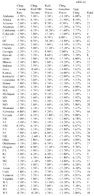
Adding economic variables that have a demonstrable impact on American’s perceptions of the economy to the “misery index” – such as gasoline prices, home price appreciation, and household income – only adds to the apparent disconnect between standard economic metrics and current voter sentiment.  The table below shows, on a percentage basis, how much lower is the unemployment rate (since 2012), how much real household personal income has grown (since 2013), how much real home price appreciation has occurred in the past two years, and how much lower are gasoline prices over the last year, in each of the 50 states.  In addition, the table assigns weights (subjective though they may be) to the income, home price, and gasoline price measures to develop an aggregate measure of how much better or worse off the electorate is in each state over the past several years.  (The unemployment rate is not included in the combined metric because it is already captured as a determinant of changes in real household personal income).

table Notepad copyMisery metrics aside, historical election results show that regardless of economic conditions there is a tendency for many states to vote consistently for the candidate from one political party (the Democratic candidate has not garnered even 40% of the presidential vote since 1964 in Wyoming and the Republican candidate has won a majority in Massachusetts only once in the past 60 years). In addition, there is clear evidence of ‘voter fatigue” with the incumbent party after two terms in the White House that, depending on the state, can reduce the percentage of the incumbent party’s vote total by as much as 5%.  All of this makes me question the value of economic metrics in predicting presidential elections – just not enough to overcome my left brain obsession with developing quantitative analytical models to explain all things.  I am no political pundit and this is an economics and policy blog not a political blog – this post has nothing to do with arguing for one presidential candidate or one party over another.

I examined the statistical relationship between voting patterns and key economic variables and used the relationships between non-economic variables (voter fatigue, current presidential approval ratings, etc.) found by others to estimate the percentage of the vote that both the Republican and Democratic candidate would receive in each state and to produce the electoral vote totals in the two graphics below. The model is based on the most recent economic and other data and does not take into consideration the quality or characteristics of the potential candidates – a significant shortcoming as in this election in particular, who the candidates are would seem to have a large impact.

base scenario

The first graphic (or base scenario) suggests an election that should be reasonably close but with a victory for the Democratic candidate.  The second graphic shows a much larger margin of victory for the Democratic candidate.  The only difference between the two scenarios is in the importance (statistical coefficient) of the voting trend variable.  Each state exhibits a different strength of voting trend (for one party or the other) but after the time needed to statistically determine the trend variable in several states I opted to examine an easier, cross sectional, 50 state aggregate trend variable. This is a sub-optimal solution because the trend variable has a large impact on results.

scenario 2

In the first chart the voting trend variable has a somewhat weaker impact on the vote percentages, while the second chart shows a somewhat stronger impact than I found in my cross sectional analysis.  Each chart also shows states that are most likely to switch from either a Democratic (light blue) or Republican (light red) win.

I make no claim that this analysis will bear any relationship to actual election results and this post should make clear why I should stick to policy and not politics, but it has been an interesting exercise in examining the impact of the economy on elections and I will update the charts in the coming months to see how key variables impact the predictions.

What Does the “Misery Index” Say About Election Results?

October 16, 2012

I am not a political analyst and this is not a political blog.  The polemics of political discourse are as tedious to me as the graphs I use with two Y axes are no doubt tedious to politicos. If you are prone to apoplexy or unable to view any data or information without an ideological lens, stop reading now.

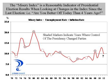
Since Ronald Reagan closed a presidential debate with Jimmy Carter by asking “are you better of today than you were four years ago” that question has been a benchmark in every presidential election and with good reason because  the answer to the question is a pretty good predictor of election results.  But how do you operationally define “better off”?    The sum of the unemployment rate and the inflation rate is  referred to as the “misery index”, since a high reading on either one or both of the components would likely have a negative impact on household sentiment.  When the misery index is lower in an election year than it was in the previous presidential election, the party in power typically retains the presidency,  and when the misery index is higher, the presidency typically changes parties.  The chart below highlights the relationship.  The chart line shows the value of the “misery index” in the 3rd quarter of each year (just before the election) and each circular marker indicates a presidential election year.  The shaded markers indicate a change in control of the party in the White House.

With the exception of the 2000 election of George W.  Bush over Al Gore, when the misery index was lower in an election year than it was in the prior presidential election year, the party in power retains the White House and when the misery index is higher,  party control of the White House changes.   The chart suggests that the 2012 election should be close, but probably leans toward President Obama’s reelection.  Looking at the individual misery indices in  swing states also gives The President a slight edge.

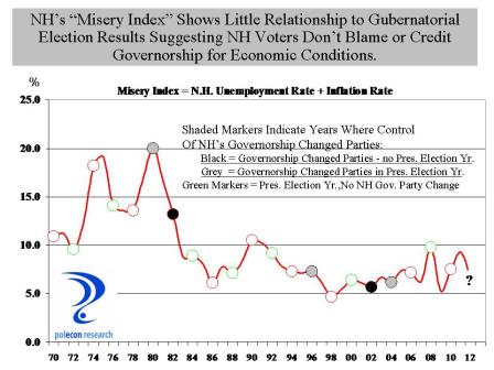
The misery index doesn’t say much about NH’s gubernatorial election however.   The chart below shows that declines in the misery index (compared to 2 years earlier during the prior election for governor) do not appear to be associated with changes in party control of the governorship in the state.  The chart does does show that a change is more likely to occur in a year in which the gubernatorial election coincides with the presidential election.

Overall, however, the chart suggests that NH voters do not hold gubernatorial candidates responsible for weaker economic conditions nor are they likely to credit them for good economic performance.  Rather, they make their choices based on the perceived qualities of candidates.  Isn’t that refreshing?


%d bloggers like this: