Archive for the ‘NH Economy’ category

The Skills Gap Debate – Round 1

October 18, 2012

Two charts may tell an important story about New Hampshire’s labor market and perhaps trends in the economy.  Help-wanted advertising has been rising in NH and as I’ve written before, it suggests job growth should be higher in NH  based on the long-term relationship between help-wanted ads and employment growth in the state.  A “skills gap” is one explanation for the divergence between help-wanted and job growth in NH, but I also offered that the divergence, along with trends in aggregate wage growth in NH  may mean employment numbers will be revised upward.   My money is still on an upward revision of job growth, with the skills gap playing an important  role for some industries and occupations, because NH has more help-wanted ads per 100 individuals in the labor force than all but 10 states – job growth should be higher (chart below).

I would be more convinced of the skills gap being broadly responsible for slow growth in the state  if a high percentage  of help-wanted ads in New Hampshire were for the highest skill occupations (professional, technical, scientific and management), but as the chart below shows, NH ranks well down the list of states on the percentage of help-wanted advertising that is for the highest skill occupations.  A skills gap could still exist between available jobs and available labor for occupations requiring specialized skills and training, even if they are not in professional, technical , or managerial occupations.  Anecdotal evidence suggest many employers are having difficulty finding workers with the right skills.  The skills gap demands further investigation, right now I am more concerned about what the relatively lower demand in NH for the highest skill occupations implies about our state’s economy.

What’s the Breaking Point for Oil Prices in Northern NE?

October 17, 2012

Because the Northeast is the one region of the country where a high percentage of households heat with oil, high oil prices can take a particularly heavy  toll on household budgets in the region.  Not all states in the region are similarly affected however.  Maine get hits hard because of its weather, the fact that its industrial mix is more energy dependent than say NH , MA, or CT, and even VT.  Plus their extensive tourism industry gets hurt when gas prices rise.  In NH, a lot of economic activity also depends on travel to the state which is hampered by high gasoline prices, and overall, NH has a relatively high rate of non-discretionary driving (that is we have a bit longer average commutes and a higher percentage of commuters traveling further) that hurts budgets when gas prices rise but our industrial base uses less energy per dollar of GDP than most states (MA and CT are lower in NE).  I’ve done some econometric modeling to see how sensitive employment changes are in New England to changes in the price of oil and gasoline.  All states are affected by higher oil and gasoline and all energy prices but the MA economy is somewhat less sensitive (the elasticity of employment with respect to oil prices is lower) than any of the  Northern New England states.  In Northern NE, NH is the least sensitive to oil prices but as the chart below shows, even at current oil prices, or at the average price during all of 2012 (about $96), employment in NH is 2,000-3,000 lower than it would have been if oil prices had remained at 2010 levels.

Higher oil prices act like a tax increase on the consumer, reducing disposable income and resulting in a shift in  purchases away from some goods and services to pay for higher energy costs.  In addition, high energy prices (especially gasoline prices) have a tremendous negative psychological impact on household and consumers confidence and sense of economic well being.  How much is too much of an increase in oil prices in Northern NE?  At what point do higher oil prices (which largely determines gas prices) tip the region into recession?  Based on the same models used above, the point at which slower job gains or actual job losses would occur is probably at a sustained price (for months on end) of at least $130 to $135 bbl.  But that changes depending on economic conditions and is also a function of the energy intensity of each state.   Strong economies can take more shocks without falling into recession.  In a weak economy it takes a smaller oil price increase to induce recession.  In NH, the breaking point price is now probably closer to $125 – $130 bbl, and in Maine a bit lower, while in Massachusetts, the price that would induce recession is probably closer to $140.

What Does the “Misery Index” Say About Election Results?

October 16, 2012

I am not a political analyst and this is not a political blog.  The polemics of political discourse are as tedious to me as the graphs I use with two Y axes are no doubt tedious to politicos. If you are prone to apoplexy or unable to view any data or information without an ideological lens, stop reading now.

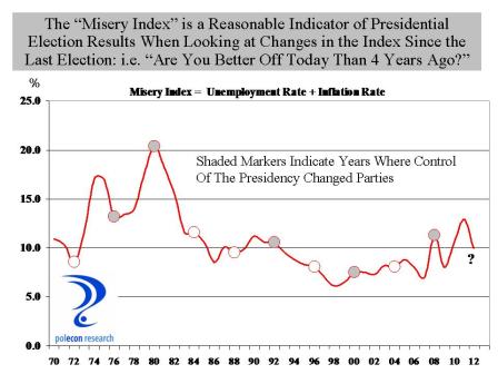
Since Ronald Reagan closed a presidential debate with Jimmy Carter by asking “are you better of today than you were four years ago” that question has been a benchmark in every presidential election and with good reason because  the answer to the question is a pretty good predictor of election results.  But how do you operationally define “better off”?    The sum of the unemployment rate and the inflation rate is  referred to as the “misery index”, since a high reading on either one or both of the components would likely have a negative impact on household sentiment.  When the misery index is lower in an election year than it was in the previous presidential election, the party in power typically retains the presidency,  and when the misery index is higher, the presidency typically changes parties.  The chart below highlights the relationship.  The chart line shows the value of the “misery index” in the 3rd quarter of each year (just before the election) and each circular marker indicates a presidential election year.  The shaded markers indicate a change in control of the party in the White House.

With the exception of the 2000 election of George W.  Bush over Al Gore, when the misery index was lower in an election year than it was in the prior presidential election year, the party in power retains the White House and when the misery index is higher,  party control of the White House changes.   The chart suggests that the 2012 election should be close, but probably leans toward President Obama’s reelection.  Looking at the individual misery indices in  swing states also gives The President a slight edge.

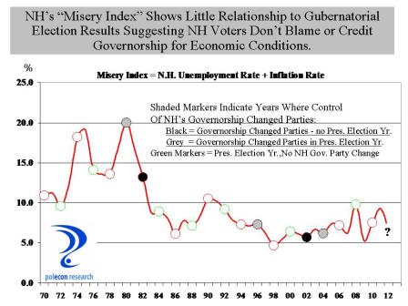
The misery index doesn’t say much about NH’s gubernatorial election however.   The chart below shows that declines in the misery index (compared to 2 years earlier during the prior election for governor) do not appear to be associated with changes in party control of the governorship in the state.  The chart does does show that a change is more likely to occur in a year in which the gubernatorial election coincides with the presidential election.

Overall, however, the chart suggests that NH voters do not hold gubernatorial candidates responsible for weaker economic conditions nor are they likely to credit them for good economic performance.  Rather, they make their choices based on the perceived qualities of candidates.  Isn’t that refreshing?

Manufacturing’s Toughest Sell

October 12, 2012

The percentage of younger workers in the workforce is declining in NH, as it is across the country, but the trends are different for specific industries and occupations (more about that in a later post).  Simply put, some industries are capturing a larger share of a smaller cohort of younger workers and the key for any industry or occupation is to have appeal for younger workers and students.  How does an industry capture more younger workers?   Is it because the industry is perceived as being desirable or “cool,” or do younger workers respond to signals about the opportunities in an industry or an occupation?

Manufacturing is one industry that has been capturing a smaller share of younger workers (government and utilities are others).   The chart below shows that over the past 15 years the share of younger workers (age 25-34) declined in NH’s workforce (age 25-64).  But the chart also shows that the drop was more pronounced in manufacturing than in the workforce overall.

Government employment hasn’t been perceived as cool for some time but job opportunities have grown or remained steady (except in very recent years) over the years suggesting that “coolness” is a factor in the career choices of younger workers.  For manufacturing it is likely to be a combination o cool and opportunities.  While manufacturers now have good opportunities for young workers, that perception must overcome  decade s of    labor market signals showing large declines in manufacturing employment.  The decline in younger workers in manufacturing roughly corresponds to the change in manufacturing employment in the state (chart below).

Manufacturing employers are in a difficult position.  Fewer households have workers with a history of manufacturing employment, limiting the legacy effects that can contribute to career choices.  A “twist”  (changing occupational makeup) in the manufacturing labor market mean that much of the public and almost no  high school guidance personnel have an understanding of the types of jobs in manufacturing. A general lack of “coolness,” perceived lack of opportunities, and  limited understanding of the opportunities that exist in the industry all mean that manufacturing will have a tough time capturing a larger share of the younger workforce, but it is important to do so for a number of reasons. I just don’t know if manufacturers can do it alone.