Archive for the ‘Uncategorized’ category

“Tomorrow Will Still be Wednesday” – Our Final Presidential Election Model

November 4, 2016

November 8th can’t come soon enough.  When it does, take a deep breath and remember this: “tomorrow will still be Wednesday.”  Whoever manages to win the unpopularity contest that is the 2016 presidential election, the earth will remain on its axis, the sun will  rise again on November 9th, you can still hug your children (if they live away from home they still won’t return your call but they will respond to your texts), and no doubt your dog will love you unconditionally no matter who wins.  You wouldn’t know it from the hyperbole on both sides but on November 9th know this: the republic will remain standing.  That is my mantra at the end of an awful campaign that has cheapened and debased our electoral system in a way that won’t be easily repaired.  You don’t have to like the politics of past presidents to appreciate that, for the most part, they led our country with dignity, honor, and respect, things that are just as important to maintaining our democracy and our position in the world as are any shows of military or economic strength. Nobody gets to be president of the United States without a healthy ego and sharp elbows but today, with an election that shows how easy it is for many to excuse rudeness, sexism, racism, nativism and just about every other “ism” as a justifiable response to political correctness or as a sign of “strength,” I can’t help but think of past presidents who led our nation through difficult times knowing that they could not do so alone and with with a decency and a humility characteristic of genuine strength and leadership.

I definitely picked a bad year to try to make political predictions based primarily on economic conditions and without regard to the particular candidates running.  As a lover of statistics and statistical models I like reading Nate Silver’s FiveThirtyEight blog for its election predictions but when he said:  “Still, you should be wary of economic determinism. “Fundamentals”-based models that don’t look at polls have a fairly bad track record, even in years that aren’t as crazy as this one.” I couldn’t resist the effort to predict presidential election results with a regression model that used primarily economic data and that didn’t require the complexity and volume of polling data that FiveThirtyEight uses. In fairness, Mr. Silver did also say “I do not mean to suggest that the economy does not matter to elections, or that there is no predictive content in looking at economic variables. As this experiment should show you, the economy assuredly does not account for 90 percent of voting results. But it may well account for half of them.” I would argue more than half.   I won’t say, but I have heard others say, that Mr. Silver would have better luck with “economic determinism” if his model used individual state-level economic data and conditions rather than national data  because economic conditions vary greatly across states (note here that I am doing my best Donald Trump imitation by saying something without taking responsibility for it).   I also won’t say Mr. Silver would have better luck using economic variables that aren’t endogenously determined (i.e. some of the explanatory economic variables he uses are almost completely determined by other economic variables in the model).  That is a pretty big no-no for a stats maven to make but only if he knows something about economics.

I first posted in April and updated in July, a presidential election prediction model.  I failed to note in prior posts that I consider only the two candidates from the major political parties in the model so the winner of each state is the one that gets more than 50 percent of a state’s vote and the predicted vote percentages will not be similar to actual results that include third party candidates.  In July I also promised to post one more iteration of the election model after the latest state-level personal income data was released prior to the election because personal income growth trends are so important to the model’s predictions.

In the November election model the Democratic candidate still has a large advantage in the electoral college but as the chart below shows, there are more states currently predicted as Democratic victories that could switch to a Republican victory than vice versa.  In the unlikely event that all predicted narrow Democratic victories changed to Republican victories and all narrow Republican victories remained Republican wins, then the Republican candidate would be awarded 294 electoral votes and win the presidency.  On the other hand, in the unlikely event that all predicted narrow victories for the Republican candidate changed to Democratic victories and all predicted Democratic victories remained Democratic wins, the electoral college vote total tally would be 384 to 154 in favor of the Democratic candidate.  These are the extremes of potential outcomes but while the July model suggested an almost impossible path to electoral college victory for the Republican candidate, the November model shows an improbable but not impossible path.

november-map

To the Victor Goes the ?

President Obama’s reward for winning the presidency was inheriting an economy in a severe recession but at least one where the most controversial policies adopted to combat it were already largely in place.  The next president will begin seeking reelection fully 10 years since the end of the “great recession” making it the longest period of economic expansion in U.S. history and suggesting the possibility that U.S. will once again be in, near, or ending a recession. I believe Mrs. Clinton will win the White House and a recession in her first term and voter fatigue after three terms of a Democratic presidency will give the 2020 election to the Republican Party.  Of course that assumes a disarming of the circular firing squad that is the current Republican Party and if there is one thing the Republican Party probably doesn’t want to do it is disarm. Republicans may be able to capture the White House in 2020 with a better salesman at the top of the ticket but demographic trends suggest it will need more.  To me, the most interesting aspect of the 2016 election is that it hints at a future realignment of political parties, with the Republican party becoming the party of the working class and the Democratic party becoming the free trading, immigration supporting, party favored by business.

What the Unemployment Rate Doesn’t Tell Policymakers Can Hurt Us

June 22, 2016

Last week the NH Labor Market Information Bureau released the NH jobs report for May and as usual all of the attention focused on NH’s low (2.7 percent) unemployment rate.  The more significant story was the April to May decline of 4,000 payroll jobs in the state.

Private sector jobs in NH were lower by 3,400 in May, the largest one month decline since 2008 – with one exception – a month in 2014 when workers at the Market Basket grocery chain left their jobs in support of their ousted CEO.  May 2016 job losses were an out sized drop for any month of seasonally adjusted data (a decline of that size would more likely be seen in the not seasonally adjusted data where large changes in employment occur annually during certain months of the year).  I am inclined to attribute some, but not all, of the drop in NH’s May employment to problems with seasonal adjustments and other statistical issues.  Still, the May data marks the first time since 2011 that a three month moving average of private sector employment growth in NH has been negative.

3 mos avg change in private emp

For some added context on the NH payroll employment numbers I wait for a release from the U.S. Bureau of Labor Statistics, usually about one week after NH releases its state’s job numbers.  That monthly report provides employment, unemployment, labor force and other labor market data for all 50 states.  Here is a bit of the context provided in the June 20th release from the U.S. Bureau of Labor Statistics:

“In May 2016, four states had statistically significant over-the-month decreases in nonfarm payroll employment and three states and the District of Columbia had significant increases. The job losses were in Tennessee (-13,400), Michigan (-12,700), New Hampshire (-4,000), and Montana (-2,700). In percentage terms, Montana and New Hampshire had the largest declines (-0.6 percent each), followed by Tennessee (-0.5 percent) and Michigan (-0.3 percent).”

The term “statistically significant” decline in employment is important.  Twenty seven states experienced declines in nonfarm payroll employment in May but in only four of those states was the decline deemed “statistically significant,” meaning that the decline was large enough for the BLS to be at least 90% certain that the change in employment did not fall within the margin for error of the employer survey on which the employment estimates are based.

May emp change

It is not wise to be too concerned with one month’s job report.  Whether the  May job growth number is real or illusory and the product of statistical anomalies, the numbers for NH still should have attracted more attention (than a 0.1% uptick in the unemployment rate) from the media and especially from lawmakers and public officials.  The May job growth number is certainly more noteworthy than a slight uptick in the state’s unemployment rate that was the focus of most media reports.   As I noted in my previous post, employment growth nationally and in NH is going to slow and one bad month is not reason to panic.  But NH’s year-over-year percentage increase in private sector employment took a big hit with the May jobs report and the state’s ranking among states on private sector job growth did as well.  Private employment growth in NH has been on a solid pace for more than a year but with the May data NH moved from the top third to the bottom half among states on year-over-year private sector job growth.

Ranking Private Sector Job Growth

Public sector job cuts continue to be a drag on NH’s total nonfarm job growth, shedding about 2,500 jobs between May of 2015 and May of 2016, by far the largest percentage decline of any state in the nation.

Change in Govt Jobs May 15 to May 16

Still, while the May jobs report was troubling, initial unemployment claims are a very good leading indicator of economic activity and they remain subdued in NH and have yet to suggest a significant downtown in either the U.S. or NH economies.  The May jobs report also showed a continuation of the recent trend of solid labor force growth.

IUC

Implications for State Revenue

My primary concern about the May jobs report for NH, and with monthly jobs reports for NH in general, is how little attention payroll employment numbers get from policymakers and how much attention and importance is given to the state’s unemployment rate.  The state will begin crafting its two-year budget this fall and solid revenue gains over the past year and a budget surplus are building pressure for substantial increases in state spending.  This isn’t a commentary on the merits of specific spending proposals (I will save that for later posts) just a caution that the fiscal environment into which spending proposals will be entered can change and the need to recognize that change as far in advance as possible.  I would feel more comfortable about the upcoming budget process if NH’s weak May jobs number, and the possibility that weaker job growth will continue, were at least acknowledged by policymakers, state agencies, and the media.  I want to know that there is someone in NH’s wheelhouse focused on the horizon and not on our wake.   I understand the appeal of the unemployment rate as a single, intuitive metric that summarizes economic conditions but the unemployment rate is a lagging indicator of labor market and economic trends.  For policymakers and anyone who needs to assess the near-term economic outlook, using the unemployment rate as a guide is a bit like driving using the rear view mirror.   The unemployment rate is an important economic indicator that says a lot about current economic conditions, it is just not that useful for forecasting purposes. Moreover, NH’s demographics (fewer individuals in demographic groups that typically have high rates of unemployment) mean that the state will almost always have a relatively lower unemployment rate than the U.S..  Too frequently that leads lawmakers and others in NH to assume the state’s economy is performing better than it actually is and better than the U.S. economy.

Business taxes are a big reason that NH revenues have outperformed expectations this fiscal year, accounting for almost two-thirds (or $61.4 million) of the $99.4 increase in traditional taxes and fees over FY2015 during the first 11 months of fiscal year 2016.  Focusing on changes in private sector  payroll employment and wage growth is especially important for lawmakers in the Granite State and especially important as we head toward a budget making year.  As a lagging indicator of economic activity NH’s unemployment rate will remain low, even as the economy slows.

Emp Growth and Business Taxes

If lawmakers focus too much on NH’s unemployment rate in their assessment of state revenue trends they risk delaying recognition of turning points in the NH economy and thus changes in state revenue trends.  Private sector employment and payroll growth slow before significant changes occur in the state’s unemployment rate and private sector employment growth is a better indicator  of trends in NH business tax revenue than is the state’s unemployment rate.  So the next time a public official brags about NH’s unemployment rate, ask him or her how many jobs were added in the state during the last month.

Presidential Campaign Impacts on U.S. Job Growth and Implications for NH

June 9, 2016

The May U.S. jobs report with downward revisions to the March and April job numbers was bad, not bad enough that you should start stocking canned goods and bottled water in your basement but bad nevertheless.  The impact of 35,000 striking Verizon Corp. workers on the May numbers is cited as one explanation for the weak report but there were 25,000 temporary workers hired by the company during the strike so the overall impact was actually fairly small.  Seasonal adjustment factors (the statistical procedure used to smooth regular annual fluctuations in employment data throughout the year– things like Christmas hiring, summer employment of youth etc.) seem to be more problematic in recent years and that may also be a contributor.   Of course it is possible that hiring was just weak, plain and simple.  Hiring will continue to weaken, I just don’t think job growth is really as weak, and the slowdown as rapid, as the May jobs report suggests.

Presidential Campaigns Appear to Impact Job Growth

The first rule of politics is to forget all of the rules of economics and that is more problematic now that the national political climate seems to increasingly influence real economic variables. Think of the impact that debt ceiling debates and government shutdown threats have had on economic activity recently.  With almost no focus in the current presidential election on sound economics and economic policies it is easy to see how politics could  contribute to a weak May jobs report (when the empirical evidence doesn’t provide a clear explanation for economic events it is hard to go wrong blaming politics and politicians).  But there is some evidence that presidential elections can temporarily depress job growth.  The uncertainty of a presidential election, especially in a year without an incumbent, and the people and policies that candidates may employ in their administration can give pause to businesses investment and hiring decisions. The uncertainty surrounding future economic and fiscal policies in a presidential election year should arguably be greater several months prior to the election rather than a month or two when the election outcome and policy directions become clearer.  I compared average private sector job growth (government employment should not be affected) in the U.S. during the months of June-August in presidential election years, to the average job growth from September (of the year prior to the election) to May (of the election year).   Since 2000, in each presidential election year the average private sector job growth from June-August significantly lagged average job growth over the prior nine month (Sept-May) period. The pattern held in 2008 but because the U.S. economy was in free fall for other reasons it is not included here.   In years with no presidential election this generally was not the case (years such as 2002, 2003 and 2007 when the U.S. was entering or exiting a recession are exceptions).

UncertaintyJob growth in NH is going to slow regardless of political uncertainties given existing labor force constraints.  NH is essentially at full employment and the nation is close. The longer a recovery lasts the greater are the chances that job growth will slow.  Still,  there are more uncertainties regarding the presidential candidates and the policies that could affect business and the economy in this election than is typical in a presidential year so it is not unrealistic to think that politics is already affecting hiring and investment decisions.

Will New Hampshire Follow the National Trend?

State level job growth numbers for May will be released June 17th.  In a small state like NH monthly job growth can be especially volatile. Up or down  conclusions about a state’s economy should not be drawn from a single month of employment data.  A three month trend in private sector employment is a better reflection of the direction of a state’s economy and by that metric NH has been on a roll.  The chart below shows that after several years of below national average private sector job growth, the pace of job growth in NH is now at a level equal to the U.S. average.  Moreover, the growth trend for NH has accelerated while the rate of private sector job growth in the U.S. has decelerated.  The rate of private sector job growth NH is going to slow nonetheless,  just as it has in the nation overall.

private sector job growthI don’t think the private sector job growth trend has gotten enough attention in NH.  Many (including me at times) focused on several years of NH’s subpar total non-farm (including government) employment growth.  But as I have noted in prior posts, the percentage drop in government jobs in NH is among the largest of any state in the nation, masking some of the strength of hiring trends in NH’s private sector.  The chart below shows how both private sector and state and local government employment in NH have grown since each sector’s pre-recession peak.  Private sector employment in NH peaked in February of 2008 and after shedding 6% of those jobs during the recession NH has regained that many plus an additional 3%.  State and local government employment in NH did not peak until April of 2010.  It takes a couple of years for property valuations to reflect economic conditions so the largest declines in property valuations – and thus local revenues and employment- occurred as the recession had ended.  State and local government employment in NH is about 8.5% lower than at its peak, with local government shedding about 6,800 jobs and state government about 1,000 jobs.

public vs private sector growth

Labor Market Response in NH May Be Too Late

For too long in NH private sector job growth remained consistent at a subpar rate despite a large increase in help wanted ads in the state.  A combination of slow or no labor force growth and a mismatch between job opportunities and the skills of job seekers were the causes and not a fundamental erosion of NH’s business climate as I argued in this post.

NH US Help Wanted

But now help wanted ads in NH and the nation are slipping (chart above) and while the recovery isn’t over we are getting better more slowly.  Unfortunately, that is occurring just as the labor market conditions –  low unemployment, rising wages, and signs that NH is once again seeing net in-migration from other states, are all resulting in a more rapid expansion of the NH labor force, the key ingredient wages

the state has lacked in recent years to achieve a faster pace of  job growth.

NH Labor force growth

A Bumpy Ride for the Remainder of 2016

I am frequently in error but rarely in doubt and in this post  last fall I was confident NH would again exceed the U.S. rate of employment growth (it is still possible but not likely) and that NH would see a 2.5% increase in total employment in 2016 (that is not going to happen). In fairness, private sector job growth has been on a more than 2% growth pace for the year and I did include two caveats in my forecast last fall: first that labor force growth in NH would have to accelerate (in part due to a resumption in net in-migration to the state) and while the labor force is once again growing in NH,  it is at a pace that may not sustain the 2% plus growth that NH’s private sector is currently on.  Second, the decline in government jobs would have to abate – it hasn’t.  A month ago at a presentation at a local community bank I downgraded my job growth forecast for NH in 2016 from 2.5% to 1.8%.  With more recent national economic data – including the May jobs data and March/April revisions, readings from my PolEcon NH Leading Economic Index, along with the uncertainties produced by the nation’s political climate, I now believe the rate of growth will be just 1.2 to1.4 percent.

A Pyrrhic Victory for Pipeline Opponents

June 2, 2016

Another energy project has been scuttled that could have provided some relief to New Hampshire and New England households and businesses who are paying among the highest prices for energy of any state in the nation. I believe the project would also have contributed to the important goal of reducing carbon emissions in NH and New England (more about my support for reducing carbon emissions and some controversial policies to accomplish that in a future post).  No doubt any proposed energy project is better when forged and tempered through a process of public review and debate.  But the withdrawal of proposed wind energy projects, and more recently the Northeast Energy Direct (NED) natural gas pipeline project, as well as the difficulties encountered by some solar projects in the state, question how committed many residents and some policymakers in NH are to finding solutions to an energy climate that is widely recognized as detrimental to households, businesses, and the NH economy.  As opponents of  pipeline, wind, and solar projects claim another “victory” in NH, an admonition given to Pyrrhus, a Greek general and ruler of Epirus comes to mind.  After a costly victory over his Roman enemies by Pyrrhus, the Greek philosopher Plutarch reportedly told Pyrrhus that another, similar “victory” would ruin him.  If the “ruin” that could occur only affected the combatants in NH’s  energy infrastructure battles, instead of the 1.4 million non-combatant “energy civilians” in the state, Plutarch’s warning might be useful.  But there are no “generals” and no real leaders or statesmen and stateswomen battling NH’s energy constraints and so the casualties of our state’s inability to take control and direct its energy future will be most broadly spread across the state’s population.

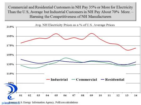
This post highlights some of my calculations of the costs to NH of the defeat (or victory as opponents would argue) over the Northeast Energy Direct natural gas pipeline proposal.  To begin, let’s reiterate the cost disadvantages faced by consumers of electricity in NH.  The chart below shows that through 2014, residential and commercial electricity customers paid, on average, about 35 percent higher rates than the national average, while industrial customers paid a whopping 70 percent higher rates than the national average.
energy prices

The NED Project’s Impact on Natural Gas and Electricity Prices

Natural gas prices have been lower in recent years as a result of increased U.S. production, largely from the Marcellus and Utica shale formations in  Ohio and Pennsylvania.  But as I noted in this post, a lack of pipeline capacity precludes NH and New England from realizing the full benefits from declining natural gas prices.  The increased supply of natural gas from nearby sources enabled by the Northeast Energy Direct project would impact natural gas prices in NH and New England.  Price reductions would result in direct savings to residential, commercial, and industrial consumers of natural gas and would also result in electricity prices that are lower in NH than without the Northeast Energy Direct project. New England’s wholesale power prices are closely related to natural gas prices because of the region’s dependence on gas-fired power generation capacity. By reducing spot prices for natural gas in New England, the NED Project will have a direct impact on New England’s wholesale power prices.

At least eight separate studies have forecast lower natural gas prices in New England resulting from an increase in pipeline capacity into the region.  Even one study from the Massachusetts Attorney General’s Office, while suggesting an increase in pipeline capacity to New England isn’t needed to assure reliability of electricity supplies in the region (inaccurately I believe and contrary to reports by others, including the operator of the New England Energy grid), recognizes that increased pipeline capacity would result in lower regional natural gas prices.

 There is a range of estimates of the price impacts from an increase in natural gas supply to the region. My estimates of energy cost savings in NH use one of the more conservative estimates of the price impacts of increased supplies to the region as documented in a study  by ICF International. I used historical data on both natural gas and electricity consumption by sector (residential, commercial, industrial)  in NH from the U.S. Energy Information Agency (EIA) as well as forecasts of future consumption based on the EIA’s regional forecast for growth in natural gas and electricity consumption and applied ICF natural gas and electricity price reduction estimates to consumption forecasts in NH to estimate savings to customers in the state that would result from the operation of the NED pipeline.  In the initial full-year of pipeline operation I estimated the savings to natural gas and electricity consumers in NH to be $165.5 million.  The breakdown of saving by source and sector is presented below.  Savings represent about 3.4 % of the 2014 energy expenditures of NH residential consumers, 6.5% of commercial sector energy expenditures, and 8.9% of the energy expenditures of industrial consumers.
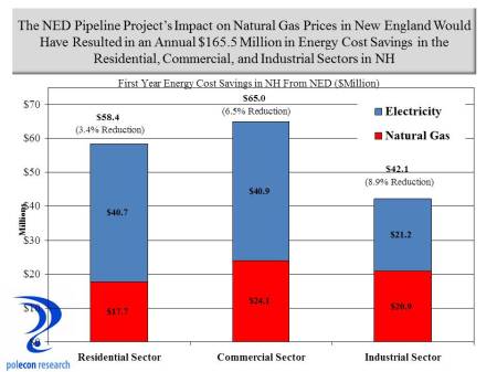
savings by sector

 Using the same sources and methods, I estimate the 10 year energy cost savings to NH natural gas and electricity consumers  would be just under  $2.2 billion in nominal dollars as a result of the Northeast Energy Direct project.
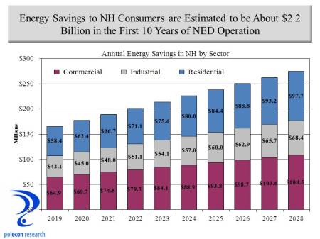
10 years savings

Additional Benefits of Increased Regional Access to Natural Gas

There are other potential benefits from NED that have been less talked about.  Much of NH has limited or no access to pipeline natural gas from local distribution companies.  The lack of access to natural gas increases energy costs for households and businesses in many regions the state.  In particular, lack of access increases the economic disadvantages currently faced by most rural regions in the state.   Natural gas is most available in the populated regions of Southern NH closest to regional pipelines and the lateral pipelines operated by local utilities who purchase natural gas from the regional pipeline operators.  The proposed NED pipeline would have passed through a portion of the state where the economy has lagged for some time and regions that could most benefit from access to pipeline natural gas.  The NED would increase capacity but local utilities would have to add lateral pipelines to serve communities, households and business in places like Keene, Claremont, Cheshire, Sullivan and Grafton Counties.

Along with extremely high electricity prices for industrial consumers relative to the U.S. average, the lack of access to natural gas is a significant disincentive to operating a manufacturing facility in much of New Hampshire, as nationally, natural gas accounts for 40 percent of the purchased energy of manufacturers on a BTU basis.  There is anecdotal evidence that manufacturers nationally are starting to react to lower natural gas prices by planning to open new facilities in the United States. There are other influential factors, including rising employment costs overseas, but those industries for which natural gas is an important input are anticipating an advantage of locating their operations in the U.S..  Cheshire and Sullivan Counties are among the most manufacturing dependent regions in the state and access to utility natural gas would especially benefit communities in those regions.  The chart below presents location quotients which represent the concentration of manufacturing employment in each NH county relative to the concentration of manufacturing employment in the U.S. overall. A location quotient of 1.00 indicates a region where the concentration of manufacturing employment is identical to the concentration of manufacturing in the the U.S. economy overall.  Location quotients above about 1.20 suggest counties where manufacturing is especially important to the regional economy.  Shaded bars represent counties through which the NED project would pass. The NED would not pass through Sullivan County but its proximity would make lateral access to gas from the pipeline feasible.
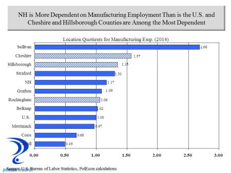
manufacturing LQ

Increased natural gas supplies and lower prices will be especially helpful to smaller manufacturing firms which face higher prices in New England but also face larger natural gas price differentials relative to larger manufacturers than anywhere in the country.  High prices and larger price differentials create a strong disincentive for new and emerging manufacturing firms to operate in New Hampshire and may be contributing to an “aging” in the manufacturing sector in the state.

gas prices to manufactures

Access to natural gas would also benefit households. Just under 20 percent of households in New Hampshire use pipeline natural gas for heating and another 13 percent use bottled gas but there are large regional variations in the availability of natural gas for heating.  Again, regions of the state that are considered economically disadvantaged, in most cases, have the least access to pipeline natural gas.  Access to pipeline gas won’t guarantee a reduction in disparities in the economic performance of various regions of NH but it would help households and manufacturers in regions where the economic performance has lagged.
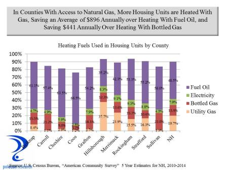
home heating in NH by source

The savings for households heating with pipeline natural gas is substantial. The table below shows the average cost differential in annual heating costs between housing units heated with pipeline natural gas and other sources.  The difference between pipeline natural gas heating and fuel oil – the largest source of home heating fuel in NH – averaged over $890 annually between 2010 and 2014. By lowering natural gas prices the differential between homes heated with natural gas and other sources (other than solar) are likely to widen.  The NED would  increase opportunities for more communities, regions and more homes to be heated with natural gas in New Hampshire, amplifying the potential savings estimated here for NH households and the NH economy associated with lower natural gas prices.

Table copy

Factoring the impacts of the NED project on natural gas prices and disposable income for  residential consumers (and not including the impacts on commercial and industrial consumers)  I estimate that an additional 5,300 jobs would have been created in the first 10 years in response to the energy cost savings to households from the NED project.  When the impacts on industrial and commercial consumers are considered the potential benefits of the project become even clearer.

Disclosure

I originally prepared more detailed estimates (than in this post) in a report I did for the proposed NED project.  I write this blog (when I have time) because I enjoy researching and writing about topics that interest me, not to advance client interests. I think the report contained some good analyses and now that the NED proposal has been withdrawn and the company is no longer a client, I don’t feel conflicted writing about it here.  The success or failure of the NED project had no impact on the compensation I received. The report addresses energy issues in NH that I have been writing about since long before my work for the NED project. It examines the usual economic impacts from the construction phase of the project but more importantly potential longer-term impacts of the project.  The report also examines controversial topics such as potential impacts on tourism activities as well as fiscal impacts of the project.  The report can be viewed here. Because the report was paid for by the NED project owners, critics will dismiss some or all of the findings.  But a report that is paid for only means that its author(s) has some “skin in the game.” In a small state, and especially in NH, anyone who produces work that distorts findings or misleads policymakers won’t be offering services of  value and won’t be working in the state for long.  On the other hand, anyone without “skin in the game” or some compensated interest is pretty much free to make any claim without evidence, present any data, or any “analysis” regardless of its accuracy, without concern for the impact that it has on their business or professional reputation. I am not arguing that any information brought to policy debates that isn’t paid for has no value or is necessarily inaccurate or misleading, just that information that is not paid for by some interests is not is inherently or by definition more accurate or relevant than work that is paid for – there should be no “halo effect” for information entered into important policy debates simply on the basis of whether or not compensation was involved – compensated or not, information entered into the debate is provided by a party with a particular interest in the issue.  The quality and accuracy of the analysis should determine its merits.  I like to think that the ultimate test of the quality of an analysis is whether those who produced it will be around and willing to answer for its accuracy or inaccuracy when the time comes when that can be determined.  I don’t think my analyses (or forecasts) are wrong that often but when they are I am available to answer to policymakers and others for it.  I don’t think I would have had to answer for my my analysis of the impacts of the NED.

A Perfect Labor Force Storm

May 24, 2016

A perfect storm is brewing for the economy and individual businesses in NH and across the country.  Slow labor force growth, the retirement of baby boomers, and weak growth in labor productivity are severely limiting the productive capacity of the nation’s economy.  Between 2010 to 2015 labor productivity in the U.S. increased by just 0.5 percent on average annually, and the labor force by an average of just 0.4 percent.  Since the end of World War II, the combined, labor productivity and labor force growth in the U.S. had never fallen below 1 percent – until 2015 when it was just 0.9 percent. I have written about the the limits labor force growth place on the U.S. and NH economies here and here (and others).  Factors such as the flow of population (state-to-state migration and  international migration), and changes in labor force participation rates will play a large role in determining which states and regions are most affected, but a real possibility exists that the economies of some  states and regions could shrink over time.

Figure 1

A quick assessment of the potential impact of baby boom retirements across the country is illustrated in Figure 1 which shows the ratio of the population in each state that will (or could) be entering the labor force approximately over the next decade – that is individuals currently ages 5-19 –  to those who will (or could) be exiting the labor force – individuals currently ages 50 to 64.   The bars in the graphic that fall below zero indicate states that face more retirements from their labor force than new entrants over the next decade or more.  As the chart shows, the labor force in New England and much of the Northeast will be especially challenged by baby boom retirements as far more individuals will leave than enter the workforce.

In NH, the impact of baby boom retirements will vary greatly by industry.  The Millennial generation will soon be the largest segment of the labor force but their distribution across industries varies greatly.  For this analysis I examined the demographic characteristics of each industry’s workforce in NH.  Figure 2 presents the ratio of early career (age 25-34) to older workers (age 55-64) in major industry groupings in NH.  The graph suggests industries that will be more and less challenged by retirements of the baby boom generation.  Industries that have higher ratios employ more individuals early in their working lives than individuals nearing retirement age.  Several industries stand out for the high percentage of older individuals in their workforce.  Manufacturing is one industry that has had difficulty attracting younger workers and I have written about that issue long ago in this blog, Educational services is another.  Professional, scientific, and technical industries have a surprisingly low percentage of younger workers but an examination of this industry grouping at a more detailed level shows that the legal profession has among the oldest demographics of any industry in the state.

Figure 2

Looking at the age composition of workers in broad occupational groups in NH (Figure 3)  shows how much difference there is across different occupations employed in professional, scientific, and technical industries. The ratio of younger to older workers in the legal profession is just 46 percent, while in computer and mathematical occupations there are many more younger workers and the ratio is 127 percent.

Figure 3

Health care is also a field with a larger percentage of older individuals in the workforce but when the demographics are examined at a more detailed industry level or by specific occupations, it is clear that the industry is bifurcated – with physicians and other health care practitioners having an older demographic while many of the support occupations in the industry that have emerged as health care has become a much larger portion of the economy, have a much younger demographic.

Industry Growth is as Important as Industry Demographics

 The retirement of baby boomers only hints at the industries that could face the most significant labor shortages over the next decade.  Retiring workers may need to be replaced but they may not.  If employment in an industry shrinks or if it grows slowly over the next decade, then labor shortages are likely to be less severe than baby boomer retirements would suggest, even in industries with a higher percentage or older and retiring workers.

 To capture the impact of industry trends on potential labor shortages related to baby boom retirements I combined projected industry growth in NH over the next decade with the ratio of younger to older workers in each industry to produce a supply/demand balance metric.  For illustrative purposes I present the supply/demand calculations for broad industry groupings in Figure 4.  I did the same calculations at a more detailed (50+ industry) level but that level of detail is not amenable to presentation in a single graphic.  It is not possible to know what industries workers entering the labor force over the next decade will work in so these calculations are only rough estimates of potential supply/demand imbalances. As the chart shows,  industries with a relatively older workforce, such as manufacturing, public administration, and utilities, will nevertheless likely confront fewer labor shortages because of slower employment growth in those industries.  Unfortunately, all industries are likely to face shortages in some occupations that are employed and in demand across many industries.

Figure 4

What Can States and Business Do?

The primary shortcoming of Figure 1 is that it is a static representation of the demographics each state’s workforce.  The population and demographic composition of states are not static however.  People move from place-to-place, state-to-state, county-to-county, and country-to- country.  A state or region with substantial labor shortages that is also viewed as an attractive location can see increases in labor supply in response to labor shortages and wages that are rising in response to shortages.   For more than two decades attracting skilled individuals with higher levels of educational attainment has been a key to NH’s economic success, since the mid 2000s however, NH has seen fewer individuals moving into the state from other states.

A popular meme in NH (and in many rural states) is that the state’s labor force challenges are largely the result of young people leaving the state.  But that is a phenomenon that has been occurring for decades in NH as it has in other rural states.   While it plays some role in the state’s labor force challenges, it has not been a key factor contributing to or detracting from NH’s economic performance – either NH’s strong successes of the 1980s and 1990s  or its subpar job growth of recent years. I wrote about who is moving to NH here, the chart below adds who (from an age perspective) left NH during the same recent 5 year time period.

Figure 5

I am not arguing that we ignore the issue of out-migration of youth, but a state budget in surplus along with the “migrating youth” meme is likely to produce proposals for labor supply policies that are likely to be as costly as they are ineffective.  In future posts I will examine the costs and benefits of several labor supply policies directed at increasing the percentage of young people in NH as well as the percentage attending college and remaining in NH after graduation.   NH is not monolithic, some communities and regions have been attracting younger workers and the age structure of their labor forces has not been increasing as rapidly as NH overall.  If policymakers want to attempt to change decades of youth migration trends then these communities are instructive of the types of actions that may or may not help NH capture higher numbers of workers early in their working lives.

Still, migration along with changes in the labor force participation rate among different demographic groups are going to be the primary determinants of the magnitude of NH’s labor force growth in the coming decades. As Figure 6 below shows, net migration from other states (the # moving in versus the # moving out) has been negative in recent years. That is largely the result of a slowdown in people moving to NH rather than a substantial increase in those leaving the state. The chart also shows that net international migration has offset much of the recent loss from state-to-state migration.

Figure 6

International migration of foreign workers into NH has played a critical role in meeting the demand for many occupations in NH.  Overall just under 8 percent of the labor force in NH is foreign born but in some occupations such as computer and mathematical occupations and life and physical sciences occupations, the percentage of foreign born workers in the NH labor force is over 20 percent (Figure 7).

Figure 7

The projections of labor supply/demand imbalances in this post don’t account for  potential increases in domestic or foreign migration but each of these will  play an important role in meeting the demand for labor in the Granite State.  Businesses have little control over net migration to NH so what can businesses do in the face of impeding labor shortages?  Here are some possible strategies to help businesses  meet their labor needs in an era of slow labor force growth:

  • Increase Wages and Pass Costs on to Consumers
  • Expand Automation and Increase Productivity
  • Move to Areas with More Labor
  • Increase Teleworking to Expand Potential Labor Pool
  • Tap the Untapped Labor Pools
  • Provide Incentives to Delay Retirement
  • Rely More on Contingent Workers
  • Recruit (and Train) Discouraged Workers.

These strategies are not available to all businesses or all industries.  Of all, I like providing incentives to delay retirement the best – it is the “revenge of the baby boomers”. More occupations today are less physically demanding and older citizens are healthier than any time in our nation’s history.  Combined, this should allow individuals to work (if they so chose) well beyond traditional retirement years.  For a long while now younger workers have been all the rage.  It is fitting that baby boomers who entered the workforce in numbers large enough to depress wages, and who have seen workplace cultures that increasingly look to appeal to the youngest workers, could see increasing demand for their services at the end of their working lives.


“Too Big to Fail” or “Too Small to Succeed”?

March 21, 2016

Community banks’ share of the U.S. banking market has declined significantly over the past two decades but since 2010, around the time the Dodd-Frank Wall Street Reform and Consumer Protection Act was passed, community banks’ share of all U.S. banking assets has shrunk at a much faster rate.  Dodd-Frank may be offering consumers greater protections (data on that issue is not readily available and is less straightforward in any case), but the data clearly show that legislation designed to prevent another “too big to fail” financial crisis is also accelerating the declining market share of community banks, contributing to consolidation in the banking industry, and perhaps helping to create more “too big to fail” institutions.  The chart below shows how the volume of assets and loans have changed since the passage of Dodd-Frank for community banks (defined here as those with less than $1 billion in assets), banks with $1 to $10 billion in assets (some researchers consider these banks to be community banks), as well as banks with over $10 billion in assets.

assets and loans

Other than bankers and their regulators, nobody really cares about the market shares of different sized banks, but the out-sized role community banks play in lending to small businesses and the critical role community banks play in smaller communities and rural regions of the country make it an important economic issue for a large slice of the U.S. economy.  In almost one-third of the nation’s counties the only depository institutions located in the county are community banks according to a study by the U.S. General Accountability Office (GAO).  Small businesses also depend disproportionately on community banks.   The chart below shows that despite holding only 14 percent of all loans in the banking industry in 2006, community banks held 42 percent of all small business loans across the country.  The chart also shows how the rate of decline in the share of all loans held by community banks, as well as small business loans, have accelerated since 2010.

community bank shares

More troubling than the loss of market share by community banks (after all, does it matter as long as lending to small businesses increases?) is the sharp absolute decline in small business lending by community banks since the passage of Dodd-Frank.  I think it matters a lot that community banks’ share of lending is declining because of the traditional role of relationship banking and the willingness to consider “soft information” has played in community bank lending decisions and the implications for access to credit by small businesses.  As the chart below shows, as recently as 2006, community banks were the largest source of small business lending by the banking industry.  Since 2010, however, small business loans at community banks have fallen sharply.


small business loans

Some of this is the result of consolidation, smaller community banks being acquired by larger, non-community banks. But even that is influenced by Dodd-Frank.  Any regulatory requirement is likely to be disproportionately costly for community banks, since the fixed costs associated with compliance must be spread over a smaller base of assets.  As the GAO reports, regulators, industry participants, and Federal Reserve studies all find that consolidation is likely driven by regulatory economies of scale – larger banks are better suited to handle heightened regulatory burdens than are smaller banks, causing the average costs of community banks to be higher.

The implications for small businesses and for the economies of smaller and more rural communities are clear. As regulations require more standardized lending and reflect bigger bank processes and practices, community bank lending will be constrained and because they are a major source of small businesses loans and major source of local lending in most rural areas, small business and the economies of smaller, more rural communities will be disadvantaged.  Automobile, mortgage, and credit card loans have become increasingly standardized and data driven.  These loans are increasingly made without any personal interactions, via the internet and by less regulated institutions, or by larger banking institutions with the infrastructure to make exclusively data driven lending decisions.  Business loans are different.  Community banks have had to focus to a greater extent on small business and commercial real estate lending – products where community banks’ advantages in forming relationships with local borrowers are still important – as more types of loans have become increasingly standardized.  Community banks generally are relationship banks; their competitive advantage is a knowledge and history of their customers and a willingness to be flexible.  Community banks leverage interpersonal relationships in lieu of financial statements and data-driven models in making lending decisions, allowing them to better able to serve small businesses.  Regulatory initiatives such as Dodd-Frank are more reflective of bigger bank lending processes which are transactional, quantitative and dependent on standardization.   Understanding the financials of a business, its prospects, the local community in which it operates, or the prospects for its industry, are hard to standardize.  Community banks ability to gather “soft information” allows them to lend to borrowers that might not be able to get loans from larger institutions that lend with more standardized lending criteria.  The less “soft information” is incorporated into lending decisions, and the more costly become the regulatory requirements on banks, the more community banks will diminish and with it an important asset for small business, and small communities across the country.  It is possible that someday small business lending can be more standardized, less interpersonal, in a way similar to credit card or auto loans and in a way that does not disadvantage small businesses, but I am skeptical.

The debates surrounding financial services regulation since the “great recession” have focused on the safety and soundness of the financial system and on consumer protections, both important objectives, and to be fair, the banking industry too often  appears only self-interested in regulatory debates.  But far too little consideration has been  given to the impact of new financial services regulations on small business, communities, and rural regions of the country.

Authors Note:  I have done some studies for the banking industry in the past.  This post is not an effort to shill for their interests.  This blog is about timely topics that interest me and a place where I can write about them free of any compensated interests.  It is an outlet for my analytical interests and opinions.   I do confess, however, an affinity for community banks and the people who run them because of the strong commitment that they demonstrate to the people, businesses, and communities in which they operate.    


Mismeasuring the Burden of Student Loan Debt

October 14, 2015

Rising higher education costs along with the volume of outstanding student loans, now in excess of $1.3 trillion nationally and greater than the volume of credit card or motor vehicle loan debt, are prompting  concerns about the impact that student loan debt is having on economic growth. Student loan debt grew at the fastest rates on record during the 2000s, doubling from $600 billion to $1.3 trillion over the past decade. Popular reports annually rank the debt loads of students graduating from colleges and universities in each of the 50 states. New Hampshire, is notable for being at the top of the list as having students graduate with the highest levels of debt in the nation.

debt of grad 2013

But the average debt levels of recent college graduates in any state says little about the impact that student loan debt has on a state’s economy. First, the schools from which students graduate aren’t necessarily the states in which students choose to reside (and repay their debts) after graduation, and second,  reports of the average debt levels of recent graduates provide no information about the outstanding balance of student loan debt (and thus overall student loan debt burden) held by residents of each state. The latter is necessary to understand the impact that student loan debt is having on a state’s economy.  I had not seen data on the balance of student loan debt on a state-by-state basis until a journalist (Ryan Lessard of the Hippo Press here in New Hampshire) passed along data from the U.S. Department of Education that was recently released by the White House. The data includes information on federal student loan debt only, and does not include private student loans or other loans used to pay for college – such as home equity loans taken out by parents, but is still extremely useful in understanding the differential impact of student loan debt in each state. The data present a different view of the student loan debt issue than do the data released annually on the debt of recent college graduates. In this post I add some economic and demographic data to the student loan debt data from the Dept. of Education to examine different measures of the relative burden that student loan debt places on individuals, and thus the economy of each state.

As of January of 2015 there were 212,000 individuals residing in New Hampshire with outstanding federal student loan debts totaling $5.1 billion dollars according to the U.S. Department of Education. The $5.1 billion compares to my estimate of $4.5 to $5.6 billion in credit card debt and $37.8 billion in home mortgage debt in the state.  In contrast to reports showing that the most recent graduates of colleges in NH have the highest student debt levels, the average outstanding loan balance among all of NH’s borrowers (regardless of where or when they graduated), at $24,048, was near the bottom of all states.

outstanding balnace by state

As I documented in a recent study of student debt, New England and the Northeast have the highest college costs in the nation, with graduating student’s debt levels similarly high. So why would NH’s average outstanding student debt balances be among the lowest in the nation? If NH residents with student debt had been paying off those debts for a longer period of time (that is borrowers were longer removed from college i.e. older on average) then their debt levels would be relatively lower even if their original debt levels were higher on average. In addition, if recent grads in NH, and their higher debt levels, leave the state, while somewhat older individuals move into the state, the state would be trading individuals with higher debt levels for those with more modest student debt levels. This seems like a plausible explanation based on some of the analysis of NH’s demographic trends I’ve written about in this blog and elsewhere. In addition, some of the discrepancy results from the new data on total student loan balances by state that includes all debt from students at two and four year colleges, as well as graduates and those with debt but who did not graduate. Thus the data released by the White House is a much more comprehensive measure of student loan debt at the state level. In addition, because it aggregates student loan debt of individuals who reside in each state, it is a more appropriate measure of the burden of student debt on any state’s economy.

Student loan debt is a problem, it has retarded household formation in NH and the U.S. and contributed to a slower than anticipated recovery in the housing market.  It has other negative impacts on younger individuals and families as well, but how large of a burden is student debt on any state’s economy and what is the best metric to assess it? It is not an easy question to answer.  The White House (Dept. of Education) data helps tremendously but analyzing it raises almost as many questions as it answers. The $5.1 billion in federal student loan debt held by borrowers living in NH represents about 7.1 percent of the state’s 2014 gross state product. Using this measure , NH ranks in the middle of all states on student loan debt burden, higher than indicated by the average student loan debt in the state. Because NH has a high percentage of students who have attended (and graduated) from college, even with below average student debt levels among all borrowers, the aggregate debt as a percentage of the state’s economy is higher than in states with lower average levels of debt among borrowers.  States with a high percentage of college attendees and graduates in their populations are likely to have a higher student loan debt to GSP ratio regardless of the average outstanding loan balance of borrowers. But is 7.1 percent a problem for the state’s economy?

debt as a pct of gspI think the student loan debt burden is probably better understood from its impact on individuals.   Only about 20 Percent of the adult population (age 18+) in New Hampshire have student loan debt and the debt has its greatest impact on a subset of the adult population. The typical repayment period of student loan debt is 10 years so, in theory, the population between graduation (or leaving school) and the age of about 35 should be most affected by student loan debt and assessing the impact of student loan debt should focus on impacts among this demographic group. For this analysis I use the characteristics of each state’s population ages 24-34 to assess the relative impacts of student debt on each state. The chart below uses the average outstanding student loan debt in each state and the average annual earnings of residents age 24-34 in each state to calculate how much of the annual earnings of 24-34 year working individuals with at least an associate’s degree go to student loan repayment in each state. Using the average outstanding loan balance in each state and assuming a combined federal subsidized and unsubsidized loan  interest rate of 4.5 percent, on a monthly basis, almost all states have average student loan burdens that require monthly payments of less than $300. The one exception is DC, not presented on the graph, where the $40,000+ average loan balance and $413 monthly payment is attributable to the high percentage of law school and other professional and advanced degree student who reside in the city.

monthly paymentA monthly student loan payment of $300 is not an inconsequential amount but less than most new car loan payments. Still, as a percentage of annual earnings, student debt payments clearly could influence the ability of younger people to purchase a home or make other significant financial commitments.  Combining monthly payments (annualized)  with the average annual earnings of college graduates ages 24-34 living in each state provides a measure of student loan debt service as a percentage of the earnings of graduates in each state.  Again, the chart shows that New Hampshire, along with several other states with both high college costs and high debt, rank relatively lower on repayment as a percentage of annual income.

burdens as a pct of earnings

The examples of several states highlight the importance of different variables in assessing the impact of student debt on any state’s economy.  The average debt of recent graduates from colleges in Vermont is in the middle among all states, yet the average loan balance of all borrowers in the state is higher than the debt levels of recent grads.  As a percentage of the earnings of working college grads ages 24-34, however, student loan debt in Vermont is the highest among all states. This suggests that recent grads (with their moderate level of debt) may be leaving Vermont while the state attracts or retains individuals with higher levels of student debt. It also suggests that the high percentage of the earnings of 24-34 year olds in the state that is absorbed by student loan debt service is, in part, a function of relatively modest average earnings  in the state.

avg debt and pct of earnings scatterplot

Another illustrative example is Georgia, a state with a relatively low average debt among recent graduates from its colleges, but with the highest level of debt among all borrowers of any state. From my limited experience in Atlanta, it is seems the city hasn’t been as overrun with northerners since Sherman’s march to the sea. This time the northerners have come armed with college degrees and promissory notes.  A state with below average student debt among recent graduates from its colleges but with above average student debt among all residents can’t address it’s high student loan debt burden by increasing state support for colleges or by providing more student aid.  Georgia appears to be gaining individuals with higher levels of educational attainment (“talent”) at a cost of higher student debt levels and greater debt burden among its residents. That is not a bad tradeoff as the state gets a more skilled workforce at a low cost to state government. Georgia reinforces a point that I repeatedly make, the importance of being attractive to skilled individuals with higher levels of educational attainment. NH makes this point as well, it has the highest average debt levels of recent graduates but relatively low average student debt for all borrowers in the state. We know NH losses a lot of its recent graduates to other states as I have documented in this blog and elsewhere, but attracts a lot of college graduates from other states, especially in the 25-40 age range.  These individuals, if they have student loan debt, have likely paid-off a good portion of it.  NH too has upgraded the skill of its labor force at a relatively low public cost by importing or attracting talent from other states.

New Hampshire, Vermont and Georgia are just three of many examples of how the debt levels of recent college graduates in a state must be interpreted with caution and in particular, when debating state-level policies directed at rising student debt levels. This brief analysis suggests different ways to assess the burden that student loan debt places on the residents of any state as well as on a state’s economy and shows that those burdens cannot be simply assessed by the most common assessment, looking at the average debt of recent college graduates. Reports on the average student loan debt of recent graduates by state can be an especially misleading indicator of the burden student loan debt places on any state’s economy.  I am not arguing here that student loan debt is not a problem, but like most public policy issues it is subject to errors of popular sentiment and conventional wisdom that can distort decision-making by policymakers. My purpose in this post is to explore some alternative measures (other than the average debt of recent graduates) of the impact that student loan debt has on each state’s economy. I welcome suggestions for better measures or criticisms of the ones examined or the methodology in this post.

A Crisis of Our Own Making

December 29, 2014

Increased shale gas production as well as a December that is on pace to be the ninth warmest nationally since 1950 has natural gas prices in the U.S. plummeting by 18% in the last three months. Natural gas futures for January delivery fell to $3.144 per million BTU on the New York Mercantile Exchange. These all suggest that a crisis in the New England energy market caused by natural gas price spikes will be less than many predicted this winter.

To be clear, to this point the New England energy “crisis” has largely been a winter phenomenon. The chart below shows the weighted average price of natural gas for electricity generation in New England and the U.S. It shows, natural gas prices for electricity generation are roughly the same in New England and the U.S. with the exception of the winter months, when increased demand for home heating along with the region’s increased reliance on gas-fired electricity generation combine to exceed the capacity of the limited natural gas pipelines in the region. The result is a limited supply and exceptionally high natural gas prices for power generation in the region. As the chart shows, the premium (over average U.S. prices) paid for natural gas by New England power producers has increased each of the past several winters. Abundant supplies and lower prices nationally and a winter forecast of 11% higher mean temperatures compared to the Winter of 2013-14, will lessen but not eliminate natural gas issues or the larger issue of longer-term energy production in the New England region.
Cost of nat gas for generation

The chart below graphically depicts perhaps the most fundamental problem confronting the New England energy market, one that currently prevents the region from fully realizing the benefits of our nation’s booming production of natural gas. The chart highlights the dearth of natural gas pipeline capacity in the New England region compared to most other regions, including much more sparsely populated regions of the country.

ngpipelinesThere is a reason the chart shows a concentration of pipelines in Ohio, West Virginia, Pennsylvania, and other nearby (to New England) Eastern states. These states currently produce about 40% of the nation’s shale gas but they promise to produce an even greater percentage of the nation’s gas in the future. Together, these states (along with small amounts from states near them) hold over 60% of the proved reserves of shale gas in the entire U.S. according to the U.S. Energy Information Agency. Unfortunately, the chart also shows that the increasing number of pipelines emanating from the region don’t make their way into New England. When the U.S. was more at the mercy of the exigencies of the world’s energy suppliers than it is now, New England had someone to blame for its energy disadvantages. With an emerging abundance of natural gas so close by, it is more appropriate to ask ourselves why we don’t benefit from the boom in nearby production.

shale gas productionNew England is not a region that produces its own fossil fuels but few areas of the country do and they still manage to avoid the sort energy “crises” that periodically plague New England. To the extent that there is an energy “crisis” we have nothing or no one to blame but ourselves. Natural gas is generally more expensive in New England but not always for electricity generation, except during a few months of the year when pipeline constraints are the culprit. New England is “retiring” older “base-load” power plants but so are many other regions – seven coal-fired power plants that I know of in Ohio and another five in Western Pennsylvania alone. But these are also states where new gas fired power plants or other generating facilities are being built to replace them and neither of these regions is straining their natural gas pipeline capacity by adding new, gas-fired power plants. I have done studies for three new gas-fired power plants in Ohio in recent years and although subject to just as much regulatory and public scrutiny, none of the facilities faced the kind of parochial opposition characteristic of most proposed projects in New England. I have also done work on a wind energy project in New Hampshire and it faced as much or more opposition as would any fossil fuel generating project. In New England it seems, any energy project with a public benefit is seen as synonymous with trampling some individuals’ rights.

Whatever the extent of the looming energy crisis in New England it is of our own making. If you don’t want renewable energy production (wind, solar, hydro etc.), gas-fired power plants and the pipelines needed to support them, or any other power producing facilities built, you have no right to complain about the availability or cost of energy in the region. Personally, I would like to see more renewable energy produced in New England and New Hampshire but that doesn’t mean we should refuse the benefits from a greater supply of natural gas. If we do, we will only put ourselves at a greater energy disadvantage than we already face. There are many reasons (aesthetic, environmental, etc. technical) why renewables are not a more favored option for generating electricity in the U.S. but most of the arguments in opposition are based on costs. Too often these arguments are made by ideologues, vested interests, and others with an agenda, most of whom have no idea of how to measure the true cost (levelized cost of energy or LCOE) of production by different generation sources or the hidden as well as direct subsidies provided to each.

Despite highlighting the increase in natural gas production this is not a post about the merits of hydraulic fracturing. In the coming years the benefit/cost calculus of “fracking” will be refined. This post is about whether New England will realize any of the benefits that result from an increasing supply of natural gas in the country. I have written before that I do not believe energy prices are the root cause of New Hampshire’s recent slower economic growth (we have had high relative energy prices during the state’s boom periods and New Hampshire is producing more goods and services with a lower energy content per dollar of gross state product than ever before). But even if not a savior, a more stable and abundant supply of energy resources at lower prices would have real economic benefits. Whatever your views of its merits, there is little doubt about the impact of the boom in shale oil and gas production on U.S. energy independence, it will no doubt alter the economic, fiscal and the international geo-political landscape of the country. In ten years it is quite possible that the only nation from whom the U.S. imports oil is Canada. Whether the shale oil and gas boom also alters the prospect for NH’s energy and economic future is less certain but is almost entirely within our control.

Natural Gas Production is a Game Changer

November 19, 2012

The rise in natural gas production in the U.S., along with the volume of proved reserves available in the future because of new technologies, could fundamentally change the energy landscape in the U.S. in a way that the significant and beneficial rise in U.S. oil production can not.  Both trends are good news for the country and  further efforts toward U.S. energy independence, but the lower prices and increased stability in supply of natural gas also have the potential to alter the energy fuel mix  in this country.  The use of natural gas has yet to make significant inroads in the transportation sector but it is hard to imagine how a fuel supply that (unlike gasoline) is, or could be, available directly at a majority of U.S. households at reasonable prices,  will not eventually fuel a much higher percentage of vehicles in this country.  In the electric power industry, the transition to natural gas is already occurring, in part because of the lower and more stable price environment for natural gas, but also because of the environmental advantages of natural gas.

The chart above shows that the price of natural gas used by the electric power industry for generation has fallen by almost 60 percent since 2005.  Although that trend will not continue, production and proved reserves in the U.S. have created a much more predictable and stable price environment for natural gas as evidenced by forecasts by the U.S. Energy Information Agency and by commodity futures markets.  The electric power industry is already changing to reflect the new realities of natural gas markets.  As the chart below shows, in just the past decade electricity generated using natural gas has gone from 15 percent of the electricity generated by coal fired power plants to 31 percent.

That trend is continuing.  Just one company (First Energy), recently announced the closing of six coal fired power plants in Ohio, Michigan, Pennsylvania, and Maryland, noting that the costs of environmental compliance upgrades made the plants not economically viable to continue to operate.

The World Needs Another Election Analysis

November 13, 2012

How many times over the last week have you heard someone say “I just don’t think there has been enough post-election analysis, where can I get more”?  Ok, nobody has likely said that to anyone, anywhere, in this country since November 6th.  But just like there is “always room for Jello,” there is always a little more room for political analysis, especially when it comes with absolutely no political spin, and from someone uniquely unqualified to offer it.  Examining town-by-town results from NH’s race for governor in the context of  demographic as well as political variables provides some clues to the problems facing the NH Republican party.   Using regression analysis to predict the percentage of votes both the Republican and Democratic candidates received in each of 230+ towns shows that several variables were significantly related to the percentage of votes each candidate received.  I know there are all sorts of explanations and contexts that account for the election results but I am striving for some level of empiricism in an ocean of spin, even if some of the important context (issues) can’t be quantified and are left out.  I am going for parsimony here.

Of course the percentage of voters registered in each party in a town is the single largest determinant of the percentage of votes received by the party’s candidate, but after and controlling for that, what other variables were significantly related to the election results?  The chart below shows the most important demographic variables (at least the most important of the 30 or so I examined).  The bars are standardized results (z scores) that show the RELATIVE importance of the variables in determining the percentage of the vote that went to the Republican candidate.

Results show that sometimes, empiricism supports rather than refutes conventional wisdom.  The variable that has the strongest negative association with the percentage of votes for the Republican candidate (controlling for all other variables) is the percentage of the town’s population age 25+ that has at least a bachelor’s degree or higher.  The percentage of the population age 25-34 also has a strong, statistically significant negative association with the vote received by the Republican candidate.  On the plus side, higher income towns and towns where a higher percentage of residents moved to NH from another state (again controlling for all the other variables and with a caveat that this data include only those who moved to NH between 1995 and 2000) were both associated with higher percentage totals for the Republican candidate.  The percentage of households with children in a town  just missed a statistically significant relationship with higher vote percentages for the Republican candidate.  In combination, these three variables point to Republican strength in higher income communities that also have a high percentage of families with children and that have a higher percentage of households that moved into NH from another state- that is a good description of many of NH’s, bedroom communities near our southern border.  It is (or was until recently) also a pretty good characterization of the bulk of NH’s in-migration from other states.   The notion that movement to NH is positively related to Republican vote totals suggests that other explanations (demographic but also issue-based) besides “NH is becoming Massachusetts north” may be responsible for NH’s emerging blue hue.  In any case,  in-migration to bedroom communities slowed a lot this past decade.  More troubling for Republicans is the negative association between higher educational-attainment and the percentage of votes received by the Republican candidate.  A higher percentage of population aged 25-34 is also negatively associated with the percentage of Republican votes, although the true meaning of this is harder to glean because this age group is also associated with a higher percentage of independent voter registration.  Whether it is age or lack of party affiliation that is the cause, however, votes for the Republican candidate were negatively associated with a higher percentage of individuals in a town in this age group.  None of this is an epiphany, but sometimes you just have to document the obvious (even if only to make it patently or inherently obvious) in order to really believe it.